 FlashBoards Learn
Color · Film language
Color Saturation
Also called: saturation, chroma, colorfulness
Color saturation is the purity of a color: how far it sits from neutral grey. A fully saturated red is red and nothing else; drain it and it slides toward grey without changing hue. In film, pushing saturation builds a vivid, heightened world, while pulling it back makes a story feel muted, weary or documentary.
- What it does
- Sets how intense every hue in the frame feels, from candy-bright to nearly grey, and with it the emotional temperature of the world.
- Use it when
- You want a world to read as heightened, joyful or artificial (push it) or tired, cold and real (pull it back).
- Watch out
- Saturation pushed evenly across the whole frame flattens the image and turns skin orange or magenta; place the strongest color where the eye should go.
- Try this prompt
night laundromat, lemon-yellow machines, cherry-red chairs, woman in a cobalt-blue raincoat, highly saturated colors, natural skin, 35mm
What is color saturation in film?
Every color can be described by hue (which color), brightness (how light or dark) and saturation (how much of that hue is present compared with grey). Turn saturation up and a blue wall becomes an electric, unmixed blue; turn it down and the wall reads as slate, then grey, while its hue stays blue.
In color theory you will also meet chroma and colorfulness. They are close relatives: colorfulness is how strongly a color is perceived, chroma judges that against a white under the same light, saturation judges it against the color's own brightness. On set and in grading software, saturation covers all three.
On a vectorscope hue is the angle and saturation the distance from the center: a muted image clusters near the middle, a vivid one throws spikes toward the edge. Saturation is also relative. A red coat looks more intense in a grey street than among other reds, which is why a color palette is planned as a whole, one of the core ideas of the color toolkit.
Why does saturation matter to filmmakers?
It sets the emotional register. High saturation reads as energy, appetite, fantasy or excess; low saturation as fatigue, cold, memory or hard reality.
It directs the eye. The most saturated area of a frame pulls attention almost as strongly as the brightest one. One vivid costume in a muted set tells the viewer who matters.
It separates worlds. Amélie (2001) lives in saturated greens and reds, a storybook Paris. Saving Private Ryan (1998) drains most of the color from its combat so the war feels like old newsreel.
Saturated colors: building a vivid world
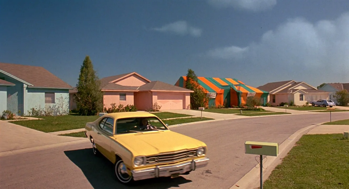
A saturated palette uses pure, intense hues that pop off the screen. It rarely looks natural, and that is the point: this world runs on different rules. Three-strip Technicolor made color the spectacle in The Wizard of Oz (1939); Godard filled Pierrot le Fou (1965) with primary red, blue and yellow; Edward Scissorhands (1990) paints a suburb in candy colors so it looks like a toy town.
What keeps a saturated look from tiring the eye:
- One dominant hue family, a few accents. Full saturation everywhere turns into noise.
- Color lives in objects first. Paint and wardrobe give clean color a grade can only exaggerate; pushing a neutral set in post mostly amplifies noise.
- Protect skin. Faces go orange or magenta long before walls look vivid, so graders often hold skin near natural while the world climbs.
How to control saturation on set and in the grade
- Design. Test paint chips and fabric swatches under the actual lighting in prep.
- Light. Deep lighting gels or RGB fixtures at full chroma give denser color than pale tints. Keep a neutral fill on faces while colored light rakes the background.
- Exposure. Color is densest near correct exposure; a stop over drifts toward white, a stop under sinks into mud.
- Filters. A polarizer deepens foliage, water and sky at a cost of roughly 1.5 to 2 stops; mist and diffusion filters soften color.
- Grade. Log footage looks grey until a LUT is applied. Hue-versus-saturation curves push or pull single colors, saturation-versus-luminance curves keep highlights from going garish, and the vectorscope shows when you cross delivery limits.
Saturated vs. desaturated: which look fits your story?
A desaturated look drains intensity toward grey without reaching black and white. It is the other end of the same dial:
| | Saturated | Desaturated | |---|---|---| | Feels | Heightened, playful, artificial | Weary, cold, documentary | | Typical genres | Musicals, animation, fantasy | War, crime, social drama | | Main risk | Cartoonish skin, visual noise | Dull, hard to read |
Pick the default saturation of the world first, then decide which moments or characters break it.
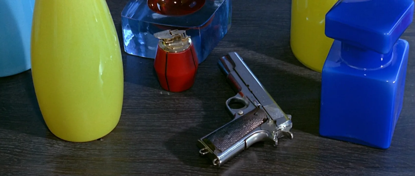
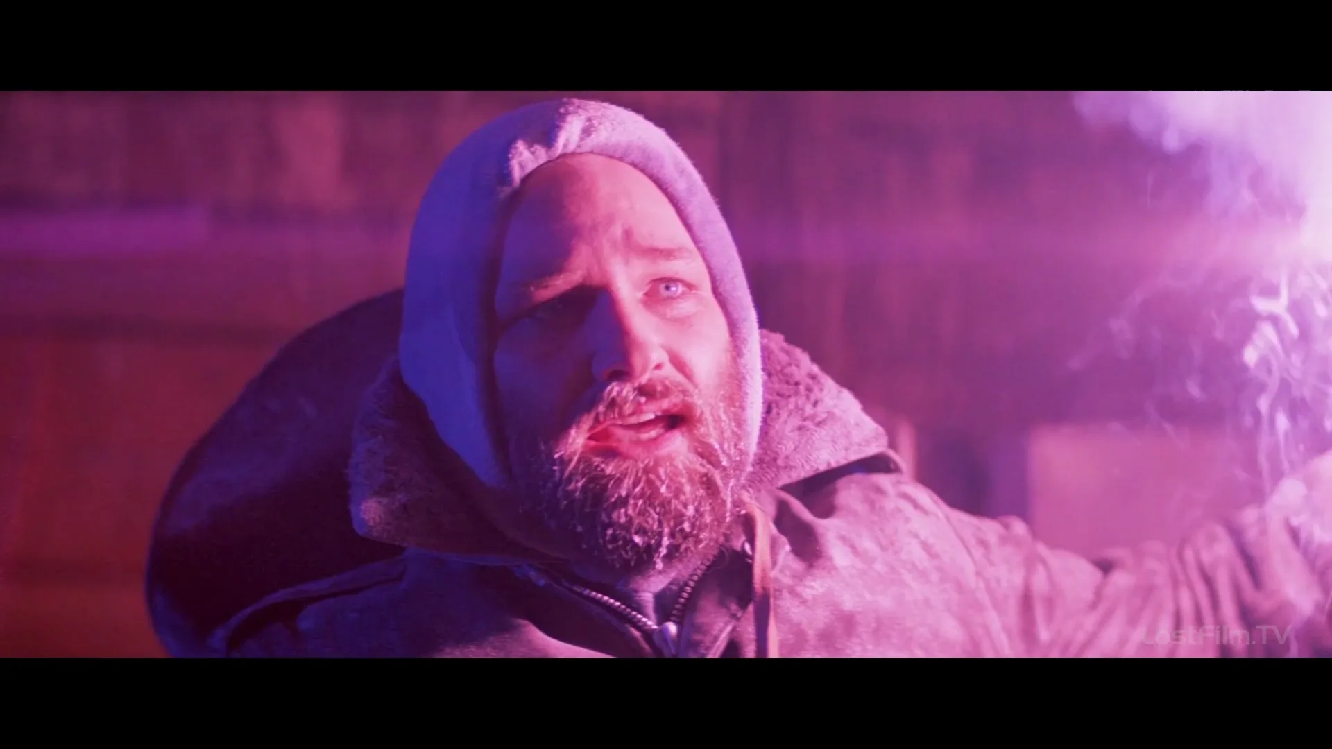
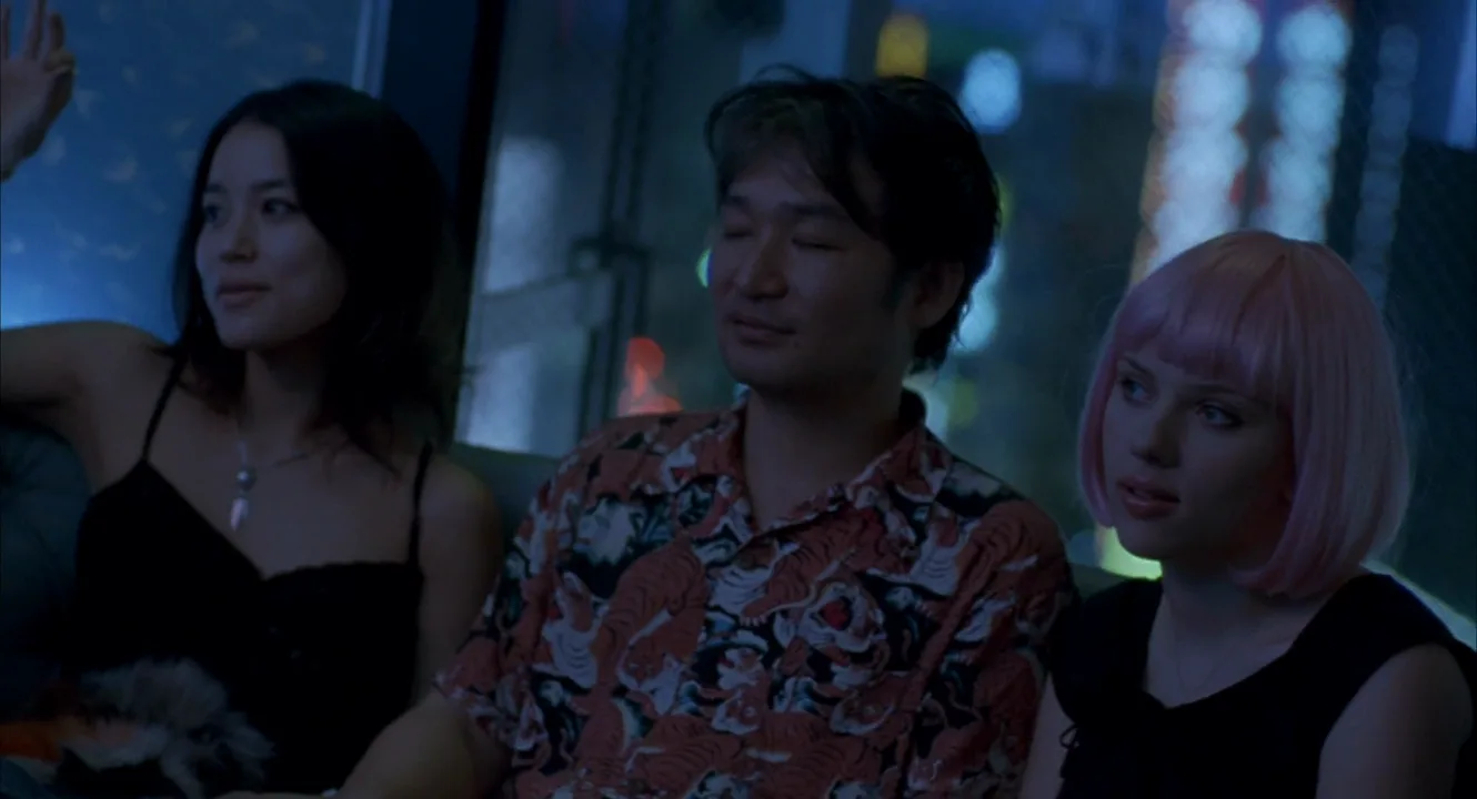
Color Saturation examples in film
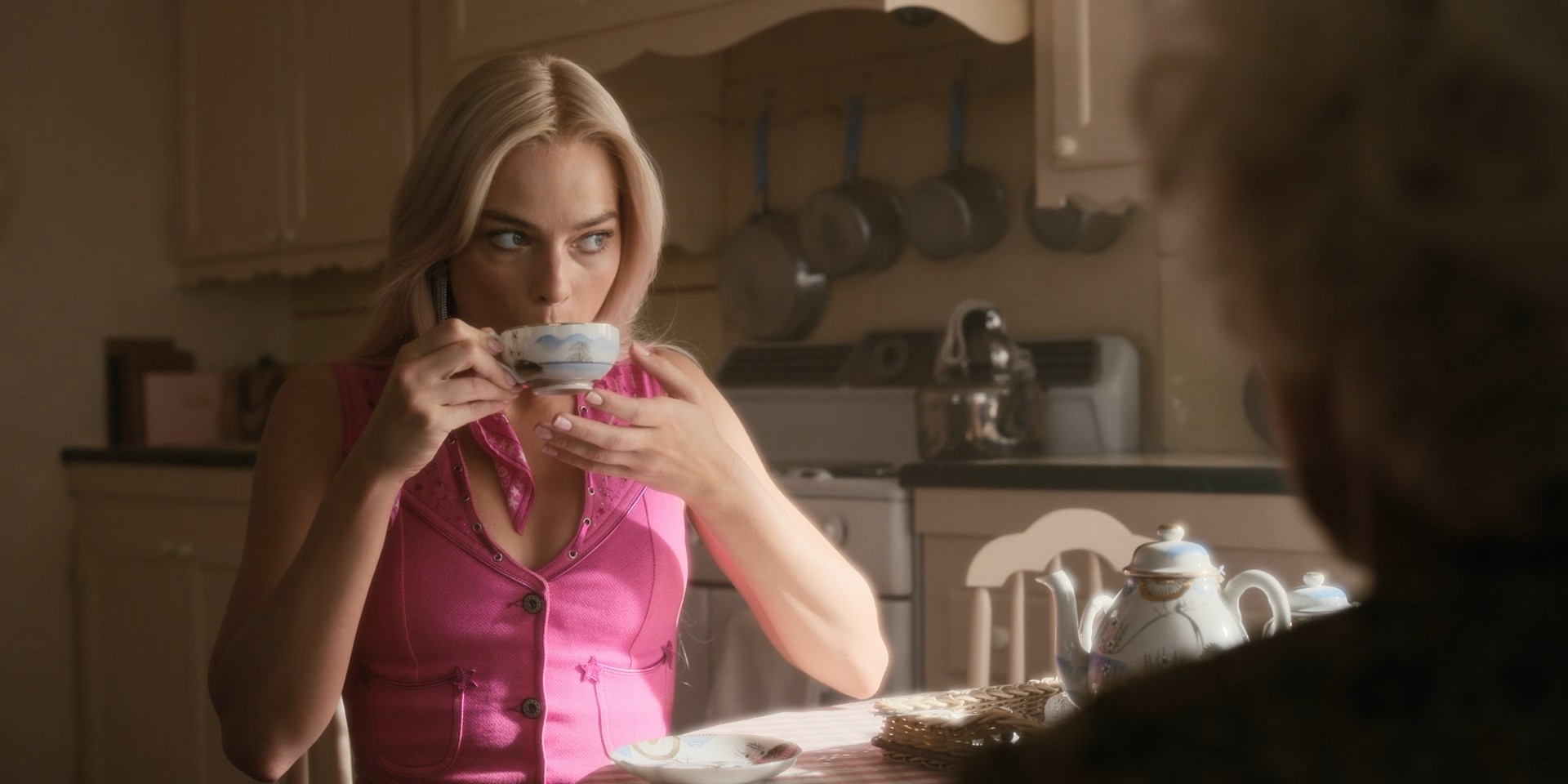
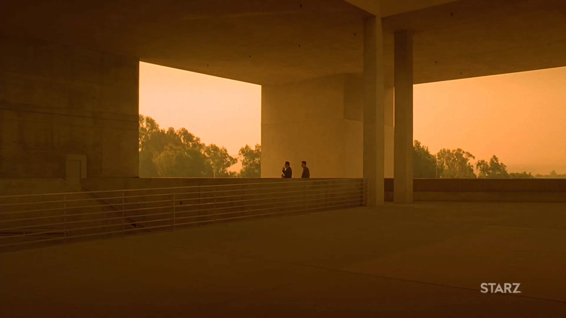
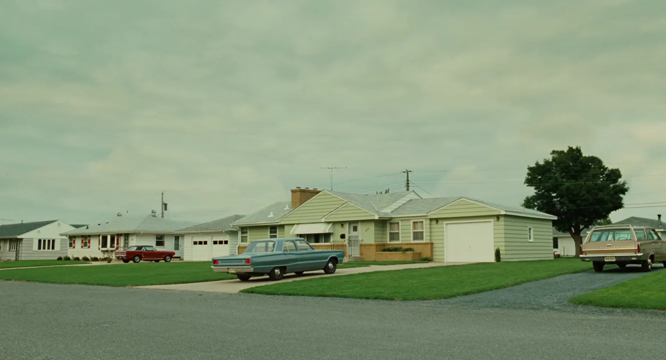
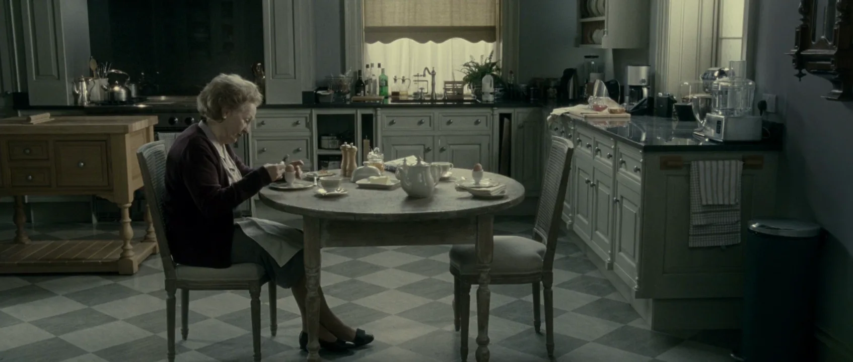
9 framesFrames from both ends of the saturation dial.

How to create a color saturation with AI
4 promptsImage models apply saturation words globally unless you say where the color lives. Name the colored objects, the light that keeps them dense and what stays neutral, especially skin. Keep saturated and muted takes beside your reference frames on one FlashBoards board to compare them. The fourth prompt re-shoots a real film shot from a text description alone, and the original plays next to the result so you can compare.
Cinematic wide shot inside a small laundromat at night: lemon-yellow washing machines, cherry-red plastic chairs, a turquoise tiled floor. A woman in her late twenties with a cropped platinum bob, freckles and a small gap between her front teeth, wearing a cobalt-blue raincoat, folds a red towel at a white counter. Highly saturated, pure colors, hard fluorescent light from above, natural skin tones, 35mm lens at chest height, fine film grain.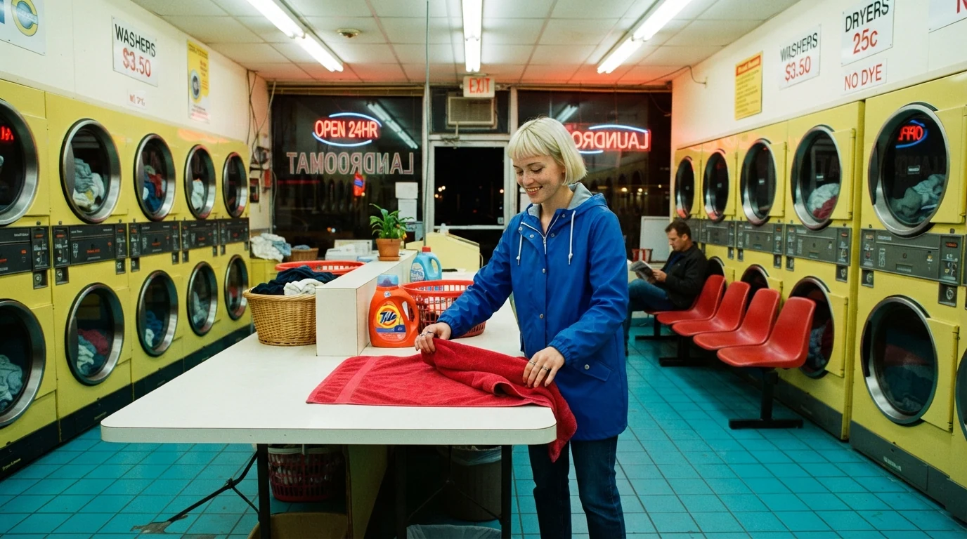
Four pure hues named on specific objects create the saturation; hard fluorescent light keeps them dense, and natural skin tones stops the model tinting her face.
Open FlashBoardsWidescreen wide shot of a coastal bus shelter on a cold morning: a tall, thin man in his sixties with a grey buzz cut, a hooked nose and a long olive wool coat sits alone holding a paper cup. Low-saturation, muted palette: slate-blue sea, faded green grass, grey concrete, pale sky; colors present but soft. Flat overcast light, 40mm lens at eye level, weary mood.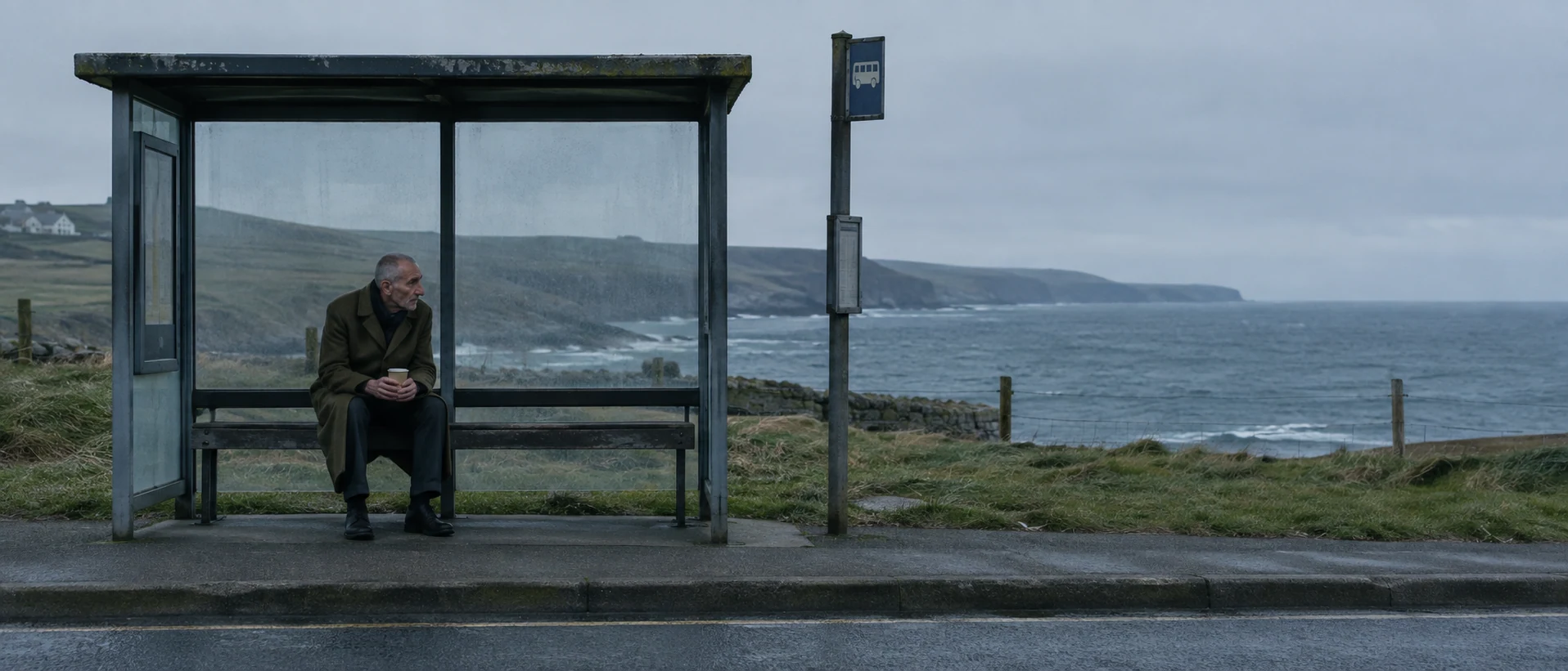
The other end of the dial. Colors present but soft and named faded hues keep the image in color instead of black and white or sepia.
Open FlashBoardsCamera: slow, steady lateral truck to the left at chest height along the yellow machines. Action: The drums are already spinning with colored clothes as she finishes folding the red towel. She turns and walks to the cherry-red chairs, sits down and looks up at the spinning machines.Spinning drums make the clip alive from the first frame, and every object in the action already exists in the start frame, so the palette stays stable.
Open FlashBoards{
"output": "Full-screen live-action shot from Edward Scissorhands (1990) from its very first frame: one continuous shot, no cuts. Glossy 1990s 35mm color film, hard clear midday sun from high screen-right, crisp short shadows, a highly saturated candy palette: deep cobalt-blue sky with soft white clouds, a curving suburban street of identical single-story ranch houses painted pale mint blue, bubblegum pink and salmon, one house wrapped in bold orange and green stripes, emerald-green lawns, a butter-yellow two-door 1970s coupe with long doors, dusty pinkish-mauve asphalt. Every color pure and dense, a toy-town suburb.",
"characters": {},
"shots": [
{
"shot": 1,
"camera": "static-feeling wide shot from knee height on the near curb at the inside of a curve, wide lens, deep focus; a small pale green mailbox with a red flag on a short post stands a few metres away in the right foreground, low in the frame, its top well below the rooftops, a strip of bright green lawn in the lower right corner; the street curves from the lower left up to the middle distance, the row of pastel houses across the middle of the frame, blue sky filling the upper half. A very slow slight tilt down and a slight pan right as the car comes close, then the framing holds.",
"action": [
"BEGINNING: alive from the first frame, the butter-yellow sedan sits small in the middle distance on the left third of the frame, on the far side of the curve in front of the mint-blue and pink houses, nose pointing to the left, a dark driver's silhouette behind the windshield.",
"THEN: the sedan starts to roll, swings around the bend and heads toward the camera, growing larger in the left third, round headlights and chrome grille catching the sun, its hard dark shadow sliding on the asphalt at its left side.",
"THEN: it glides into the left-centre foreground just left of the mailbox and stops, three-quarter front view angled toward frame right, filling the lower left of the frame; the pastel houses, the striped house and the blue sky stay bright behind it.",
"THEN: the sedan holds still for a few moments, engine idling, sun glinting on the hood and chrome bumper; the mailbox and lawn do not move.",
"END: the sedan backs up in reverse gear, rolling straight backward away from the camera the way it came, without turning, its nose still pointing toward frame right, shrinking toward the middle distance on the left third."
],
"voice": "silence: nobody speaks in this shot, no voice at all",
"dialogue": []
}
],
"sound": {
"ambience": "quiet suburban midday, birdsong, a lawn sprinkler ticking heard from nearby, the low rumble of the sedan's engine approaching, idling and reversing, tires crunching softly on the asphalt",
"speech": "no words in this video; the only human sounds are breaths and movement",
"never_spoken": "no narration and no voice-over: the descriptions, performance notes and step words of this prompt are never spoken aloud",
"music": "a film score under the scene, always below the voices: a light whimsical waltz of plucked strings and a tinkling celesta, playful and slightly eerie",
"subtitles": "none"
}
}Remakes the suburban street shot from Edward Scissorhands (1990), dir. Tim Burton, DP Stefan Czapsky, keeping the low curbside angle with the mailbox, the candy-colored houses under a deep blue sky, the silent yellow car rolling up to the camera and a whimsical score.
Every surface gets a named, pure hue (mint and pink houses, a striped house, emerald lawns, a butter-yellow car, cobalt sky) and hard midday sun keeps those colors dense, so the high saturation is written into the scene rather than left to a vague word like vibrant.
Open FlashBoardsCommon mistakes
- Vibrant turns everything neon. Name the colored objects and add natural skin tones.
- Muted becomes black and white or sepia. Say colors are present but soft.
- Light softens color. Golden hour or haze weakens a saturated palette; use hard sun or strong colored practicals.
- Too many equal hues fight. Give one hue most of the frame.
Keep the reference frames, prompts and every generated take side by side — images and video in one canvas.
FAQ
4 questionsWhat does saturation mean in film?
Saturation is how pure or intense a color is, measured by its distance from neutral grey. A highly saturated shot has strong, unmixed hues; a low-saturation shot looks muted. Filmmakers control it through production design, lighting, exposure, filters and the grade, using it to set mood, direct the eye and separate one world from another.
What is the difference between saturation and chroma?
Both describe color intensity. Chroma judges a color against a white under the same light; saturation judges it against the color's own brightness. In everyday film work and grading software, saturation is used for both, and the distinction matters mostly in color science and technical documentation.
What is the difference between saturated and desaturated colors?
Saturated colors are pure and intense, so the image feels vivid, heightened or artificial. Desaturated colors are pulled toward grey while keeping their hue, so the image feels muted, cold or documentary. They are two ends of one control, and most films set a default level, then push or pull it for specific scenes.
How do you increase color saturation in a video?
Start before the grade: strongly colored wardrobe and sets, correct exposure, deep colored light and a polarizer on foliage, water and sky. In the grade, raise global saturation gently, then push specific colors with hue-versus-saturation curves. Keep skin natural and watch the vectorscope so colors do not clip.
Related terms
3- Color TheoryColor
Color theory in film is the practical knowledge of how hue, saturation and brightness interact and how filmmakers use palettes, contrasts and color changes to guide the eye and shape emotion.
- Desaturated LookColor
A desaturated look drains color intensity across the frame without going fully black-and-white, giving a muted, cold, war-weary or documentary feel.
- VectorscopeColor
A vectorscope is a video scope that plots every pixel by hue (angle) and saturation (distance from center), used in grading to check color balance, skin tones and legal saturation.
Further reading
Blain Brown, Cinematography: Theory and Practice (Routledge) — chapters on color and color control. Mark D. Fairchild, Color Appearance Models (Wiley) — definitions of colorfulness, chroma and saturation.