 FlashBoards Learn
Color · Film language
Color Palette
Also called: film palette, color scheme, movie colors
A film's color palette is the small set of colors that dominates its images, built from sets, costumes, light and the grade. Kept limited on purpose, it makes a movie look like one coherent world and sets its emotional temperature, so the viewer feels warmth, dread or loneliness before anyone speaks.
- What it does
- Binds every frame of a film into one visual world and tells the viewer how to feel about it.
- Use it when
- Before shooting: to brief production design, costume and lighting, and to separate story worlds or chart a character's change.
- Watch out
- A palette chosen only in the grade fights the sets and costumes; decide it in prep and build it into the physical frame.
- Try this prompt
wide shot of an empty laundromat at night, limited palette of teal, mint and cool grey, one mustard-yellow raincoat as the only warm color, 35mm
What is a color palette in film?
A color palette is the short list of hues a film allows itself. Painters mix from a palette; filmmakers build one out of paint on walls, fabric, skin, practical lamps, gels and the final grade. When it works, you can pause any frame and name the film from its colors alone.
A working palette has three layers:
- Dominant color: the one that fills most of the frame, usually in walls, sky, floor or the overall light. Think 60% of the image.
- Secondary colors: one or two hues that support the dominant, in costumes, furniture and shadows. Roughly 30%.
- Accent: a small, often saturated note that pulls the eye: a coat, a lamp, a door. About 10% or less.
Hue is only part of it. A palette also fixes saturation (how pure the colors are) and value (how light or dark they sit). Two films can both be "blue" and feel nothing alike: one pale and chalky, the other deep and inky. That is why a palette sheet lists specific swatches, not color names. The rules for how these colors relate come from color theory in film; the palette is the choice you make with those rules for one particular story. More on that in the color hub.
Why do movies use a limited color palette?
Unmanaged color is noise. A real street holds dozens of competing hues, and the eye jumps between them. Cutting that list down does four jobs at once.
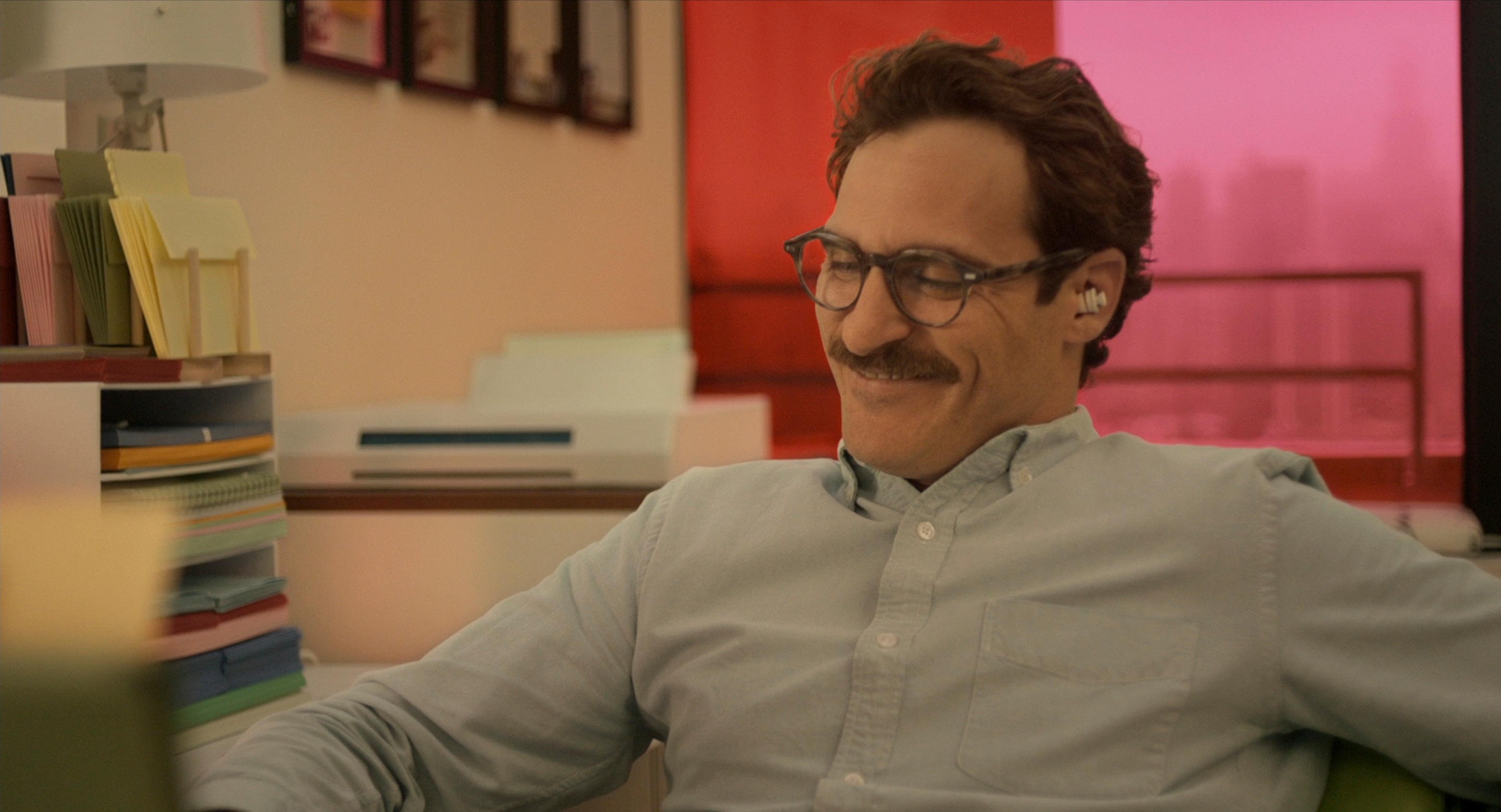
It sets emotional temperature. A warm color palette of ambers and reds reads as intimacy, memory or heat; a cool color palette of blues and cyans reads as distance, night or control. Her (2013) lives in corals, pinks and warm pastels, which makes a lonely story feel tender rather than cold.
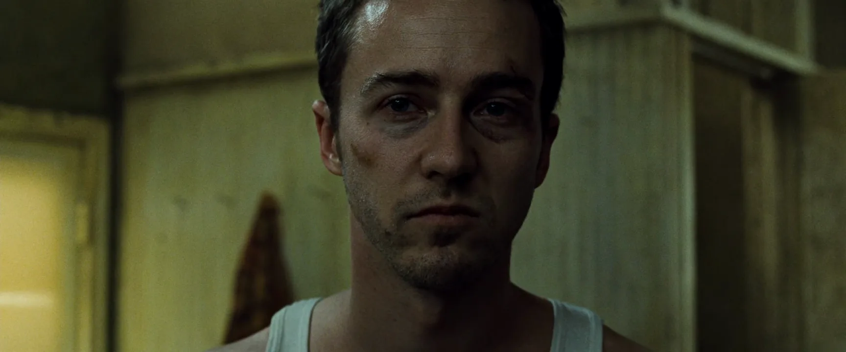
It makes a world coherent. Fight Club (1999) keeps its interiors in sickly greens and yellows, so offices, bathrooms and basements feel like parts of one infection. The Matrix (1999) tints the simulation green so thoroughly that you know which reality you are in from any single shot.
It separates worlds and people. In Kurosawa's Ran (1985), the three sons and their armies are coded yellow, red and blue, so a battlefield of thousands stays readable from a wide shot.
It tracks change. Because the audience learns the palette early, breaking it registers as an event: a first warm lamp in a cold film, or color draining out of a character's surroundings as things go wrong.
Analogous colors: a unified, harmonious palette
An analogous scheme uses neighbors on the color wheel: yellow, orange and red, or blue, cyan and green. The frame feels calm and complete, and mood comes through strongly because every element pushes the same way.
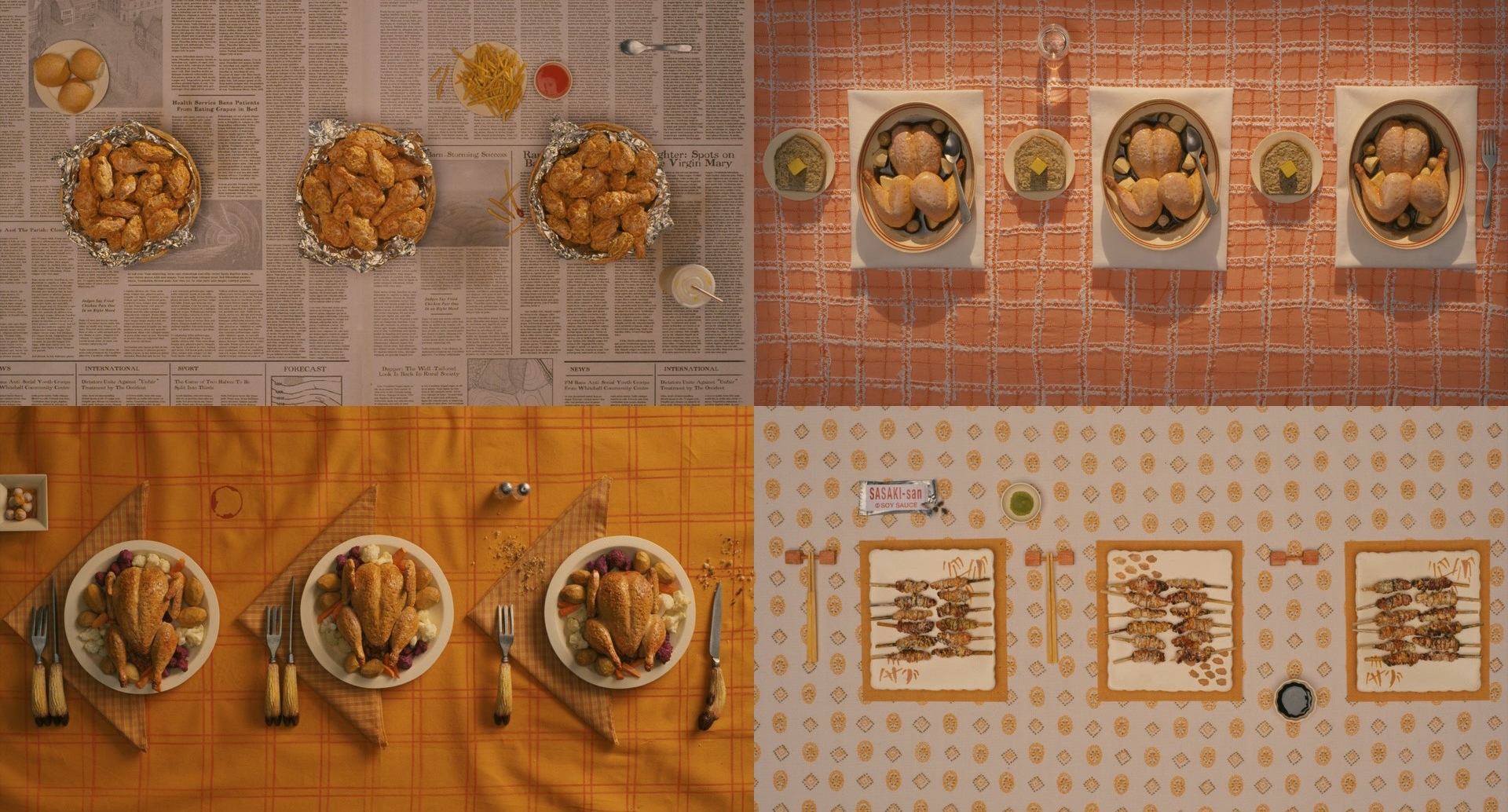
Wes Anderson's Fantastic Mr. Fox (2009) is the textbook example: fur, cloth, food and autumn light all sit between mustard and rust. Night-world films often do the cool version, with blues sliding into violets and cyans.
The risk is flatness. With so little hue contrast, separation has to come from value and texture: a darker background, a brighter face, a rough fabric against smooth walls. Keep a clear value range from near-black to near-white, or the image turns to mush. Push an analogous scheme all the way to one hue and you reach a monochromatic color scheme.
Split-complementary colors: contrast with nuance
A straight complementary pair sets opposites against each other: blue and orange, red and green. Complementary colors give maximum contrast, but they can look like a poster. A split-complementary scheme keeps the base color and replaces its complement with the two hues on either side of it.
Take a blue base. Its complement is orange; the split version uses red-orange and yellow-orange instead. In practice that might be a blue-grey night street, a red-orange neon sign and the yellow-orange of a sodium lamp. You still get warm-against-cool tension, but the warm side has two voices, which reads as more natural and less designed.
It is a good choice when a film needs strong color contrast but the obvious teal-and-orange pairing would feel generic. Let the base dominate; the two split hues should share the remaining area unequally, one clearly in front of the other.
Triadic colors: three hues, one in charge
A triadic scheme uses three hues spaced evenly around the wheel, like red, yellow and blue, or orange, green and violet. It is the most vivid structure and the hardest to control: at equal strength the three colors cancel each other out and the frame looks like a toy box.
The fix is hierarchy. One hue dominates, one supports, and the third appears in small doses. Lower the saturation of two of them and the scheme becomes lively instead of loud. Ran uses the primary triad as costume and banner color against muddy landscapes, so the triad reads as identity rather than decoration.
On set, a triad usually lives in costume and props, while light stays close to neutral. If you gel the light in all three colors as well, skin tones break down fast.
Dominant and accent color: making one thing matter
The simplest palette structure is also the most useful: a dominant color that sets the world, and a small accent that breaks it. The accent works because it is rare. Put the only red in the film on one character's scarf and the audience will track that scarf across a crowd.
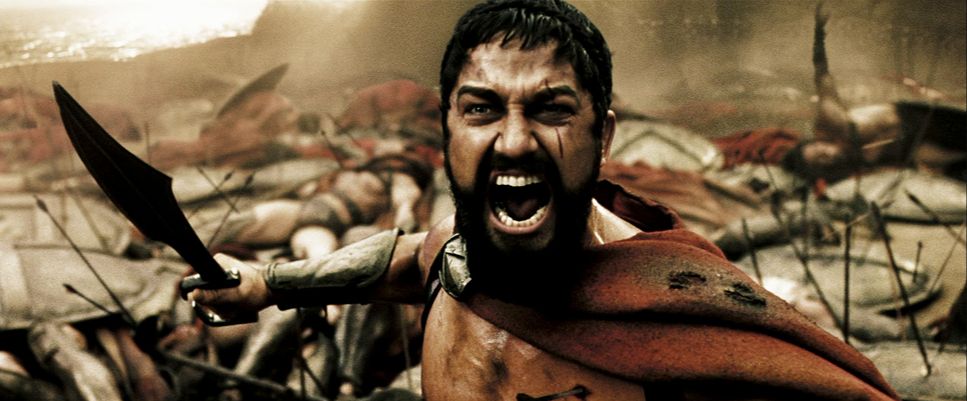
Zack Snyder's 300 (2006) grades its world into bronze and dusty sepia, then leaves the Spartans' cloaks a saturated red. Man of Steel (2013) keeps a steel-blue, storm-grey world and lets the red of the cape carry the warmth.
Keep accents small and consistent. Repeat the accent color in another object and it stops being an accent. The extreme version drains everything except one object to black and white, which is selective color, as with the red coat in Schindler's List (1993). Accent colors also pick up meaning through repetition, which is where color symbolism begins.
Production design palette: building color into the set
Most of a film's palette is built, not graded. The production design palette fixes the colors of walls, floors, furniture, props and vehicles before a single light goes up. The grade can bend these colors, but it cannot invent a red door that was painted grey.
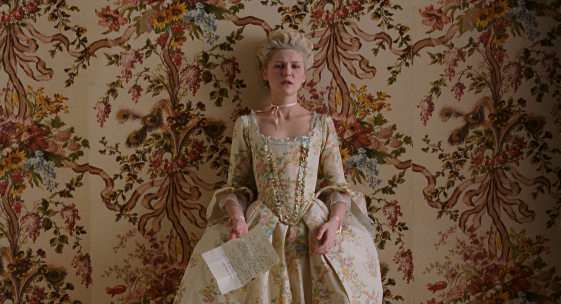
The production design department usually works from a palette board: paint chips, fabric swatches, reference frames and a few words on mood for each set or sequence. Costume design works from the same board, so actors neither vanish into walls nor clash with them. Sofia Coppola's Marie Antoinette (2006) shows the payoff: gowns, wallpaper and pastries share a narrow range of powder pinks, creams and pale greens, so the queen literally matches her rooms.
Practical rules that save days later:
- Control value first. Paint walls a stop or so darker than skin, and faces separate on their own.
- Mute big surfaces, saturate small ones. Saturated walls dominate every shot; save strong color for props and costume accents.
- Test on camera. Paint that looks warm under the fluorescent tubes of a shop can swing toward green or grey under 3200K tungsten or 5600K daylight.
How to create a color palette for a film
A palette starts in the script, not on a color wheel.
- Map the emotion. Break the story into movements and write one feeling per movement: safe, tense, lost, free. Palette changes should follow these turns.
- Pull references. Collect frames, paintings and photos that carry each feeling, and sample 3–5 swatches from each. A film lookbook holds these next to short notes for the department heads.
- Pick a structure. Analogous for unity, complementary or split-complementary for conflict, triadic for heightened worlds, dominant-plus-accent for focus. Write down the ratio: dominant around 60%, secondary around 30%, accent 10% or less.
- Assign colors to departments. Which hues live in paint, which in costume, which in light? Light gets the fewest, because colored light also colors skin.
- Set light and camera. Choose a white balance and color temperature plan per location: for example 3200K tungsten practicals at night against a 5600K base for a warm-in-cool look. Build a viewing LUT for set so everyone judges color the same way.
- Test with actors. Shoot costume and makeup on the real sets. Palettes that look great on paint chips can turn faces grey or green.
- Protect it in the grade. Refine with hue-versus-hue and saturation curves, check skin against the skin-tone line on a vectorscope, and remove stray colors the set could not control.
A quick check for any finished scene: blur a still until no detail remains. What is left is the palette. If it is muddy or random, so is the scene's color.
Color palette vs. color theory
Color theory is the general knowledge: how hues relate on the wheel, what contrast and harmony do, how saturation and value change perception. It applies to every film.
A color palette is one film's specific answer: these five swatches, in these proportions, changing at these story points. Theory tells you that complementary colors create tension; the palette decides that this film's tension is a blue-grey city against one orange streetlamp.
Put simply, theory is grammar and the palette is the sentence. Scheme names such as analogous, triadic or split-complementary sit between the two: they are theory's templates, which a palette can follow closely or bend. A palette can also be defined mostly by saturation instead of hue: a desaturated look is a palette choice too.
Color Palette examples in film
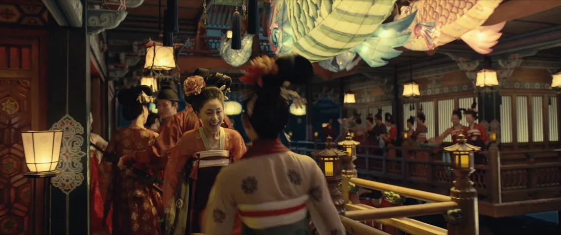
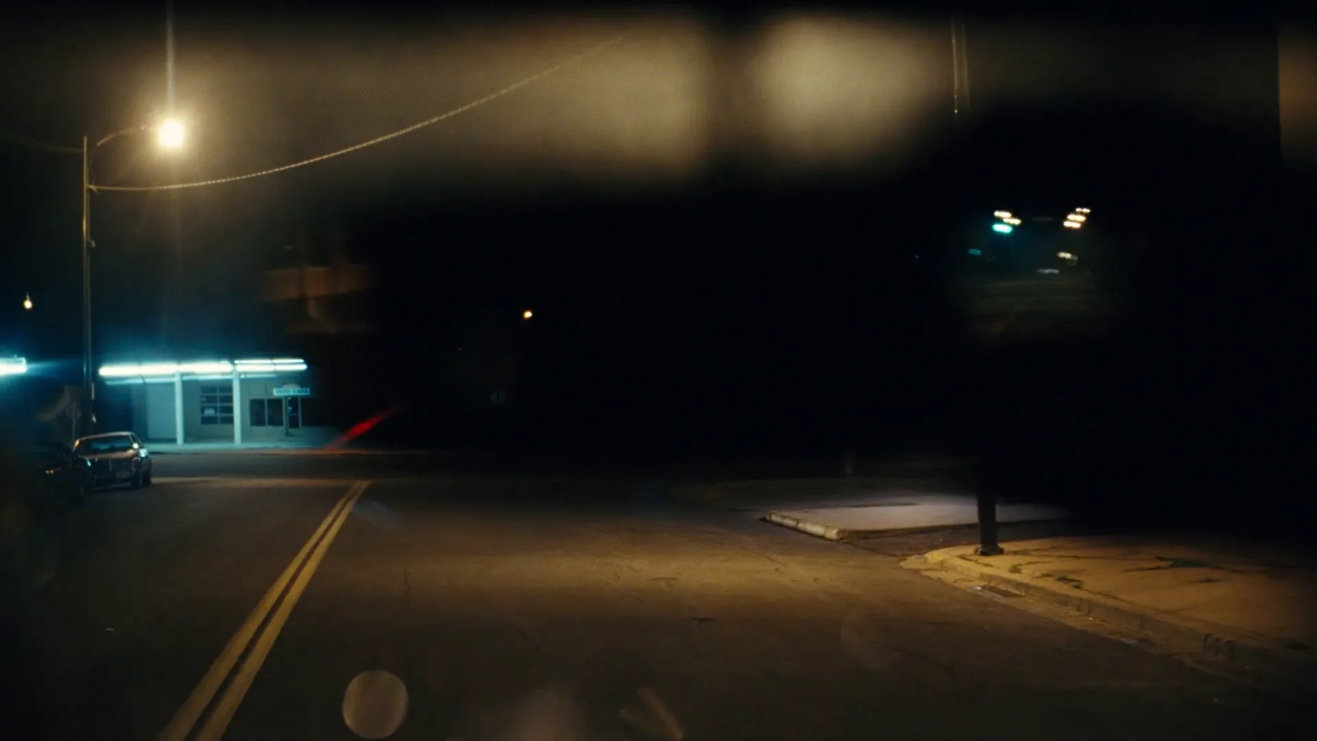
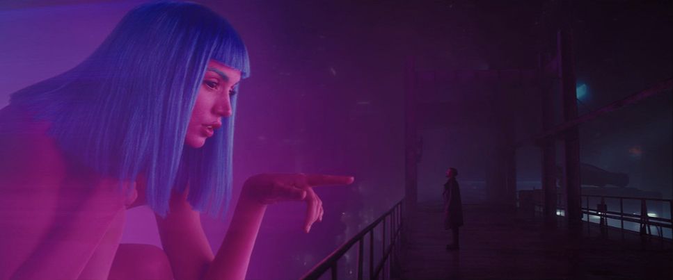
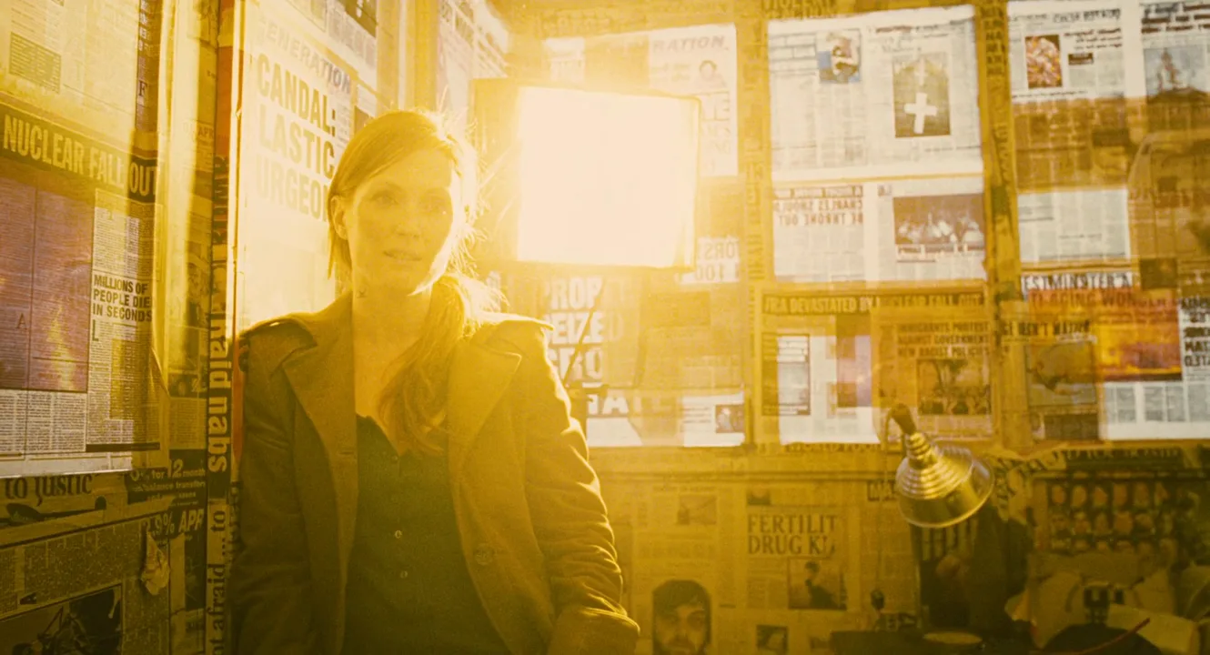
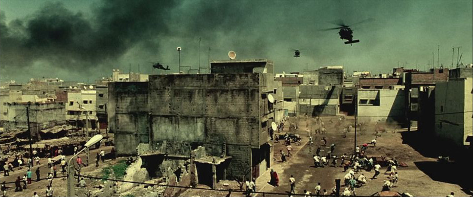
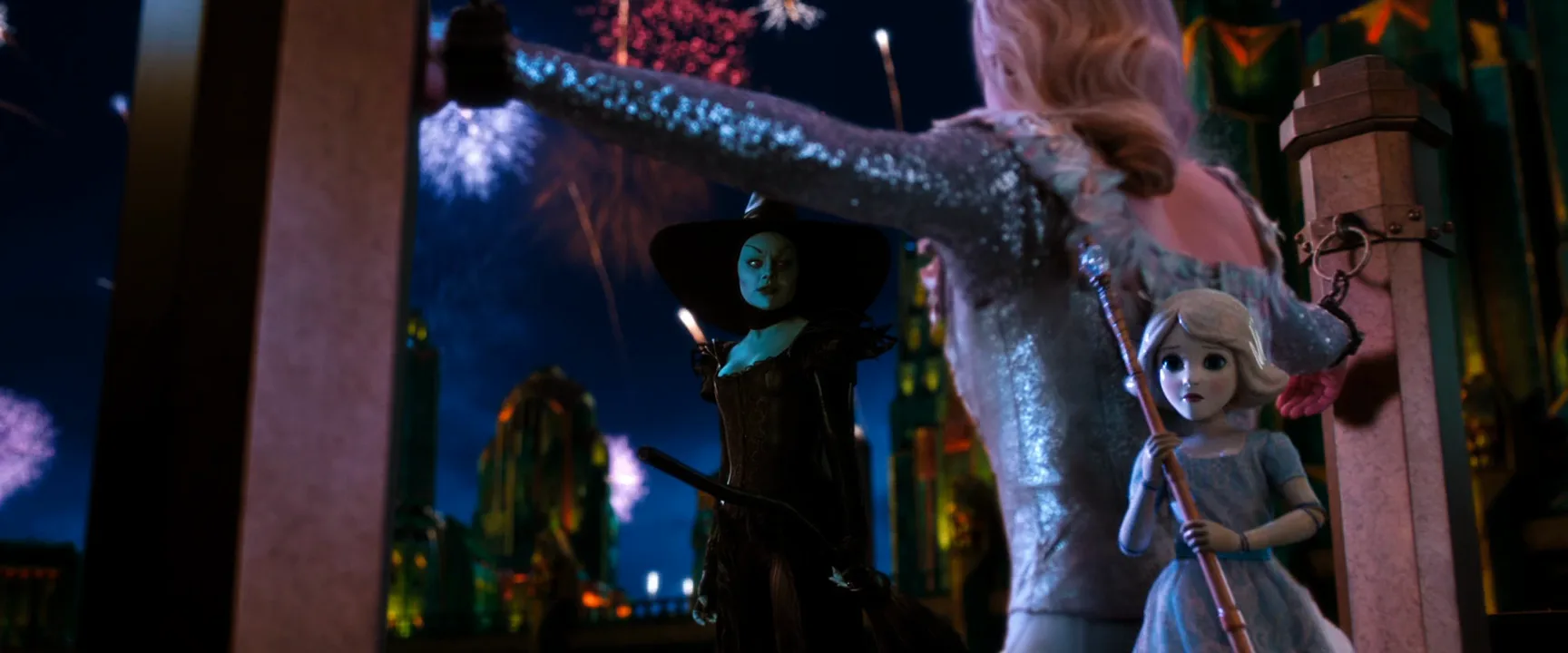
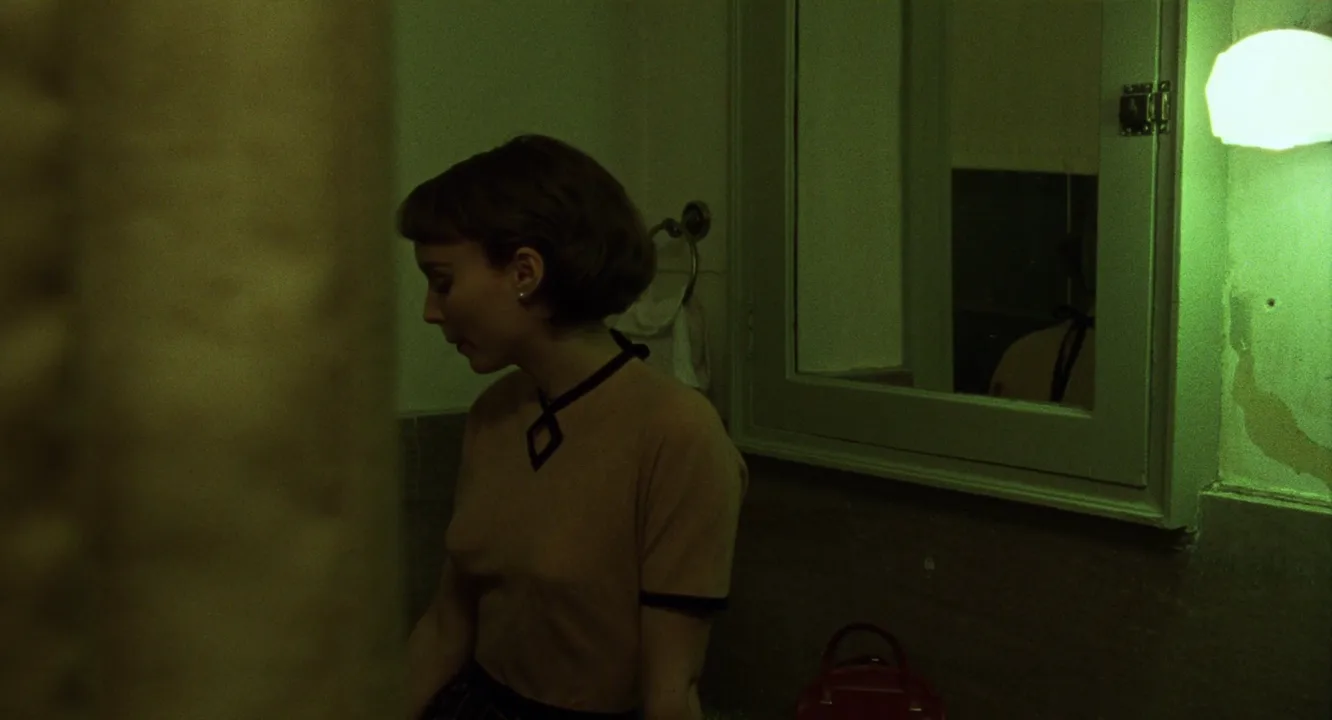
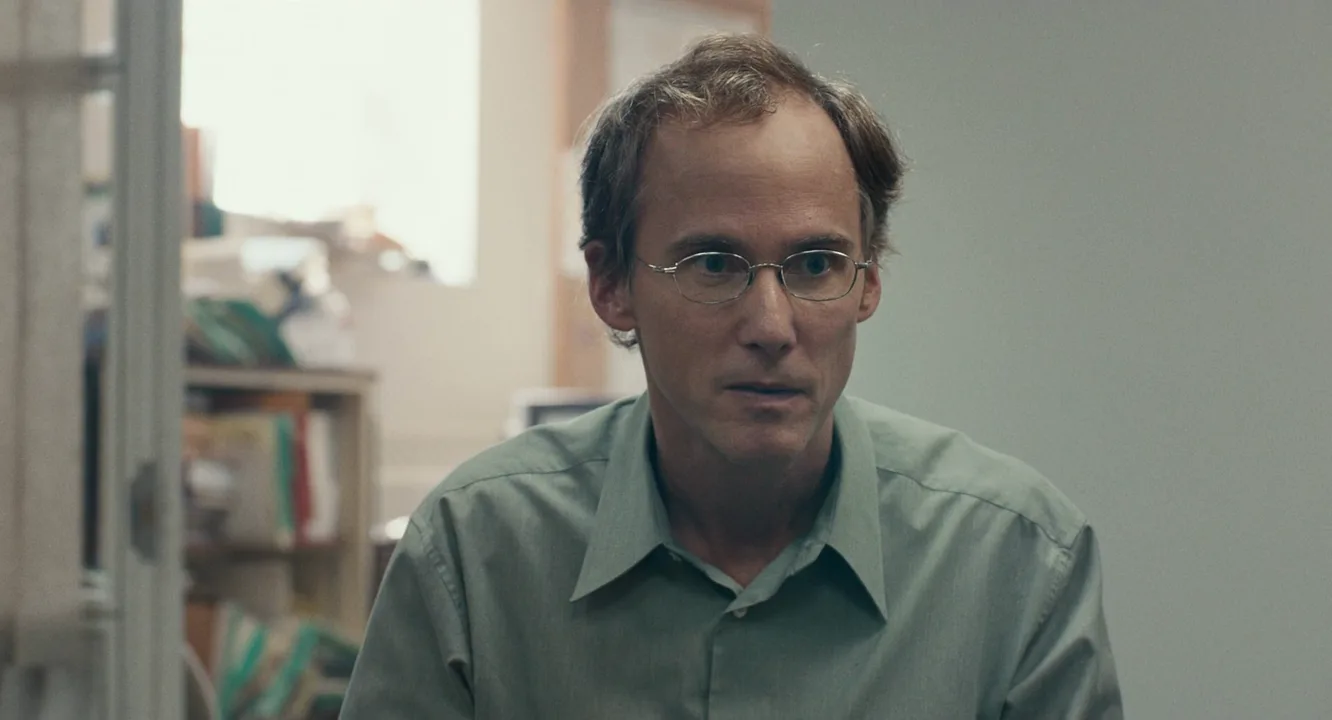
16 framesFrames from films with a deliberate palette. Look past the subject and read each frame as a set of swatches: what dominates, what supports and where the accent sits.


How to create a color palette with AI
4 promptsImage models rarely hold a palette unless you name it: say "limited palette" and list the exact hues, their roles and the one object that carries the accent. In FlashBoards, pin your reference frames and swatches next to the generations on one board, so you can compare each take against the palette at a glance. Generate the start frame, try a second structure, then animate the frame that holds its colors best. The fourth prompt re-shoots a real film shot from a text description alone, and the original plays next to the result so you can compare.
Wide cinematic shot, 35mm lens at chest height, inside an empty all-night laundromat with rows of front-loading washing machines. Strict limited color palette: walls, machines and floor tiles in teal, mint green and cool grey. One accent of mustard yellow: the raincoat of a woman in her sixties with a cropped silver buzz cut and heavy black-framed glasses, folding a teal towel at a steel counter in the middle of the frame. Even cool fluorescent overhead light, soft shadows, low saturation everywhere except the raincoat, natural warm skin tone. Quiet, lonely mood, fine film grain.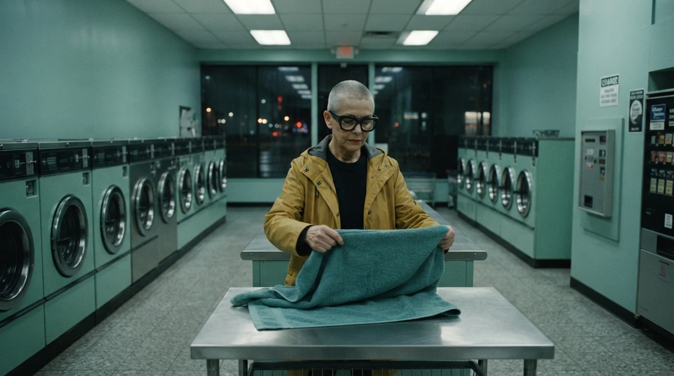
The palette is spelled out as roles: teal, mint green and cool grey for everything large, mustard yellow tied to one object. Saying "low saturation everywhere except the raincoat" stops the accent from leaking into lamps and signage, and "natural warm skin tone" keeps the face from going grey under a cool scheme.
Open FlashBoardsAnamorphic widescreen shot, 40mm lens at eye level, a 1970s roadside diner at golden hour. Analogous color palette only: rust red vinyl booths, burnt orange counter stools, ochre laminate walls, chocolate brown wood paneling, cream coffee cups. Behind the counter a young cook with freckles, a shaved head and a small gold hoop in one ear wipes a coffee pot, low sun through the windows turning the whole room amber. Warm, nostalgic, harmonious, soft haze, gentle film grain.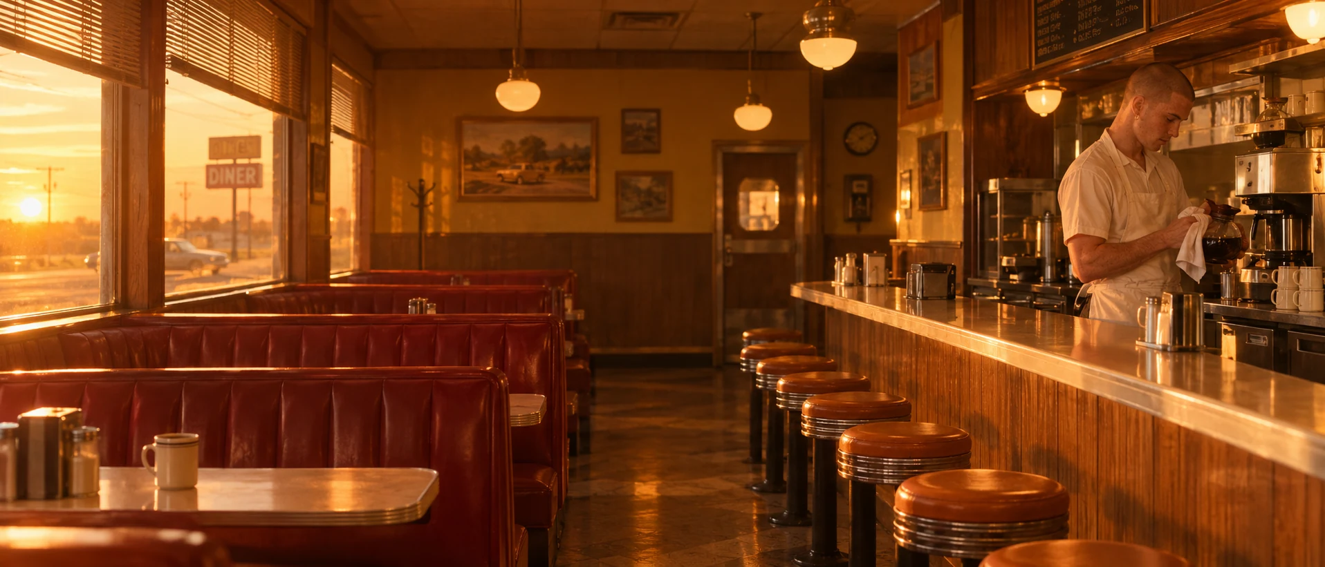
A second take with a different structure: an analogous warm scheme instead of dominant-plus-accent. Naming a color per surface (booths, stools, walls, paneling) is what keeps stray hues out; "analogous color palette only" and "harmonious" tell the model to stay between red and ochre, and "low sun turning the room amber" makes the light agree with the set.
Open FlashBoardsCamera: slow, steady push-in from the wide shot toward the woman at the counter, ending in a medium shot of her and the towels. Action: She is already folding the teal towel as the shot begins, snaps it flat and lays it on the pile. She pulls the next towel from the basket and starts folding again. Near the end she pauses and looks up toward the window. The drums of the washing machines behind her keep turning the whole time. The palette stays teal, mint and cool grey, with her mustard raincoat as the only warm color.Motion starts in the first frame ("already folding", drums "keep turning"), so the shot is alive instead of drifting on a still. The camera move has a start and an end. Restating the palette at the end keeps the model from warming the image as it animates, and every object mentioned is already in recipe 1's frame.
Open FlashBoards{
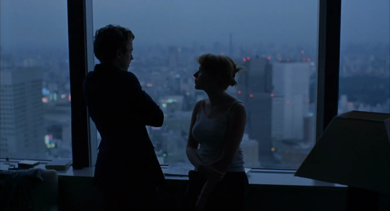
"output": "Full-screen live-action scene from Lost in Translation (2003) from its very first frame: one continuous shot. 35mm film, fine grain, early 2000s, underexposed by about two stops. A dark high-rise hotel room in Tokyo at late dusk, lit only by the dim overcast sky through a floor-to-ceiling window. Strict cool, low-saturation palette of one hue: deep slate-blue sky and city, dusky blue-grey haze, a navy-black room; the whole image is dim and muted, the sky a dull steel blue rather than bright; the two people read as near-black silhouettes against the glass; the only other notes are a muted grey tower block on the right and a few tiny red aircraft-warning lights far away.",
"characters": {
"S1": {
"name": "John, played by Giovanni Ribisi",
"look": "slim young man with short tousled dark hair, dark suit jacket, seen almost entirely as a silhouette",
"voice": "soft, flat, tired, a little distracted"
},
"S2": {
"name": "Charlotte, played by Scarlett Johansson",
"look": "petite young woman, blonde hair loosely pinned up, pale grey thin-strap camisole, dark trousers, a faint blue rim of light on her shoulders and cheek",
"voice": "quiet, light, gently hopeful"
}
},
"shots": [
{
"shot": 1,
"camera": "locked-off tripod, static, eye level, normal lens, medium-wide shot from inside the dark room; a black window mullion runs down the left edge and another just right of centre, the dark window ledge crosses the lower fifth, the dark shade of a table lamp sits in the lower right foreground; nothing moves in the frame except the two people",
"action": [
"BEGINNING: alive from the first frame, S1 stands in the left third with his back to camera, looking out at the city, his right hand raised to his face rubbing his eyes; S2 stands just right of him near the centre, back to camera, both hands resting on the ledge behind her hips, her head turned in profile toward him.",
"THEN: S1 lowers his hand; S2 turns her body toward him and lays her right hand on the back of his left arm, rubbing it gently while she looks up at his face.",
"THEN: S1 turns to his left into profile, facing her, and folds his arms across his chest, leaning his left shoulder against the mullion; S2 takes her hand back and clasps both hands low in front of her, looking up at his face.",
"THEN: both hold still in profile, facing each other at arm's length, a small bright gap of blue city between their silhouettes; his head tilts slightly down toward her.",
"THEN: S2 raises her right hand again and rests her fingers on his folded forearm, stroking it slowly; S1 keeps his arms folded and does not move toward her.",
"END: both stay in profile, her hand still on his arm, his gaze on her face, two dark shapes against the pale blue glass."
],
"dialogue": [
{
"speaker": "S2",
"on_screen": true,
"when": "just after the first second, as her hand reaches his arm",
"delivery": "quiet, friendly, a little tentative",
"line": "<d>[English] How'd it go, huh?</d>"
},
{
"speaker": "S1",
"on_screen": true,
"when": "right after her question, as he turns to face her",
"delivery": "flat, tired",
"line": "<d>[English] Oh, it was good, you know. I'm tired.</d>"
},
{
"speaker": "S1",
"on_screen": true,
"when": "straight after, arms folded",
"delivery": "matter-of-fact, already elsewhere",
"line": "<d>[English] Yeah, I gotta go downstairs and meet Kelly for some drinks.</d>"
},
{
"speaker": "S1",
"on_screen": true,
"when": "while her fingers stroke his forearm, near the end",
"delivery": "offhand",
"line": "<d>[English] She wants to talk about some photo thing.</d>"
}
]
}
],
"sound": {
"ambience": "quiet air-conditioned room tone, a faint distant city hum heard from far below",
"speech": "exactly these spoken phrases, each said once, in this order",
"never_spoken": "no narration and no voice-over: the descriptions, performance notes and step words of this prompt are never spoken aloud",
"music": "a film score under the scene, always below the voices: a soft, hazy synth pad with a slow, melancholy pulse",
"subtitles": "none"
}
}Remakes the window shot from Lost in Translation (2003), dir. Sofia Coppola, DP Lance Acord, with Charlotte and John: the locked-off frame, two silhouettes against a slate-blue city at dusk, her hand on his arm, his folded arms, their exact lines and the cool low-saturation palette carried over.
The palette lives in output, stated as roles: deep slate-blue sky and city, blue-grey haze, a navy-black room, the people as near-black silhouettes and only tiny red lights as accents. Underexposing the shot and lighting the room only by the dusk sky makes the light agree with the palette, and Charlotte's and John's lines come straight from the film.
Common mistakes
- "Cinematic" drifts to teal and orange. Many models default to that pairing. Name your own hues and say "only" or "strict limited palette".
- Random colors in windows and signs. Backgrounds fill up with blue sky or neon. Say what the window shows ("grey night rain", "amber low sun") so the palette covers it.
- The accent spreads. Mention the accent color once, tied to one object, and describe everything else in the dominant hues.
- Faces turn grey or green. Cool and monochrome schemes pull skin with them; add "natural warm skin tone" to the prompt.
- The palette drifts in video. Restate the palette in the video prompt and keep the scene to what is already in the start frame.
Keep the reference frames, prompts and every generated take side by side — images and video in one canvas.
FAQ
5 questionsWhat is a color palette in film?
A film color palette is the limited set of colors that dominates a movie's images, spread across set design, costumes, lighting and the final grade. It usually has one dominant hue, one or two supporting hues and a small accent. The palette makes the film look like a single world and sets its emotional tone, from warm and nostalgic to cold and clinical.
How do you create a color palette for a film?
Start with the story: write the feeling of each act or sequence. Gather reference frames for those feelings and sample three to five swatches from each. Choose a structure (analogous, complementary, triadic or dominant-plus-accent), assign colors to paint, costume and light, then test on camera with actors before the shoot and protect the palette in the grade.
How many colors should a movie color palette have?
Most strong palettes rest on three to five hues: one dominant, one or two secondary and an accent. A common working ratio is about 60% dominant, 30% secondary and 10% accent. Neutrals such as black, white, grey and skin tones don't count against that limit, but their warmth or coolness should still agree with the palette.
What movies are known for their color palette?
Frequently cited examples include Her (2013) for its warm corals and pinks, Fight Club (1999) for sickly greens, The Matrix (1999) for its green-tinted simulation, Ran (1985) for color-coded armies, Blade Runner 2049 (2017) for orange haze and violet neon, and Wes Anderson's films, such as Fantastic Mr. Fox (2009), for tightly controlled analogous schemes.
Is a color palette the same as color grading?
No. The palette is the plan: which colors the film uses and where. Color grading is one of the tools that carries it out in post, by adjusting hue, saturation and contrast shot by shot. Most of a palette is physical, in paint, fabric and light. Grading can refine it and remove stray colors, but it cannot fully create a palette the set never had.
Related terms
6- Color TheoryColor
Color theory in film is the practical knowledge of how hue, saturation and brightness interact and how filmmakers use palettes, contrasts and color changes to guide the eye and shape emotion.
- Complementary ColorsColor
Complementary colors sit opposite each other on the color wheel — red/green, blue/orange, purple/yellow — and together create maximum color contrast; teal-and-orange is the best-known film version, setting warm skin against cool shadows.
- Warm Color PaletteColor
A warm palette is dominated by reds, oranges, ambers and yellows; it usually reads as intimacy, nostalgia, heat, comfort — or, pushed hard, danger and sickness.
- Cool Color PaletteColor
A cool palette is dominated by blues, cyans and cold greens; it tends to read as distance, calm, loneliness, night or clinical control.
- Monochromatic Color SchemeColor
A monochromatic scheme builds the image from a single hue in different shades and tints — an all-red room, an all-green world — so meaning comes from lightness and texture rather than color contrast.
- LookbookFilmmaking Process & Crew
A film lookbook is a curated document of reference images, frames, palettes and short text that shows how a specific film will look and feel — used to pitch the project and to align the director, DP and designers.
Further reading
Patti Bellantoni, If It's Purple, Someone's Gonna Die: The Power of Color in Visual Storytelling (Focal Press). Blain Brown, Cinematography: Theory and Practice (Routledge), chapters on color.