 FlashBoards Learn
Color · Film language
Desaturated Look
Also called: muted colors, washed-out look, bleach bypass look
A desaturated look lowers color intensity across the whole frame without going fully black-and-white. Skin, clothes, sky and walls all drift toward grey, so the image feels muted, cold, tired or documentary-plain. Viewers read it as a harder, less comfortable world, which is why war films and bleak thrillers use it so often.
- What it does
- Pulls every color toward grey so the frame reads as weary, cold, factual or remembered.
- Use it when
- The story lives in war, poverty, grief, winter or a world that has lost its warmth.
- Watch out
- Drained color is not the same as bad exposure: keep contrast and skin separation or the image turns to mud.
- Try this prompt
muted desaturated film still, grey overcast light, faded olive and slate tones, pale skin, low color saturation, 35mm grain
What is a desaturated look?
It is a global choice about color saturation: every hue is pulled toward neutral grey, but none disappears. Red becomes brick, blue sky becomes slate, greens go olive. Hue relationships survive; their intensity does not.
Three checks separate it from lookalikes:
- It is frame-wide. One grey coat on a colorful street is costume, not a look. Compare skin, background and wardrobe at once.
- It is not just weather. Overcast light mutes color naturally, but a desaturated grade holds that level in interiors and night scenes too.
- It is not black-and-white. A trace of color lets the audience feel the warmth that is missing. Keep one object vivid inside a drained frame and you get selective color.
In the color toolkit it sits at the low end of the saturation scale, opposite the candy-bright worlds of musicals.
Why do filmmakers use desaturated colors?
Color intensity reads as vitality. Remove it and the audience senses exhaustion, cold or danger before anyone speaks.
- War. Saving Private Ryan (1998) drained its combat footage toward a newsreel-like palette, so the landing feels closer to archive film than to a Hollywood battle.
- Moral rot. Se7en (1995) used a silver-retention print process that deepened blacks and dulled color; the city itself looks sick.
- Loss. In The Road (2009) the grey palette is the premise: a world where color has died.
- Memory and realism. Muted tones recall faded prints, so period dramas use them to feel remembered; handheld thrillers use them to feel observed rather than designed.
A drained first act also makes a later return of color feel like relief.
How to shoot and grade a desaturated look
The best muted images start in front of the lens; the grade only finishes them.
Design and wardrobe. Choose olive, khaki, charcoal, stone and faded navy. Remove saturated accents — one red cup will fight the grade in every shot. Age costumes instead of using new ones.
Light. Soft, sourceless light — overcast sky, big bounces, heavy diffusion — keeps colors from popping. Mixed temperatures still read as color at low saturation, so decide which one wins.
Capture. Shoot log or raw; removing saturation later is easy, adding it back clean is not. On film, the film stock and lab process matter: bleach bypass (skipping the bleach so silver stays in the image) lowers saturation and raises contrast at once — the harsh, metallic variant people mean by a "bleach bypass look".
Grade. Lower global saturation to roughly 40–70% of normal, then give skin back 10–20% so faces look cold, not dead. Hold contrast and true blacks — muted color with weak contrast is just mud. On the vectorscope the trace should shrink toward the center. Add grain for texture, and grade the whole sequence to one level so cuts don't jump.
Desaturated look vs. monochromatic color scheme
Both look restrained, but on different axes. A desaturated look lowers intensity and keeps the full spread of hues. A monochromatic color scheme narrows the range of hues to one family, which can be fully saturated — an all-red room is monochromatic and loud.
They often combine: a drained image tinted slightly blue drifts toward a cool color palette. Rule of thumb: many hues, all weak — desaturated; one hue, any strength — monochromatic.
Desaturated Look examples in film
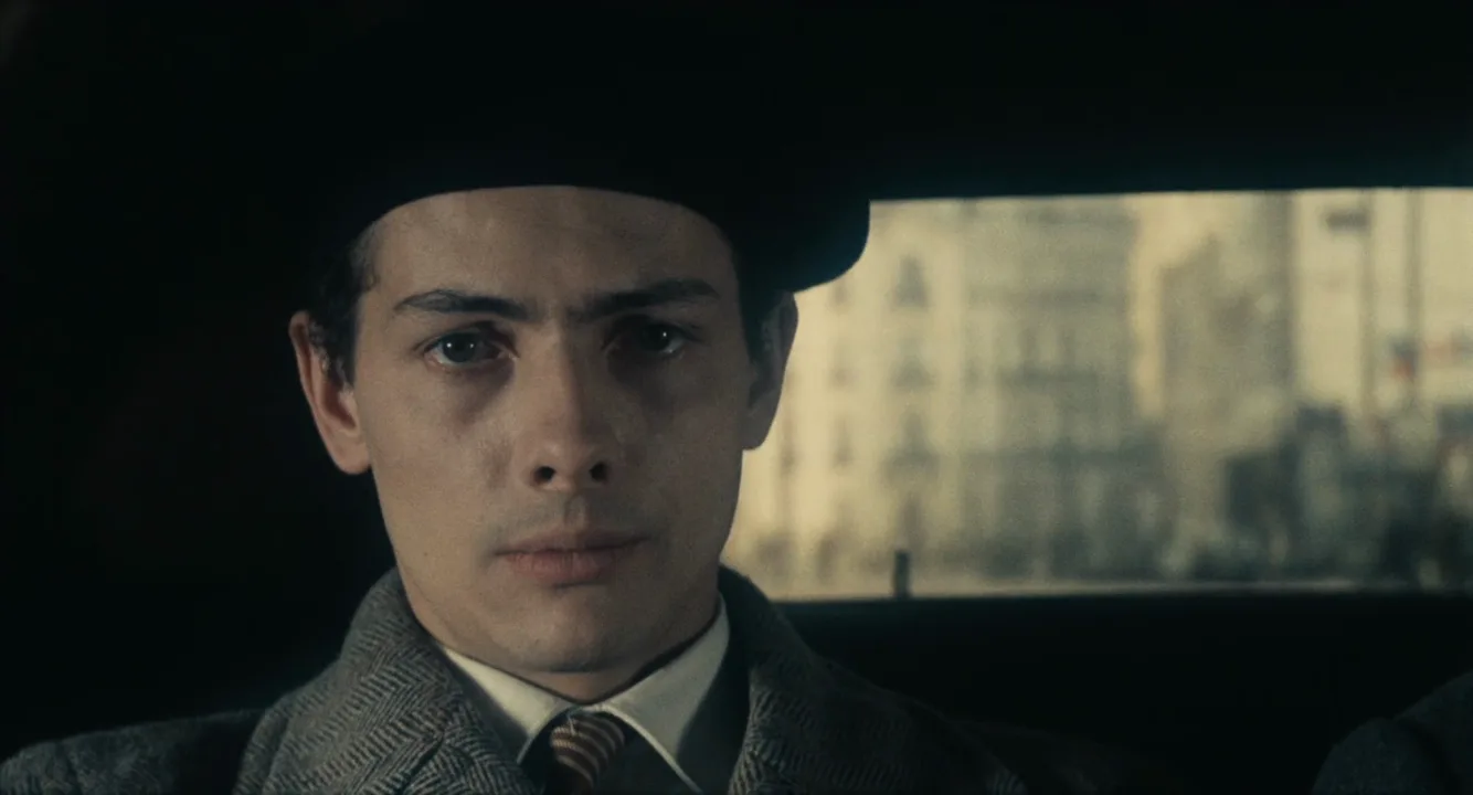
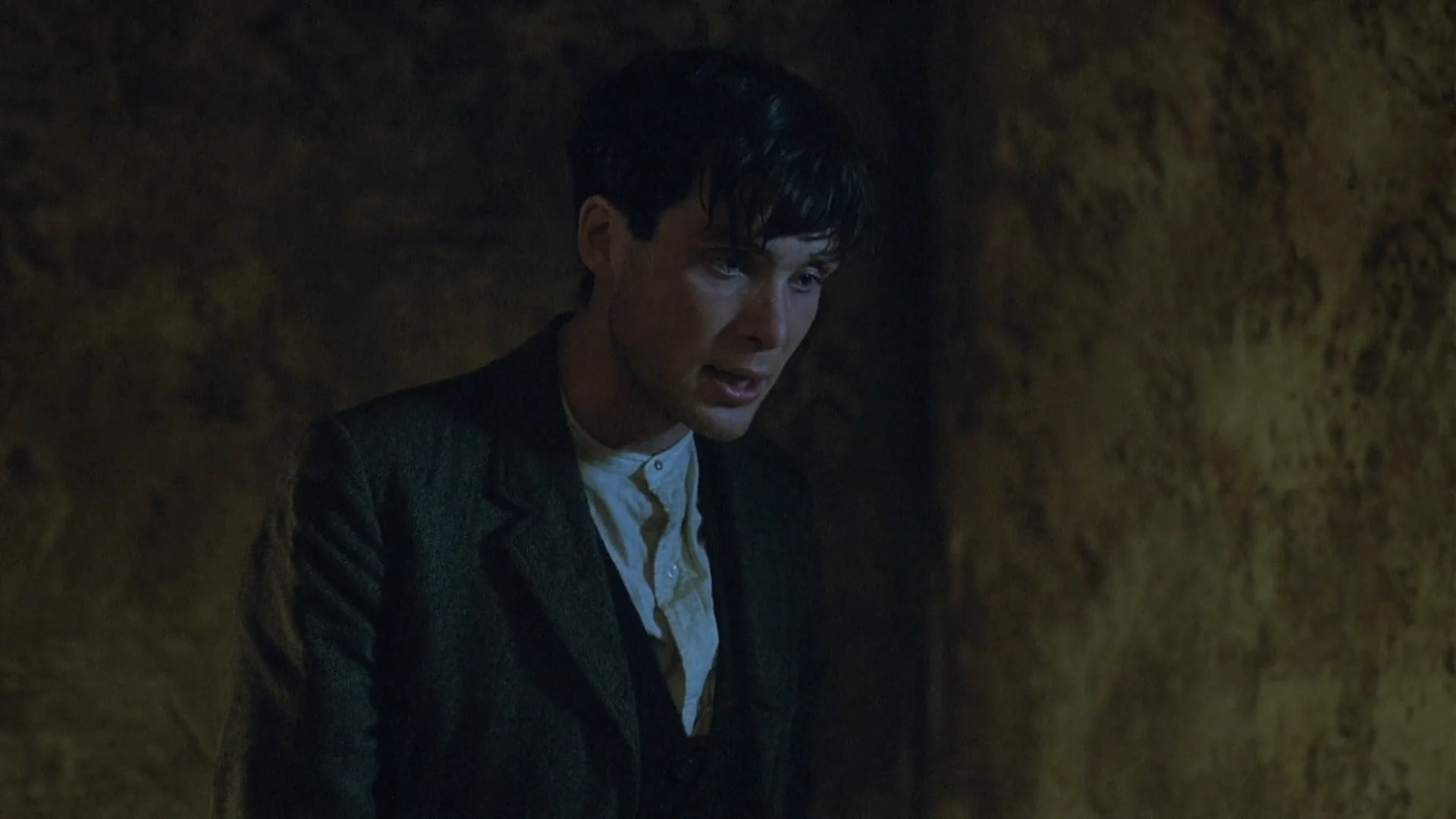
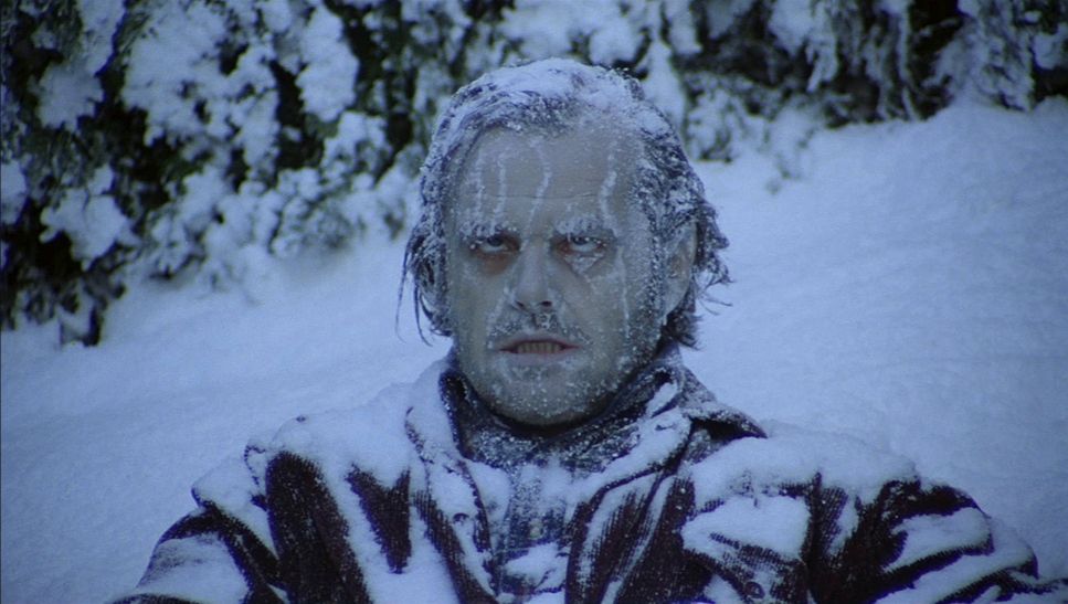
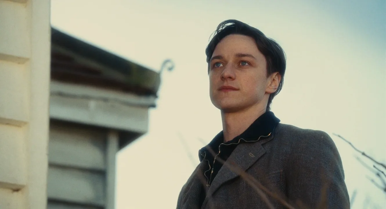
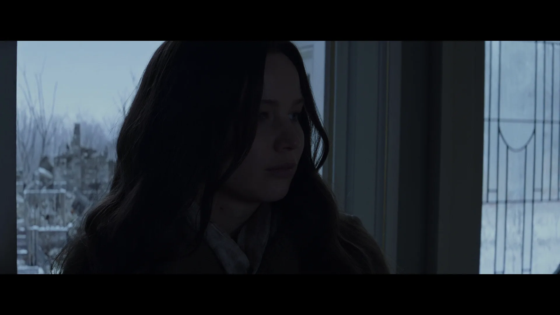
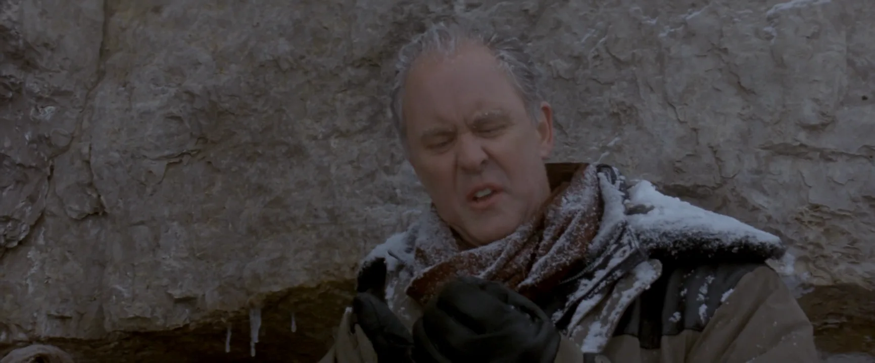
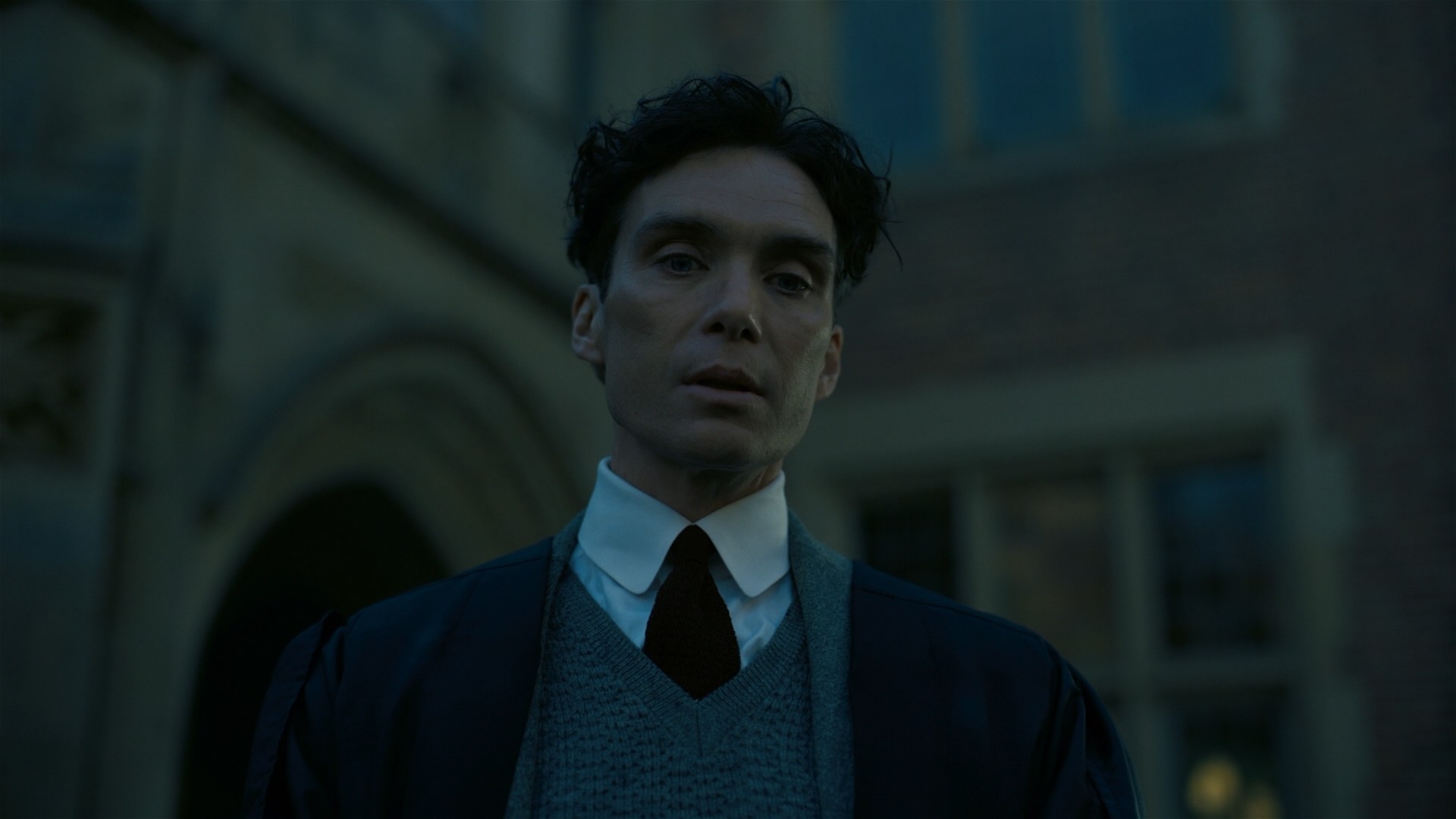
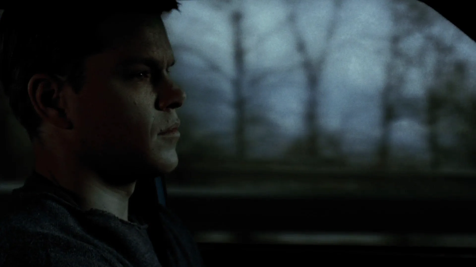
8 framesCompare several colors in each frame — skin, clothes, walls, sky. They all sit close to grey, yet none of these images is black-and-white.
How to create a desaturated look with AI
4 promptsImage models default to vivid color, so a muted look has to be written in as materials, weather and grade words together. In FlashBoards, keep reference frames next to your generations and compare takes side by side. The fourth prompt re-shoots a real film shot from a text description alone, and the original plays next to the result so you can compare.
Cinematic film still, medium shot of a fictional soldier in his thirties with a narrow face, a thin scar across his left eyebrow and close-cropped sandy hair, standing in a muddy trench under heavy overcast sky, faded olive wool uniform, grey sandbags. Muted desaturated color grade, low saturation, bleach bypass look, strong contrast, deep blacks, cold soft daylight, pale natural skin, 35mm lens at eye level, film grain.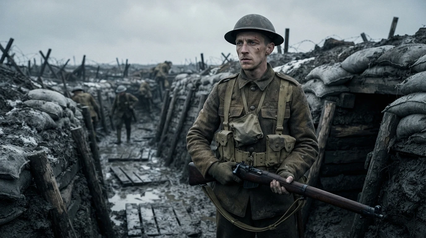
"Muted desaturated color grade, low saturation" sets the intensity; "faded olive wool" and "grey sandbags" give the model muted materials to work with. "Strong contrast, deep blacks" keeps it from going flat, and "bleach bypass look" adds the metallic edge of a war film.
Open FlashBoardsWide anamorphic film frame of a fictional woman in her fifties with silver-streaked black hair tied back and a long charcoal coat, walking alone along an empty coastal road in winter, slate-grey sea, pale dune grass, a weathered white house far away. Washed-out muted palette, desaturated colors close to grey, soft overcast light, faint cold blue in the shadows, subtle film grain, melancholy.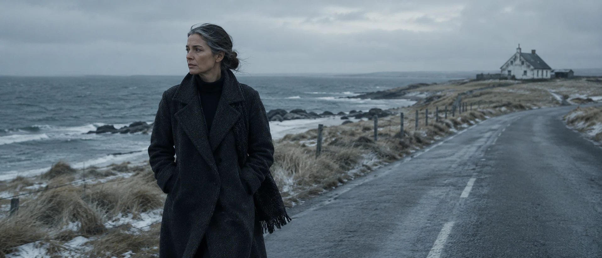
A second take with grief instead of war. "Washed-out muted palette" and "desaturated colors close to grey" do the work, while "faint cold blue in the shadows" keeps a trace of hue so it doesn't turn black-and-white.
Open FlashBoardsCamera: slow handheld push-in toward the soldier's face, starting at medium shot and ending at a medium close-up, slight natural sway. Action: the soldier is already breathing hard and scanning the trench to his left; he wipes wet mud from his cheek with the back of his hand, then lowers his gaze and exhales. Light drizzle falls across the frame the whole time. Colors stay muted and desaturated, grey overcast light, deep blacks.Motion starts immediately (breathing, scanning), so the shot is alive from the first frame. Drizzle is the only added element and fits the existing sky. Restating the palette keeps the clip from warming up.
Open FlashBoards{
"output": "Full-screen live-action shot from The Wind That Shakes the Barley (2006), alive from its very first frame: one continuous shot. Muted desaturated 35mm period realism, Ireland 1920, a bare cell at night, dim soft light from off frame right, olive-brown stained plaster wall, near-black wool and a dirty off-white shirt, pale natural skin, deep murky shadows, low saturation, fine film grain.",
"characters": {
"S1": {
"name": "Damien, played by Cillian Murphy",
"look": "lean young man in his twenties, short tousled black hair falling over the brow, pale face, dark wool jacket and waistcoat over a collarless off-white shirt",
"voice": "quiet, even, Cork accent, controlled anger"
},
"S2": {
"name": "a British officer, never seen, heard from off frame right",
"look": "not visible in this shot",
"voice": "clipped English officer voice, contemptuous"
}
},
"shots": [
{
"shot": 1,
"camera": "handheld with a faint slow drift, slightly high angle, normal lens, medium shot; S1 fills the left-to-centre of the frame, a dark vertical seam in the plaster just right of his shoulder, the empty stained olive wall filling the right third; the framing stays the same to the end",
"action": [
"BEGINNING: alive from the first frame, S1 leans forward with shoulders hunched, head tilted down toward screen right, eyes fixed on someone low and just off frame right, lips closed, listening while the off-screen voice speaks.",
"THEN: his brow tightens and he starts to answer, lips moving, gaze still locked off frame right, hands out of frame.",
"THEN: he keeps talking in a steady low voice, his head dipping slightly lower and further toward screen right with small nods on the stressed words, never looking at the camera.",
"END: still mid-sentence, jaw set, eyes on the man off frame right, body otherwise still."
],
"dialogue": [
{
"speaker": "S2",
"on_screen": false,
"when": "from the first frame, while S1 only listens",
"delivery": "cold, contemptuous, already mid-sentence",
"line": "<d>[English] You're a murdering gangster who shoots men in the back.</d>"
},
{
"speaker": "S1",
"on_screen": true,
"when": "right after the officer finishes, as his brow tightens",
"delivery": "quiet, firm",
"line": "<d>[English] No, you're wrong. I'm a Democrat.</d>"
},
{
"speaker": "S1",
"on_screen": true,
"when": "straight after, head dipping lower",
"delivery": "steady, low, precise",
"line": "<d>[English] In the last election, Sinn Fein won 73 seats out of a possible 105.</d>"
},
{
"speaker": "S1",
"on_screen": true,
"when": "to the end of the shot, still speaking as it ends",
"delivery": "steady, rising conviction",
"line": "<d>[English] Our mandate's for an Irish Republic separate from Great Britain.</d>"
}
]
}
],
"sound": {
"ambience": "the dead hush of a stone cell, faint cloth rustle and breathing",
"speech": "exactly these spoken phrases, each said once, in this order",
"never_spoken": "no narration and no voice-over: the descriptions, performance notes and step words of this prompt are never spoken aloud",
"music": "a film score under the scene, always below the voices: a low sustained cello drone with faint sombre strings",
"subtitles": "none"
}
}Remakes Damien's interrogation shot from The Wind That Shakes the Barley (2006), carrying over the left-of-centre framing, the plaster seam, the olive wall, the gaze off frame right and the exact lines.
The look sits in output: muted materials (olive-brown stained plaster, near-black wool, dirty off-white shirt) plus grade words ("low saturation", "deep murky shadows", "pale natural skin"). Framing, gaze and the corpus dialogue copy the original, so only the drained palette is left to judge.
Common mistakes
- Color creeps back. Uniforms turn bright green, skies blue. Name muted materials ("faded olive", "slate", "charcoal"), not just grade words.
- Foggy instead of muted. "Desaturated" alone often gives a low-contrast haze. Add "strong contrast, deep blacks".
- Accidental black-and-white. Words like "colorless" kill every hue. Keep one faint tint, such as "cold blue in the shadows".
- Grey skin. Add "pale natural skin" so faces don't look corpse-like.
Keep the reference frames, prompts and every generated take side by side — images and video in one canvas.
FAQ
4 questionsWhat does desaturated mean in film?
Desaturated means the colors in the image have been reduced in intensity, moved toward grey, without removing them completely. The frame still has hues — skin tones, green grass, blue sky — but all of them are muted. Filmmakers use it to make a world feel cold, weary, dangerous or historically distant, and it is most common in war films, crime thrillers and bleak dramas.
How do you get a desaturated look in color grading?
Start from a balanced image, lower global saturation to about half and adjust by eye. Keep or raise contrast so blacks stay dense. Isolate skin with a qualifier and return a little saturation so faces stay alive. Check the vectorscope for a compact trace and add grain. Muted wardrobe and sets make the grade far easier.
What movies use a desaturated color palette?
Well-known examples include Saving Private Ryan (1998), Se7en (1995), The Road (2009) and Army of Shadows (1969). War films, post-apocalyptic stories and gritty thrillers use muted color most often, and period dramas rely on it to make the past feel remembered.
Is a washed-out look the same as a desaturated look?
They overlap. Washed-out usually describes an image with lowered saturation and lifted blacks, so it looks faded, like an old print or a sunlit photo. A desaturated look only requires lower saturation; it can keep deep blacks and strong contrast. Washed-out is one variant of muted color, softer and more nostalgic, while bleach bypass is the harsh variant.
Related terms
4- Monochromatic Color SchemeColor
A monochromatic scheme builds the image from a single hue in different shades and tints — an all-red room, an all-green world — so meaning comes from lightness and texture rather than color contrast.
- Color SaturationColor
Saturation is how pure a color is — how far it sits from neutral grey; raising or draining it lets filmmakers build a vivid, heightened world or a muted, weary one.
- Selective ColorColor
Selective color keeps one hue — or one object — in color while the rest of the frame is black-and-white or heavily desaturated, turning that object into the story's focal sign.
- Cool Color PaletteColor
A cool palette is dominated by blues, cyans and cold greens; it tends to read as distance, calm, loneliness, night or clinical control.
Further reading
Steven Ascher and Edward Pincus, The Filmmaker's Handbook; Alexis Van Hurkman, Color Correction Handbook; American Cinematographer coverage of Saving Private Ryan (1998).