 FlashBoards Learn
Color · Film language
Color Theory
Also called: color in film, film color, color psychology in film
Color theory in film is the working knowledge of how hue, saturation and brightness interact, and how filmmakers use palettes, contrasts and color changes to guide the eye and shape emotion. It turns color from decoration into a tool: it tells the viewer where to look, what to feel and when something has changed.
- What it does
- Organizes hue, saturation and value so every color in the frame either supports the subject or pulls the eye to it.
- Use it when
- You design a film's look, separate a character from a set, or want a color shift to mark a turn in the story.
- Watch out
- Color only reads against value: two hues with the same brightness merge, and too many saturated colors cancel each other out.
- Try this prompt
night laundromat in desaturated teal-green, one woman in a saturated red coat as the only warm color in frame, 35mm, eye level
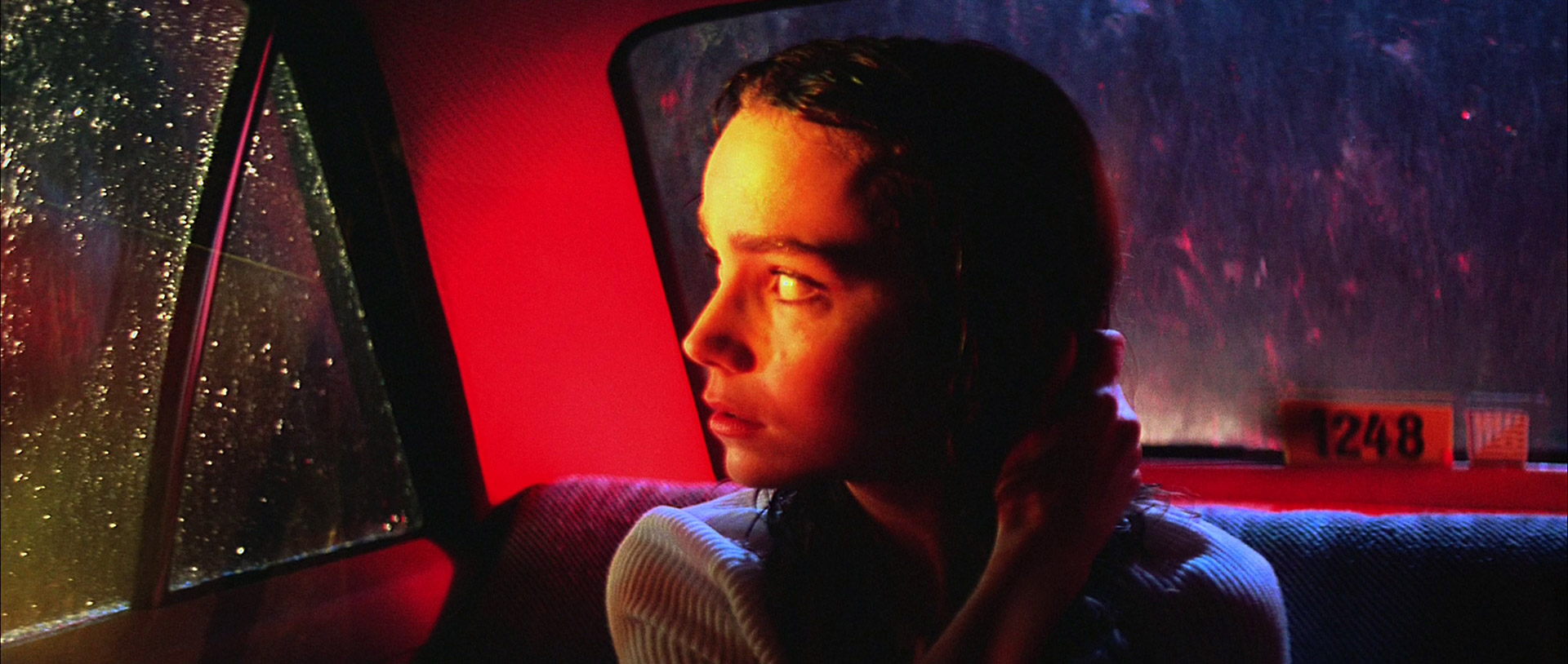
What is color theory in film?
Color theory is a set of practical rules about how colors look next to each other and what they do to a viewer. Painters built it; cinematographers, production designers and colorists use it every day. In film color it answers three questions: which colors go in the frame, how strong each one is, and how bright each one is.
Every color can be described by three properties:
- Hue: the color family, such as red, green or blue.
- Saturation (chroma): how pure or how gray the color is. See color saturation.
- Value: how light or dark it is.
The color wheel arranges hues in a circle so their relationships become visible. Filmmakers lean on a handful of classic schemes:
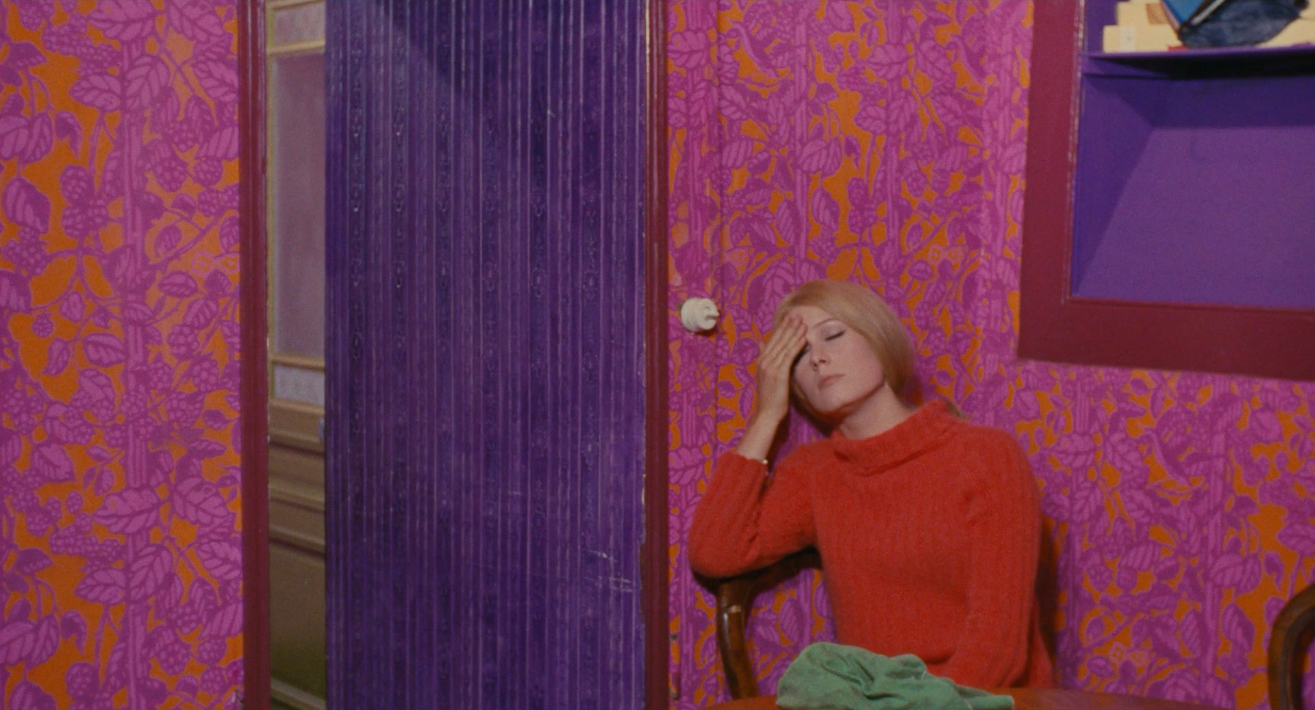
- Complementary: two hues opposite each other, like red and green or orange and blue. Maximum tension. See complementary colors.
- Analogous: three or four neighbors, like yellow, orange and red. Calm and unified.
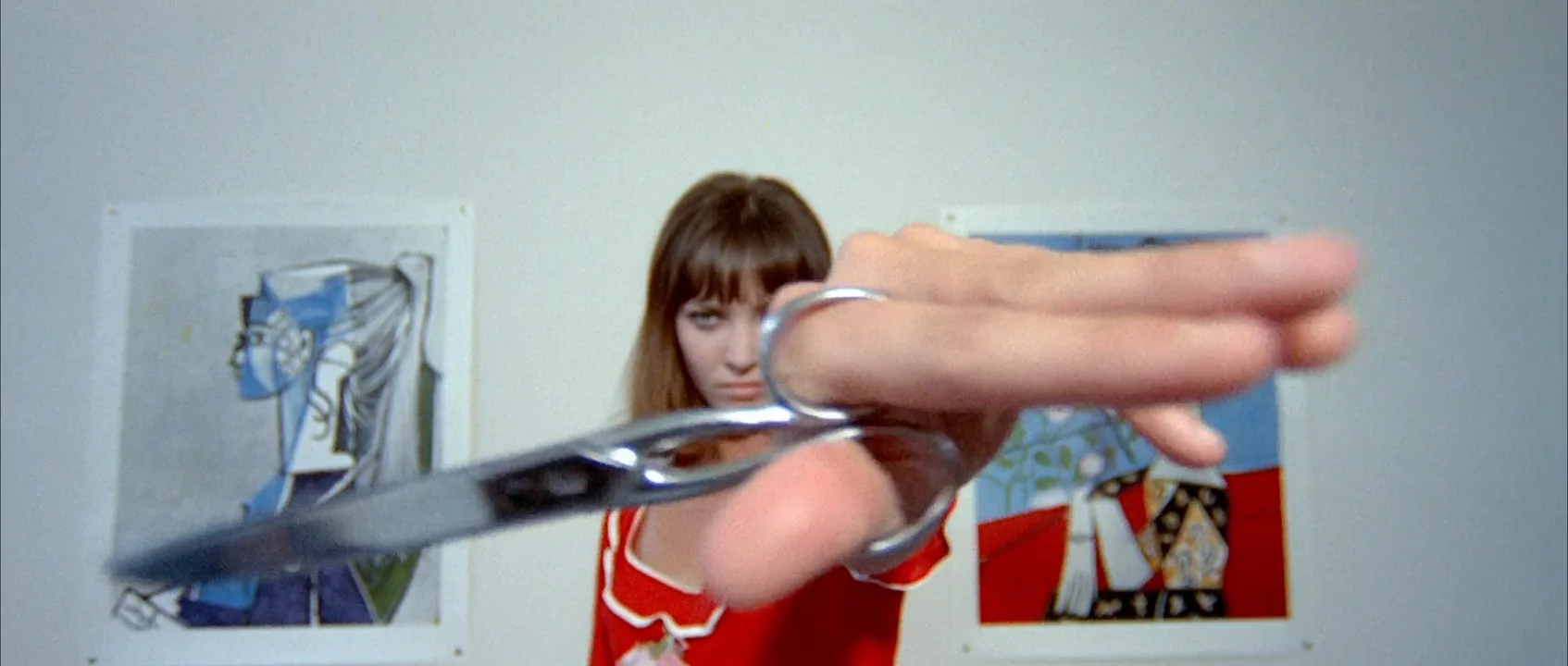
- Triadic: three hues evenly spaced, like the red, yellow and blue of a Godard film. Bold and graphic.
- Split-complementary: one hue plus the two neighbors of its opposite. Contrast with less strain.
- Monochromatic: one hue in many values and saturations. See monochromatic color scheme.
These schemes are not a law. They are a starting vocabulary that helps a crew agree on what the film should look like before anyone paints a wall or hangs a gel.
Hue: the color family
Hue is the name we give a color: red, yellow, green, blue, purple. It is independent of how bright or how saturated the color is. A pale pink and a deep crimson share the same red hue; they differ in value and saturation.
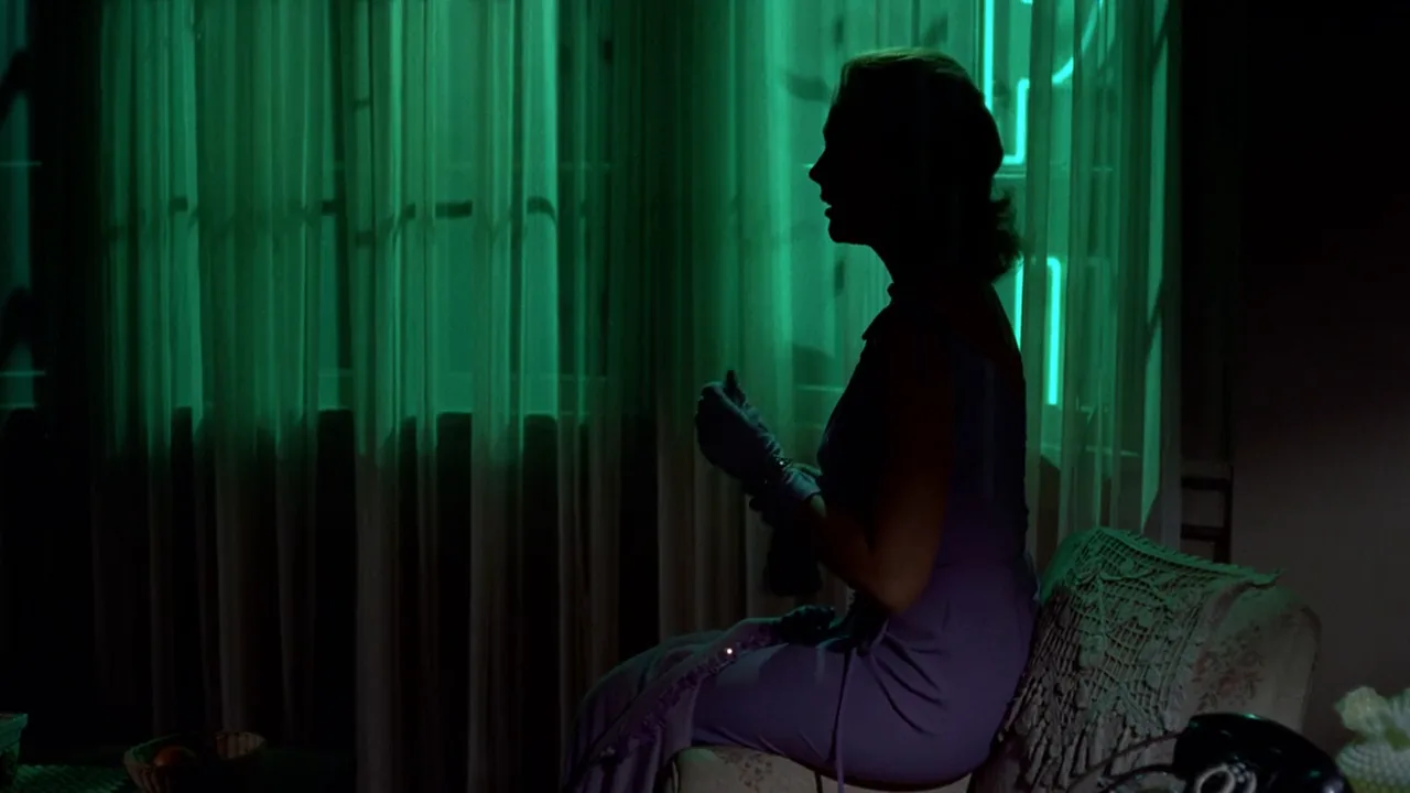
In practice, hue is the first thing an audience registers and the thing it remembers. Vertigo (1958) floods Judy's hotel room with green from the neon sign outside, and that green becomes a signal the film returns to. The Matrix (1999) tints the simulated world green and the real world blue, so the hue alone tells you which reality you are in. Hero (2002) goes further and gives each retelling of its story its own dominant hue.
Hue is also where temperature starts. Reds, oranges and yellows read as warm; blues, cyans and blue-greens read as cool. That split is the basis of every warm color palette and cool color palette, and it is closely tied to the physical color temperature of the light sources on set.
Value and luminance: why a color needs light and dark
Value is how light or dark a color is. Luminance is its measured brightness in the video signal. The two matter more than hue, because the eye reads shapes by light and dark first and by color second.
Fully saturated hues do not have the same brightness. In the Rec. 709 formula for luma, green carries about 72% of the brightness, red about 21% and blue only 7%. That is why a pure yellow jumps out while a pure blue sinks into shadow, and why a red dress against a green wall of the same value can turn into one flat gray shape.
The test is simple: desaturate the frame. If the subject disappears in black and white, the separation came only from hue, and it will be fragile on a phone screen, in a dim cinema or for the roughly one in twelve men with red-green color blindness. Memento (2000) runs one of its two timelines in black and white, a reminder that a frame built on strong values still reads without any color at all.
On set, check value with a monochrome monitor view or a false-color overlay. Put the brightest value where you want the eye, keep backgrounds a step or two darker or lighter than faces, and let hue do the emotional work on top.
Color contrast: how color directs the eye
Color contrast separates areas of the frame by differences in hue, saturation, temperature or lightness. The eye goes to whatever breaks from its surroundings, so contrast is the most direct way color directs the viewer's eye.
The Bauhaus teacher Johannes Itten listed seven kinds of color contrast. Five do most of the work in film:
- Light-dark: a bright face against a dark set; the strongest and most reliable contrast.
- Warm-cool: an amber practical against blue night; it also adds depth, because warm tones seem to advance and cool tones recede.
- Complementary: opposite hues side by side intensify each other; teal and orange is the familiar film version.
- Saturation: one pure color in a gray or muted world, like the red coat in Schindler's List (1993). See selective color.
- Extension: proportion. A small area of a strong color can balance a large area of a weak one; a single red object in a mostly teal frame holds its own.
The other two, contrast of hue and simultaneous contrast, explain side effects: a neutral gray looks slightly warm next to blue and slightly cool next to orange. Colorists fight this when a skin tone shifts as the background changes.
The rule of thumb for directing attention: keep the background low in saturation and close in hue, and let the subject be the one element that is different.
How does color affect mood in film?
Color works on the viewer before they notice it. Warm, saturated palettes feel close, sensual or dangerous; cool, desaturated ones feel distant, clinical or lonely. High saturation with bright values feels playful; low saturation with dark values feels heavy.
Filmmakers use this in three ways:
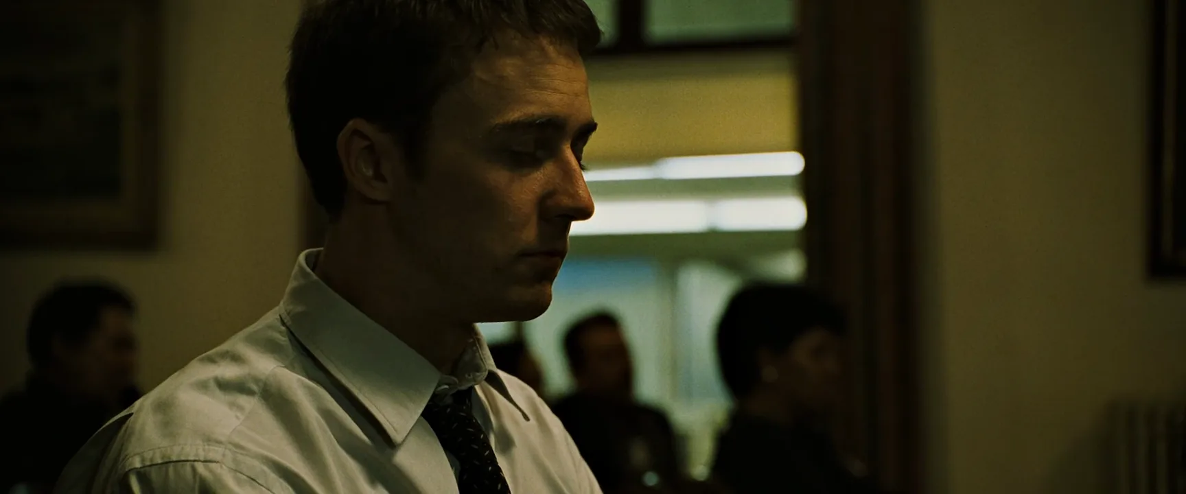
- Tone for the whole film. Amélie (2001) pushes saturated greens and reds into a storybook world. Fight Club (1999) sinks into sickly green-yellow office light and grimy skin. The color palette sets the emotional temperature before a line is spoken.
- Color as a map. Traffic (2000) separates its storylines by grade, and The Matrix separates its worlds by tint. The viewer always knows where they are.
- Color change as story. The Wizard of Oz (1939) moves from sepia Kansas to Technicolor Oz. A palette that slowly drains or warms can carry a character's arc without dialogue.
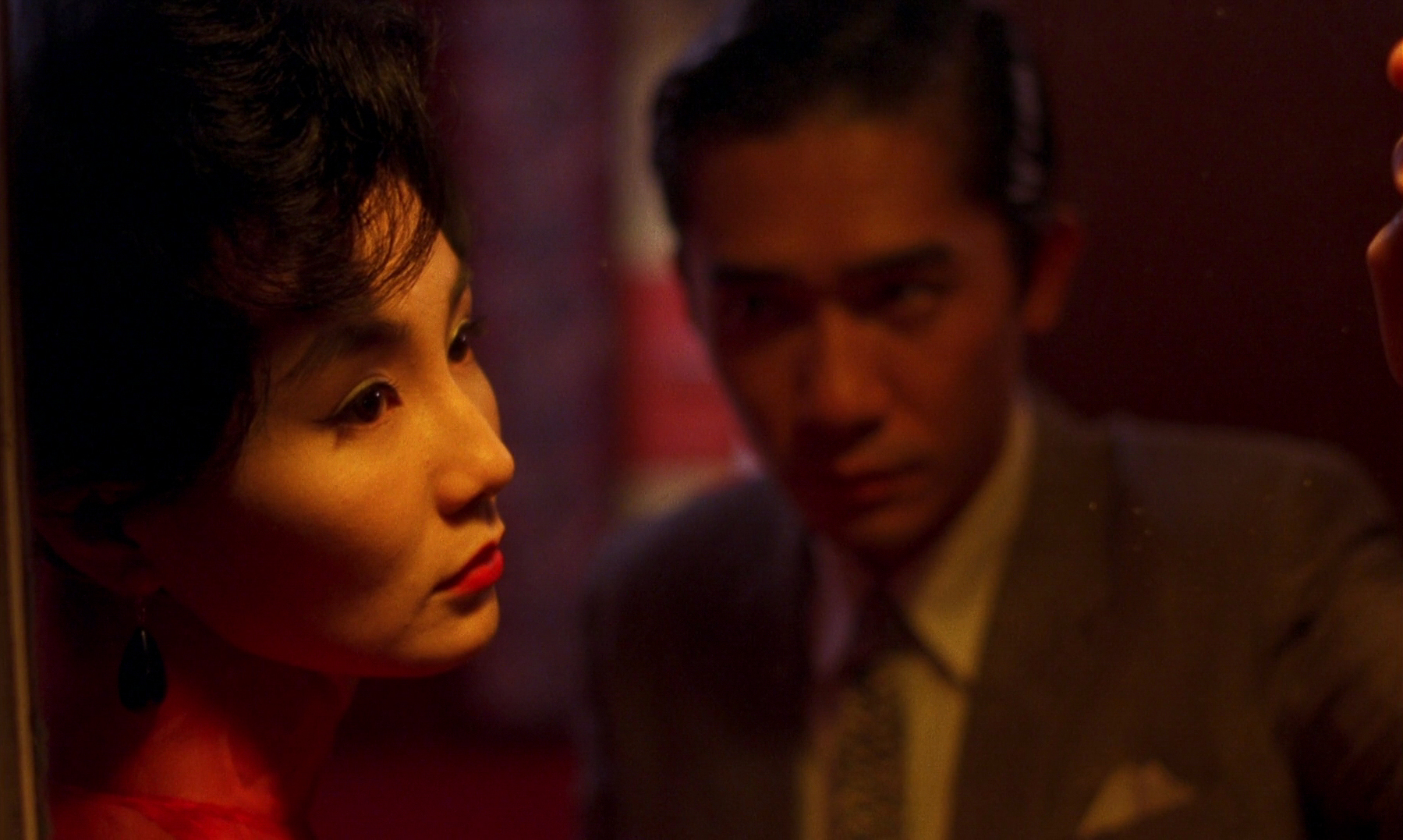
Meaning is set by context. Red can be love in In the Mood for Love (2000) and alarm in a submarine thriller. A film teaches its own code through repetition; see color symbolism for how that code is built and why universal color charts mislead.
How to apply color theory on set
Color is designed in three places, and a good look is agreed in all of them before shooting.
1. Production design and costume. Most of the color in a frame is on surfaces. Pick a dominant hue for sets, a secondary hue, and one accent reserved for the character or object that matters. A common proportion is roughly 60% dominant, 30% secondary, 10% accent. Hand the art department and the costume designer the same swatch board.
2. Light. White balance decides which light counts as neutral; everything else is pushed from there. At a 3200K base, 5600K daylight in the window goes blue; at 5600K, tungsten practicals go amber. Saturated color comes from lighting gels or RGB LED fixtures. Keep saturated light off the key side of faces unless the scene calls for it; put it on the background, the rim or the shadow side, where it shapes mood without making skin look sick. See colored lighting.
3. Grade. The colorist refines what was captured: separating skin from the background, pulling saturation out of distracting areas, shifting shadows and highlights toward opposite temperatures. A vectorscope shows where every hue sits and whether skin stays near its natural line. The grade can enhance a palette; it cannot invent one that the set and light never had.
Practical checks: shoot a test with the actual costumes against the actual walls, view it in monochrome to check value, and look at it on a phone as well as a calibrated monitor.
Color theory vs. color palette
Color theory is the grammar; a color palette is one sentence written with it. Color theory is general knowledge: how hues relate on the wheel, why value separates shapes, which contrasts pull the eye. A palette is a specific decision for one film or scene: these five colors, in these proportions, and nothing else.
You use color theory to build and test a palette. If the palette is complementary teal and orange, theory tells you to keep skin in the orange zone and let shadows go teal. If the palette is monochromatic blue, theory tells you to separate the subject with value and saturation, since hue can no longer do it. When a scene looks muddy, theory explains why: too many hues at the same value and the same saturation.
Color Theory examples in film
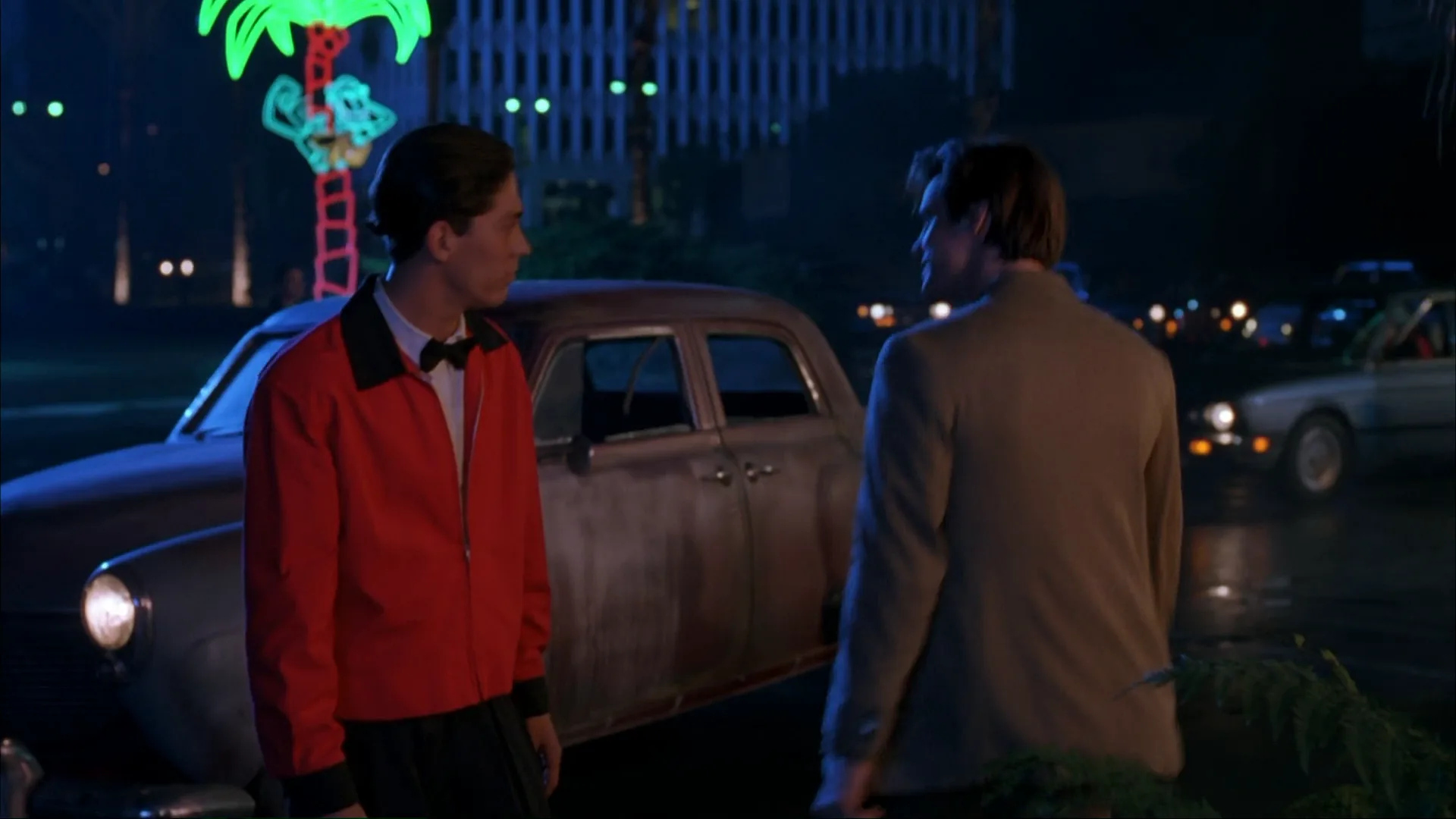
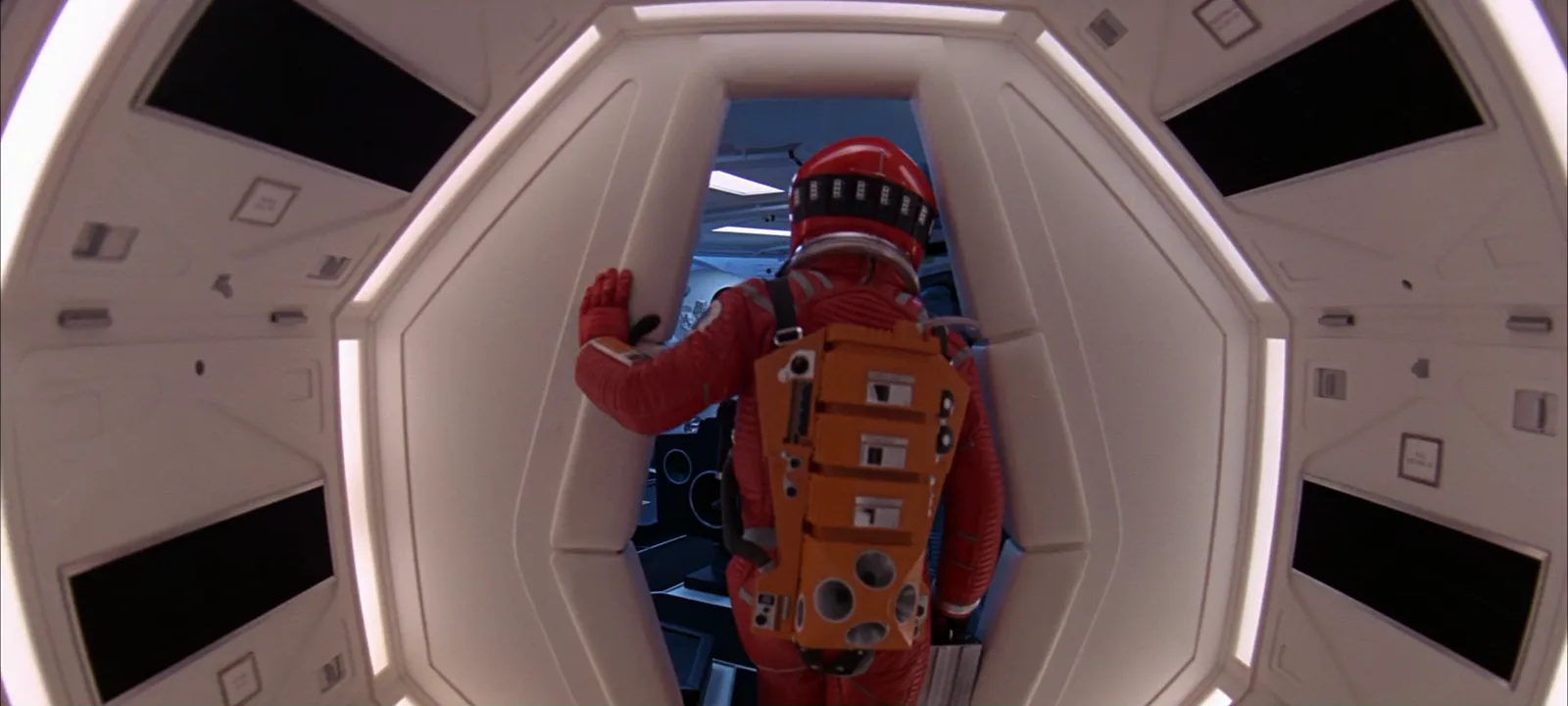
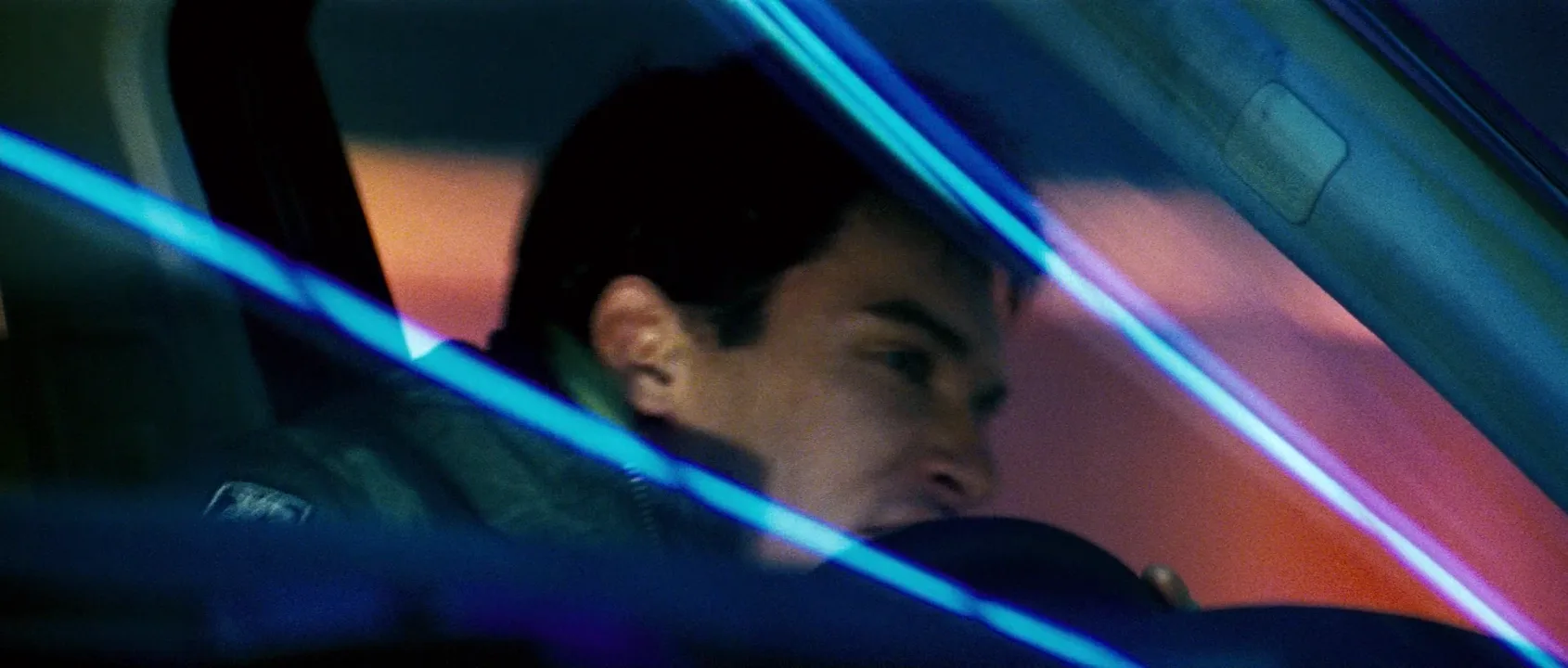
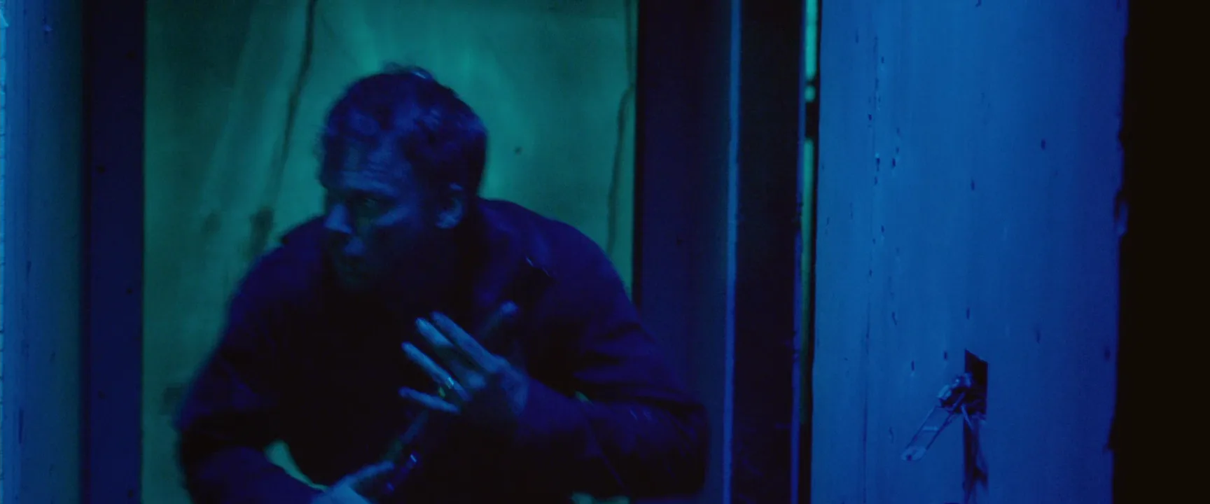
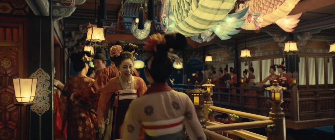
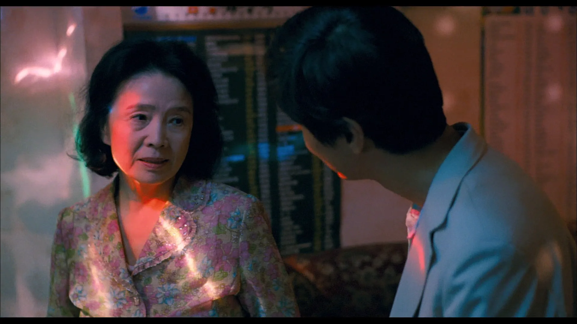
14 framesFor each frame, find the dominant hue, the accent and where the brightest value sits. Then notice which of the three leads your eye first.

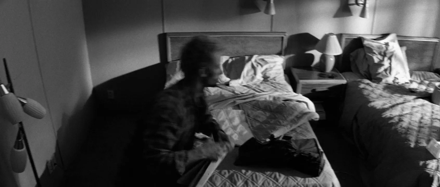
How to create a color theory with AI
4 promptsImage and video models mix colors freely unless you set the rules: name the dominant hue, the single accent and what carries each one, and state the saturation of the background. Build a palette board of film references in FlashBoards, generate next to it, and compare takes side by side to see which one kept the accent clean. The fourth prompt re-shoots a real film shot from a text description alone, and the original plays next to the result so you can compare.
Cinematic medium wide shot inside a narrow laundromat at night. A woman in her early forties with a short copper-red undercut, pale freckled skin and a small silver nose ring stands between two rows of washing machines, wearing a saturated crimson wool coat. Walls, machines and tiled floor are desaturated teal-green under cool overhead fluorescent tubes. Her red coat is the only warm, saturated color in the frame. Symmetrical composition, rows of machines leading to her, 35mm lens at eye level, soft film grain.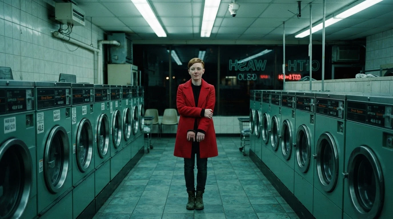
"Desaturated teal-green" sets the dominant hue and its low saturation; "the only warm, saturated color in the frame" protects the accent. Naming every surface that carries the teal keeps the model from sprinkling extra colors into the set.
Open FlashBoardsWidescreen interior of a wooden boathouse at sunset. A man in his seventies with a long white braided beard, deep sun wrinkles, a chipped front tooth and a knitted mustard cap mends a rust-orange fishing net on his knees. Strictly analogous warm palette: amber sunlight, ochre oilskin jacket, rust nets, burnt-orange ropes, dark brown timber. Low sun through the open door puts the brightest value on his face and hands; the rest of the shed falls into deep warm-brown shadow. 50mm lens at seated eye height, calm and still.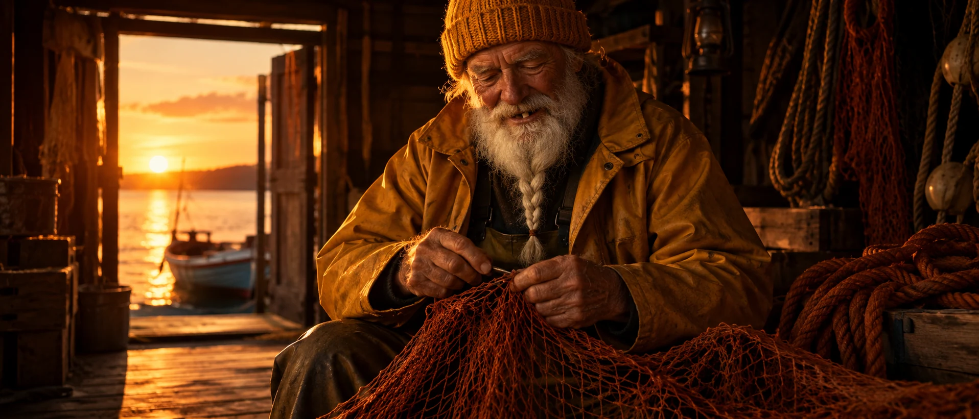
This take swaps contrast of hue for harmony: "strictly analogous warm palette" plus a named object for each hue keeps everything between yellow and red. Separation comes from value, stated as where the brightest light lands.
Open FlashBoardsCamera: slow, steady dolly-in at eye level along the aisle, from medium wide to medium shot, moving from the first frame to the end. Action: The drums of the washing machines are already spinning on both sides. The woman in the crimson coat walks slowly toward the camera down the aisle, her coat swaying. Halfway, one fluorescent tube above her flickers and steadies. She stops in the center of the frame and looks straight into the lens, the red coat bright against the teal-green machines.Spinning drums and her walk start on frame one, so the shot is alive at once. The push-in makes the red accent grow in the frame, and the last line restates the color contrast so it holds through the clip.
Open FlashBoards{
"output": "Full-screen live-action shot from 2001: A Space Odyssey (1968), from its very first frame: one single continuous shot. Late-1960s 70mm film look, fine grain, crisp and clean. A long spaceship corridor built from repeating octagonal white rings with black gaps between them, the walls covered in small square gray panels. Soft even white light glows from inside the rings, almost shadowless. The whole set is near-colorless white, pale gray and black; the astronaut's red suit and orange backpack are the only saturated colors in the frame.",
"characters": {
"S1": {
"name": "Dr. David Bowman, played by Keir Dullea",
"look": "seen only from behind, fully covered: saturated vermilion-red one-piece space suit, red gloves, rounded red helmet with a dark band of slots at the back, a boxy orange backpack with rows of small square modules and round holes",
"voice": "silence: he does not speak"
}
},
"shots": [
{
"shot": 1,
"camera": "wide-angle lens, chest height, centered one-point perspective straight down the corridor; the camera dollies in behind S1 at walking pace and slowly gains on him, from a full-body wide shot at the start to a medium shot of his back and backpack at the end",
"voice": "silence: nobody speaks in this shot, no voice at all",
"action": [
"BEGINNING: alive from the first frame, S1 is already walking away from camera down the middle of the white corridor, small in the center of the frame; his left arm (screen left) is raised high, the gloved left hand sliding along the white rings of the ceiling, his right arm hangs down holding a small silver metal case at his right hip.",
"THEN: he keeps a slow, careful, even pace, head facing straight ahead down the corridor, the left hand hopping from ring to ring overhead while the octagonal rings slide past the lens on all sides and the red suit stays locked in the center of the frame.",
"THEN: the camera closes in, the orange backpack grows large and sharp in the middle of the frame, his raised left hand now pressing flat on the wall at screen left.",
"END: a narrower octagonal white hatch surrounds him at the end of the corridor, a darker room with blue-gray machinery visible through it; the camera is close behind him, his left hand still on the wall at screen left, the silver case still in his right hand, the red suit and orange pack filling the center of the white frame."
],
"dialogue": []
}
],
"sound": {
"ambience": "steady low hum of ship ventilation, soft muffled footsteps on a hard floor, slow calm breathing inside a helmet",
"speech": "no words in this video; the only human sounds are breaths and movement",
"never_spoken": "no narration and no voice-over: the descriptions, performance notes and step words of this prompt are never spoken aloud",
"music": "a film score under the scene, always below the voices: a cold, sparse low string drone with a faint high sustained tone",
"subtitles": "none"
}
}Remakes Bowman's corridor walk from 2001: A Space Odyssey (1968), dir. Stanley Kubrick, DP Geoffrey Unsworth, keeping the forward dolly, the white ring corridor, the raised hand and the lone saturated red suit.
The set is written as near-colorless white, gray and black and the suit as the only saturated color, so contrast of saturation is stated outright instead of left to chance. A forward dolly that keeps the red figure centered lets the accent grow in the frame while the white corridor stays neutral.
Open FlashBoardsCommon mistakes
- Color soup. Ask for "cinematic colors" and you get every hue at once. Name one dominant hue, one accent and the objects that carry them.
- Accent leaks. The red of the coat shows up on signs, lips and props. Assign the accent to one object and describe the rest of the set in the dominant hue.
- Everything saturated. Models push saturation everywhere. Say "desaturated" or "muted" for the background and "saturated" only for the subject.
- Flat value. A colorful image with no light-dark structure looks muddy. State where the brightest value falls and which areas go dark.
- Palette drift in video. Over several seconds the grade can slide warmer or cooler. Keep both colors in frame and repeat the contrast in the last action sentence.
Keep the reference frames, prompts and every generated take side by side — images and video in one canvas.
FAQ
5 questionsWhat is color theory in film?
Color theory in film is the practical knowledge of how hue, saturation and value interact on screen. Filmmakers use it to choose palettes, build contrasts that pull the eye to the subject, and change color over the story to mark a shift in mood or meaning. It guides production design, costume, lighting and the final grade, so every color in the frame is a decision rather than an accident.
How does color affect mood in film?
Warm, saturated colors tend to feel close, passionate or dangerous; cool, desaturated colors feel distant, calm or lonely. Brightness matters too: light, saturated palettes feel playful, dark and muted ones feel heavy. The exact meaning depends on context, since a film teaches its own color code through repetition. Red can mean love in one film and alarm in another.
What are the main color schemes used in film?
The most common are complementary (opposite hues such as teal and orange), analogous (neighboring hues such as yellow, orange and red), triadic (three evenly spaced hues), split-complementary (one hue plus the two neighbors of its opposite) and monochromatic (one hue in many shades). Complementary schemes create tension and separation; analogous and monochromatic schemes feel unified and calm.
What is the difference between hue, saturation and value?
Hue is the color family: red, green, blue. Saturation is how pure or grayish that color is. Value is how light or dark it is. Two colors can share a hue and differ in the other two, like pink and crimson. For cinematographers value matters most, because the eye reads shapes by light and dark before color, and colors of equal value merge in black and white.
Is teal and orange an example of color theory?
Yes. Teal and orange is a complementary pairing: skin tones sit in the orange range, so pushing shadows and backgrounds toward teal, their opposite on the color wheel, makes faces stand out. It is effective and widely used in action films, but used everywhere it flattens a film's identity. It works best when the palette and story actually call for warm-cool separation.
Related terms
5- Color PaletteColor
A film's color palette is the limited set of colors that dominates its images — in sets, costumes, light and grade — chosen to give the film a coherent look and emotional temperature.
- Complementary ColorsColor
Complementary colors sit opposite each other on the color wheel — red/green, blue/orange, purple/yellow — and together create maximum color contrast; teal-and-orange is the best-known film version, setting warm skin against cool shadows.
- Color SymbolismColor
Color symbolism uses colors as signs — red for love, danger or power, green for envy or sickness — but in film the meaning is set by context and repetition inside the story, not by a universal chart.
- Color TemperatureLighting
Color temperature describes how warm or cool a light source is, measured in kelvin: candlelight around 1900K, tungsten about 3200K, daylight about 5600K, overcast and shade higher still.
- CinematographyCameras & Capture
Cinematography is the art of creating the moving image: the choices of camera, lens, framing, movement, light and exposure through which the director of photography turns a script into pictures.
Further reading
Josef Albers, Interaction of Color (Yale University Press, 1963). Johannes Itten, The Art of Color (1961). Patti Bellantoni, If It's Purple, Someone's Gonna Die: The Power of Color in Visual Storytelling (Focal Press, 2005).