 FlashBoards Learn
Color · Film language
Monochromatic Color Scheme
Also called: monochrome, monochromatic palette, single-hue look
A monochromatic color scheme builds the whole frame from one hue in different shades and tints, like a room lit entirely blue or a world tinted green. With color contrast gone, the eye reads the image through lightness, texture and shape, and the hue sets the mood at once.
- What it does
- Replaces color contrast with one hue, so mood arrives instantly and the image is read through light, shadow and texture.
- Use it when
- A scene needs a strong, single emotional temperature: a dream, a memory, a threat, a closed-off world.
- Watch out
- Without a range from near-black to bright highlight, a one-hue frame goes flat and muddy.
- Try this prompt
monochromatic blue color scheme, night kitchen, every object a different shade of blue from navy to ice, single moonlight key, 35mm
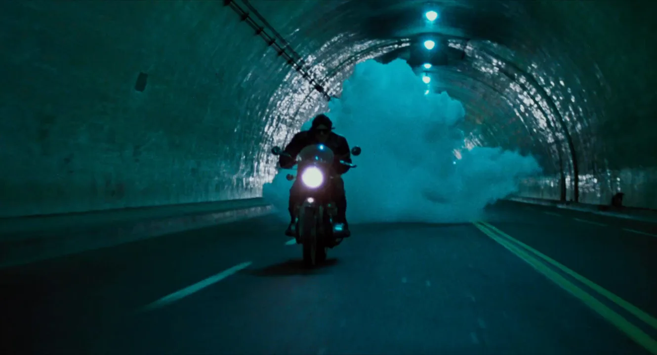
What is a monochromatic color scheme?
A monochromatic scheme uses a single hue and varies only its lightness and saturation: navy, cobalt, sky and ice are all one blue. It is the narrowest possible color palette, the opposite of a complementary scheme that sets two hues against each other, and one of the core looks in the color toolkit.
On screen, the look comes from three places, usually combined:
- Set and wardrobe. Walls, props and costumes from one color family. Ingmar Bergman's Cries and Whispers (1972) dresses its rooms in deep red and fades between scenes to red.
- Light. A saturated gel or single-color practical washes everything.
- Grade. A tint across the whole image. The Matrix (1999) gives its simulated world a green cast.
The test: if one color word describes the frame, it is monochromatic.
Why do filmmakers use a monochrome palette?
One hue removes choice from the viewer's eye. Attention goes to shapes, silhouettes and whatever is brightest.
- Instant mood. Blue reads as night, cold or grief; red as heat and danger; green as sickness or the artificial. This is where the look overlaps with color symbolism.
- A separate world. A tint marks a dream, a flashback or another storyline. The orange haze of Las Vegas in Blade Runner 2049 (2017) makes a city feel dead and airless.
- Abstraction. With color stripped down, the frame turns graphic.
- Unity. When skin, walls and sky share one hue, characters look absorbed by, or trapped in, their surroundings.
A whole film in one hue gets numbing, so most films hold the look for a sequence and then release it.
How to create a monochromatic look
- Pick the hue and range. Pure cyan only, or cyan into teal. A narrower range reads more stylized.
- Control the art department. Paint, props and wardrobe in that family. Anything off-hue pulls the eye.
- Light in the hue. Gel every source the same color or lock RGB fixtures to one hue. Colored lighting colors skin more convincingly than a grade.
- Build lightness contrast. Widen the tonal range: deep shadows, clear midtones on faces, one hot highlight. A key-to-fill ratio of about 4:1 or harder keeps faces off the background.
- Finish in the grade. Rotate stray hues toward the target and pull saturation out of anything outside it.
Decide early about skin. Keeping faces natural against a one-hue world is a different device, closer to selective color.
Is black and white a monochromatic color scheme?
Technically yes: black-and-white is monochrome with no hue, only a scale of grays. Filmmakers still treat it separately. Black-and-white removes color; a monochromatic color scheme keeps one hue and uses it emotionally.
Between them sit the tinted forms. Sepia tone is a warm brown monochrome that reads as memory, and silent-era film tinting dyed whole scenes blue for night or amber for lamplight.
Monochromatic vs. desaturated look
A desaturated look lowers the intensity of all colors while keeping them different: a gray-green coat, a dull red car and pale skin share one muted frame. A monochromatic scheme limits the number of hues to one, and that hue can be fully saturated, like a neon magenta room.
Quick check: raise saturation. A desaturated image regains several colors; a monochromatic one just intensifies its hue.
Monochromatic Color Scheme examples in film
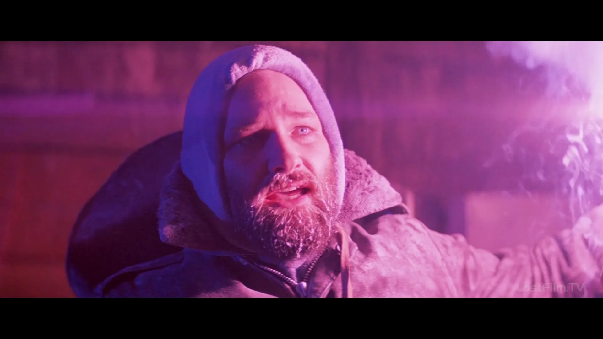
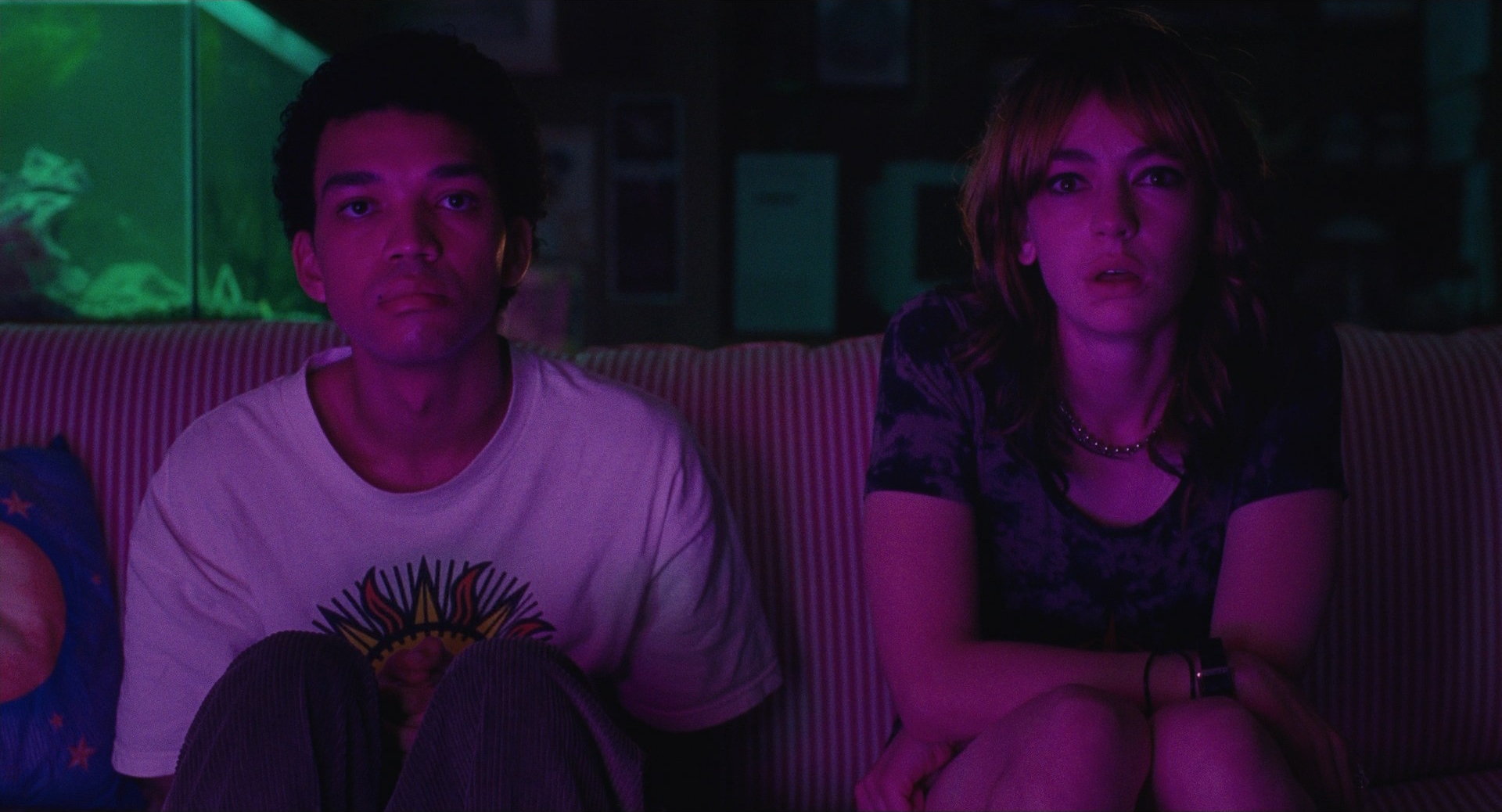
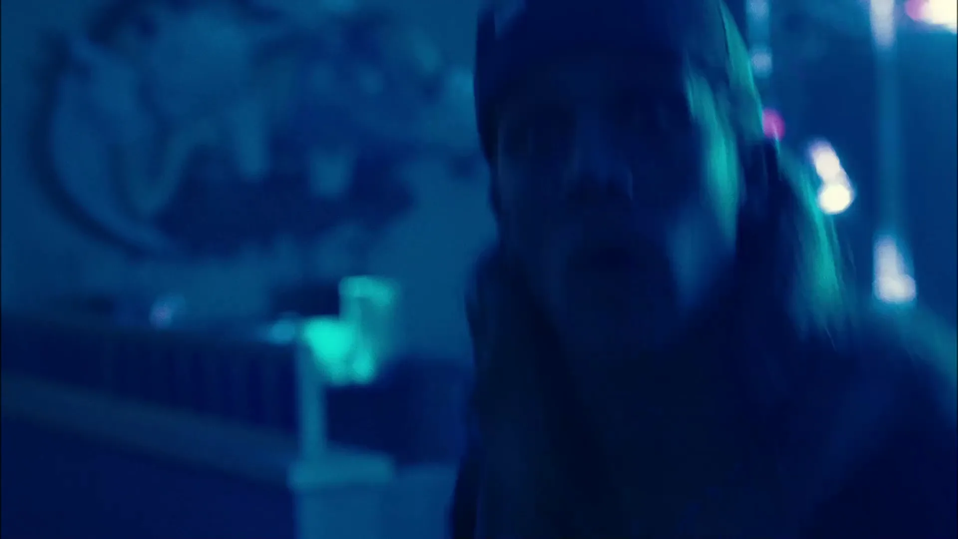
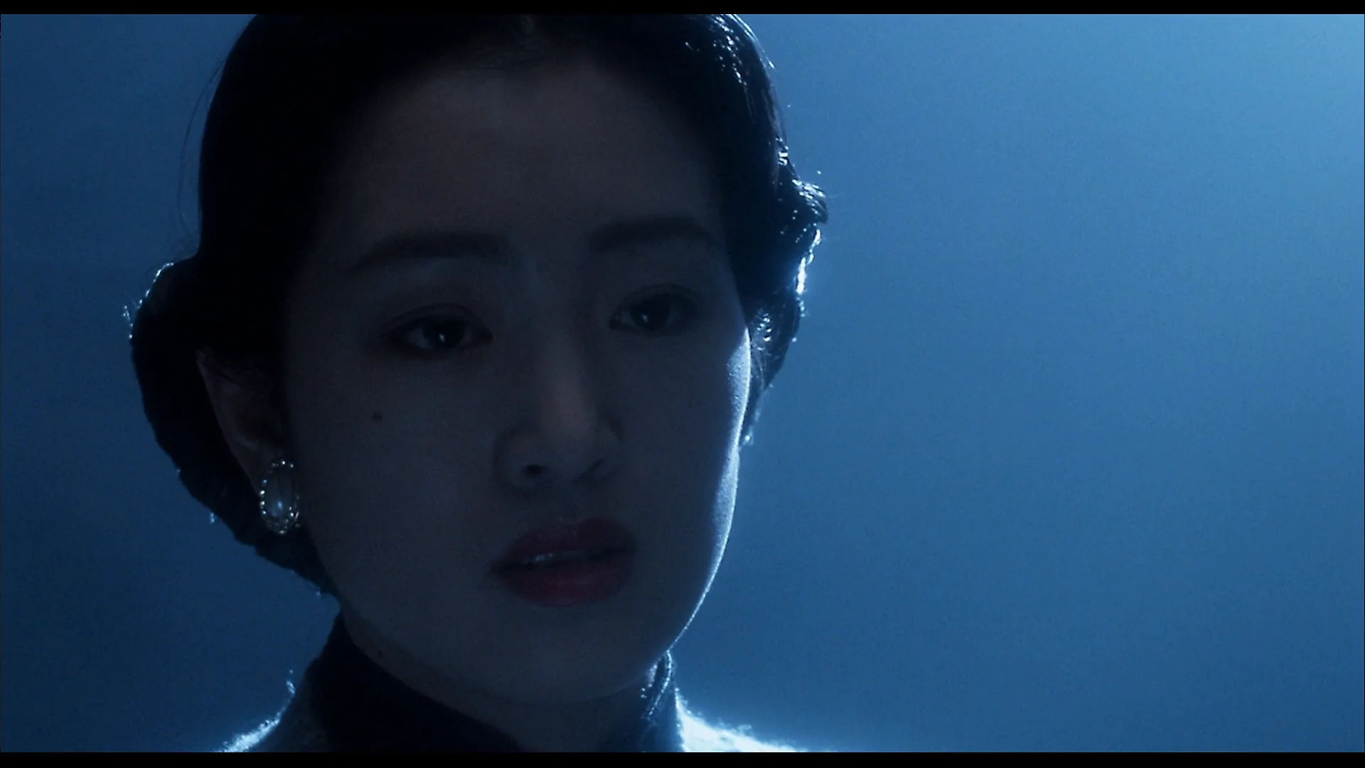
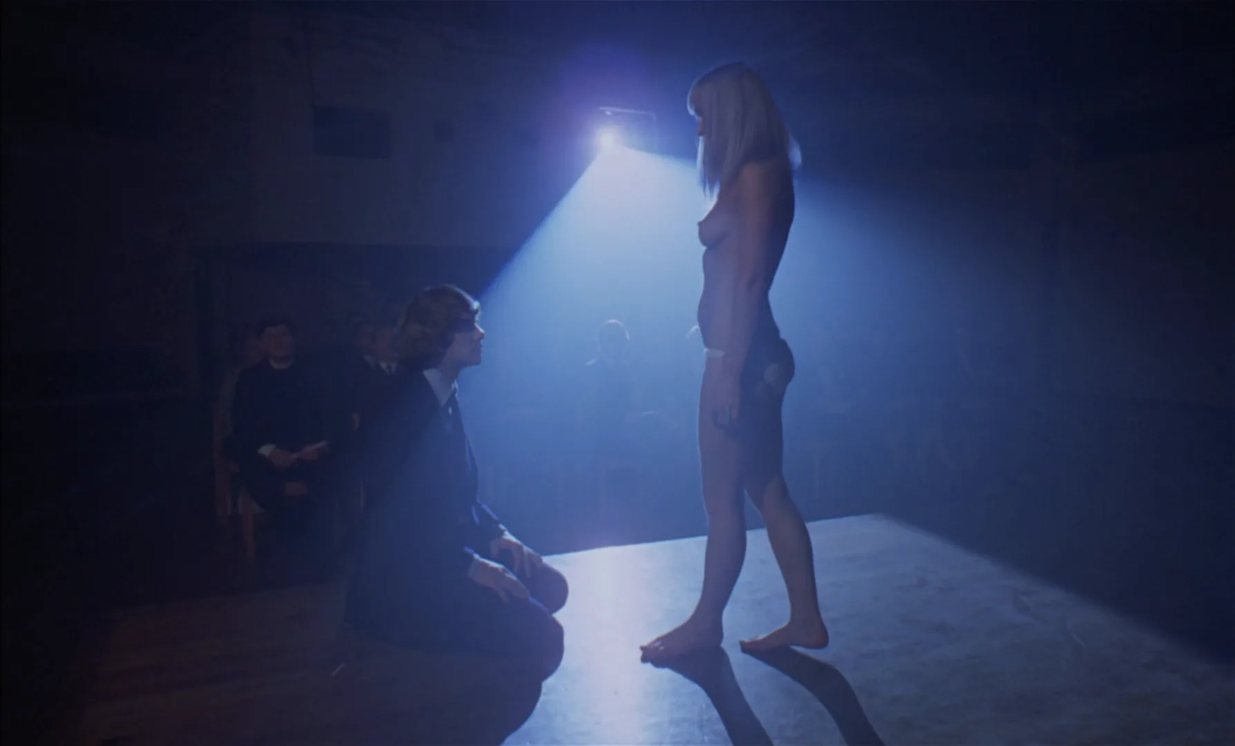
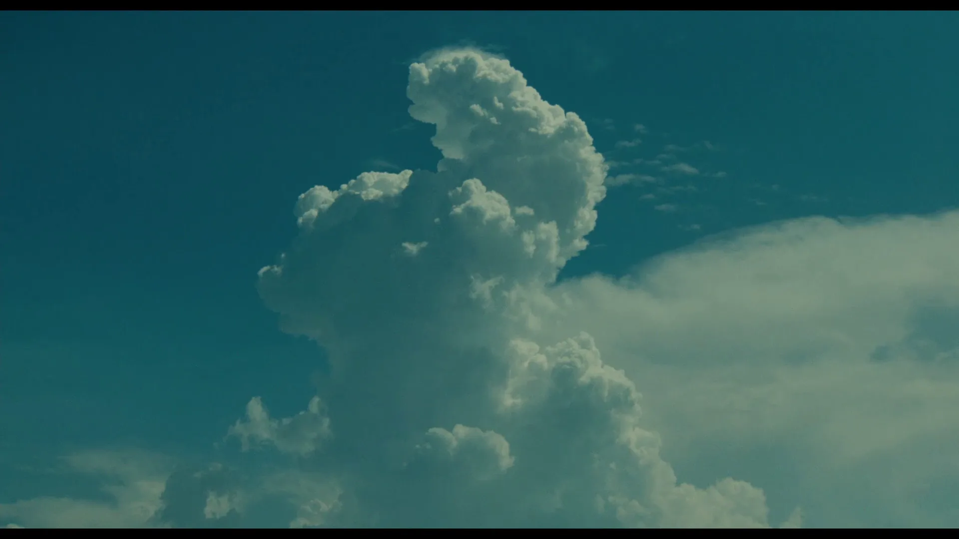
9 framesFrames where one hue carries the whole image, each held together by a bright highlight and deep shadow.
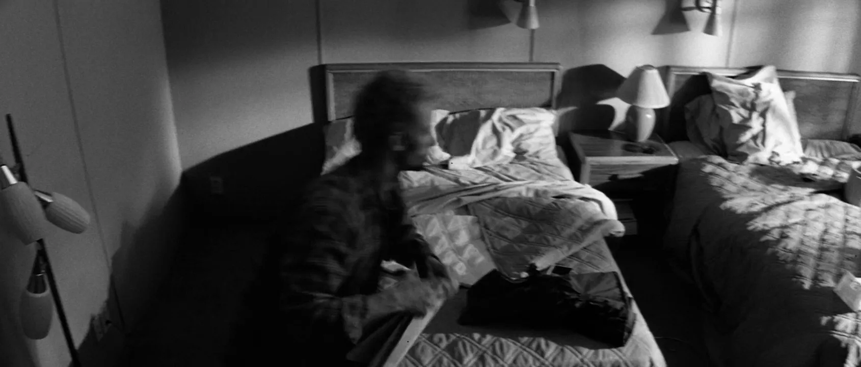
How to create a monochromatic color scheme with AI
4 promptsImage models drift toward natural, multi-colored images, and the word monochrome alone often gives black-and-white. Name the hue as a color scheme, assign a shade of it to every object, and name the lightness range. Keep references and takes on one FlashBoards board so every shot holds the same hue. The fourth prompt re-shoots a real film shot from a text description alone, and the original plays next to the result so you can compare.
Monochromatic blue color scheme, full-color cinematic still. Medium-wide shot of a narrow apartment kitchen at night. A woman in her forties with a silver-streaked black bob, a thin scar through her left eyebrow and an oversized slate-blue knit sweater rinses a mug at the sink. Every object is a shade of blue: navy cabinets, powder-blue tiles, a cobalt mug, an ice-blue window. Only lightness changes, from near-black shadows to a pale blue-white highlight on the window. Single cool moonlight key from the left window, 35mm lens at chest height, fine grain, quiet melancholy.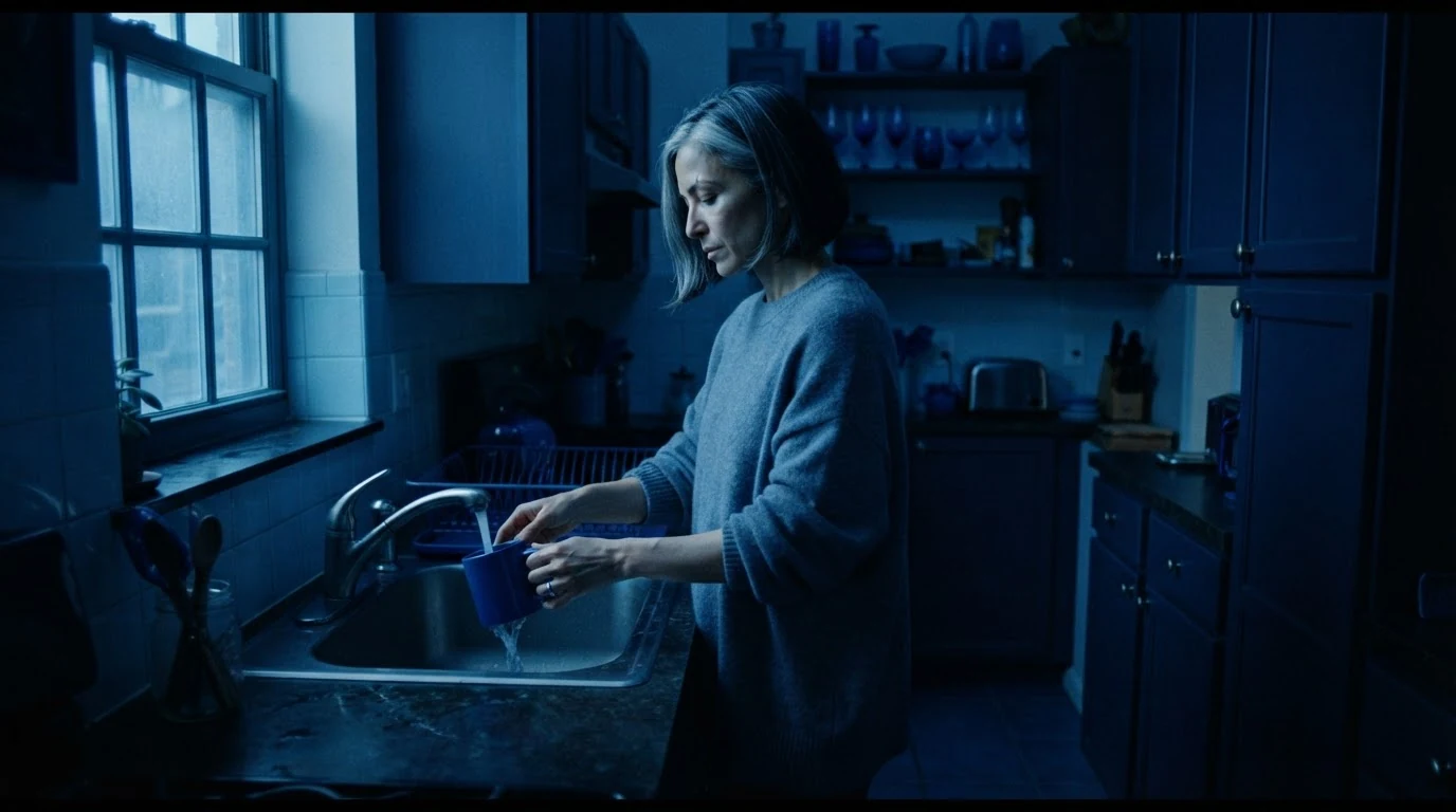
Monochromatic blue color scheme, full-color prevents black-and-white. A named blue for each object leaves no room for a warm lamp, and only lightness changes forces the tonal range.
Open FlashBoardsMonochromatic red color scheme, widescreen cinematic still. An old theater dressing room: crimson walls, oxblood carpet, a scarlet velvet chair, rose-pink bulbs around a mirror. A gaunt bald man in his sixties with a waxed white mustache and a burgundy silk robe sits at the mirror, his face lit the same deep red. Deep maroon shadows, one hot pink-red highlight on the bulbs. 50mm lens at seated eye level, low-key, feverish mood.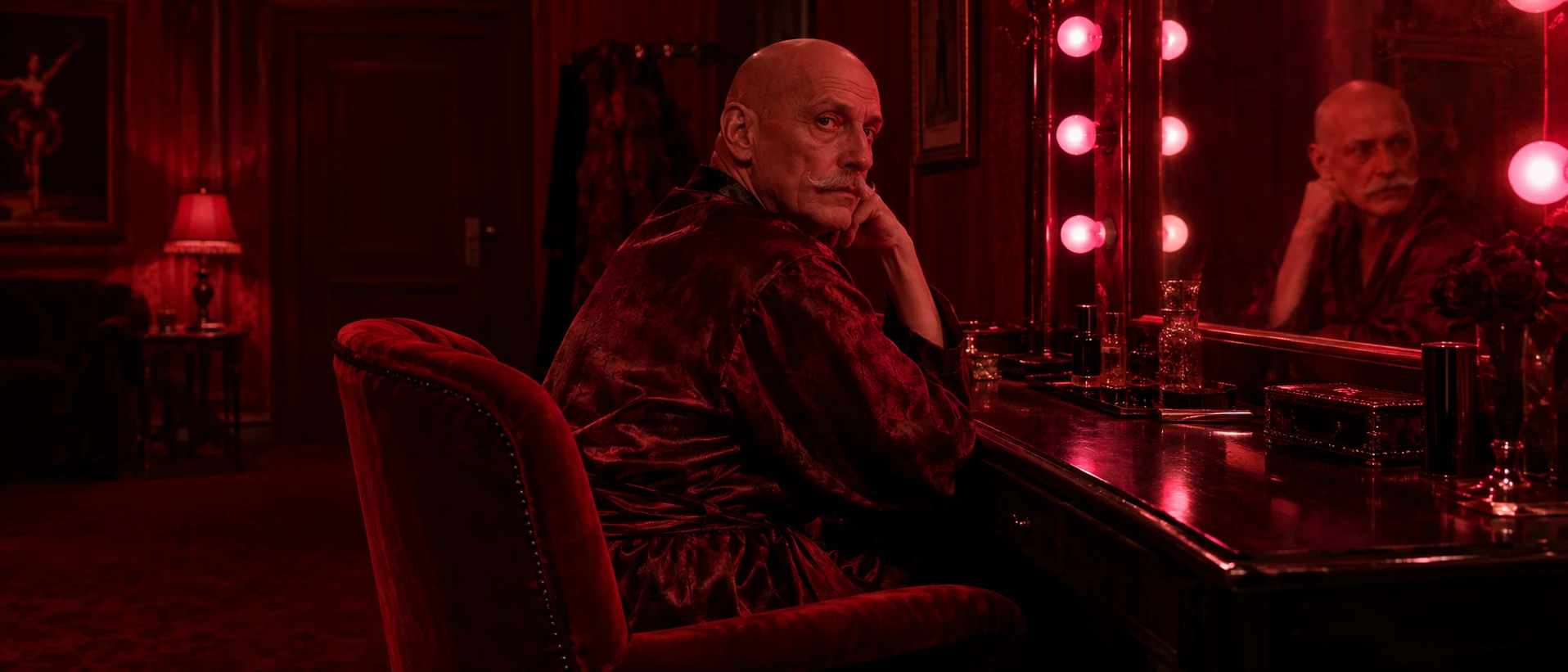
A warm second take in a wider frame. Lit the same deep red stops natural skin tones, and deep maroon shadows plus one hot pink-red highlight keep depth in a single hue.
Open FlashBoardsCamera: slow, steady push-in from medium-wide to a medium shot of the woman at the sink, at chest height. Action: Water is already running over the cobalt mug as she turns it in her hands. She shuts off the tap, lifts the dripping mug and turns her head toward the ice-blue window, moonlight sliding across her face. She holds still, looking out. The whole kitchen stays in shades of blue.Running water starts the motion on the first frame. Naming only visible objects prevents invented props, and the last line holds the hue so the clip does not warm up.
Open FlashBoards{
"output": "Full-screen live-action scene from The Thing (1982), alive from its very first frame: one continuous shot. Monochromatic magenta color scheme, full-color and saturated: the burning flare's magenta light floods the whole image as if the shot were filmed through a hot-pink gel. Skin, beard, hood, parka and the weathered plank wall behind all read as shades of one magenta: deep plum-violet in the darkest shadows, a dark maroon-red on the wall at the left edge, a pink-white glare at the flare in the upper right corner. Only lightness changes. Early-1980s anamorphic 35mm, night outside an Antarctic research station, flare smoke and fine snow drifting through the light, heavy grain.",
"characters": {
"S1": {
"name": "MacReady, played by Kurt Russell",
"look": "man in his early thirties, full bushy brown beard and mustache flecked with frost, pale eyes, tight gray knit hood pulled around his face, heavy dark padded parka with a shaggy shearling collar and a zipper at the chest",
"voice": "hoarse, cold-roughened baritone, breathless but steady"
}
},
"shots": [
{
"shot": 1,
"camera": "locked-off, slightly low angle looking up, anamorphic lens, medium close-up of S1: his hooded head sits left of centre, the bulk of his dark parka shoulder fills the lower left corner, and his raised left arm stretches up and out to the upper right corner of the frame, where the flare burns just past the edge; the camera never moves",
"action": [
"BEGINNING: alive from the first frame, S1 holds his left arm raised toward the upper right corner, gripping the sputtering flare just past the frame edge; a pink-white glare and rolling smoke fill the upper right corner. His head is tilted slightly back, brows raised and pinched together, eyes wide, looking up just left of the lens at someone standing above him; his mouth hangs open as he breathes hard.",
"THEN: he speaks up to that person, his lips moving inside the frosted beard, his raised arm staying perfectly still.",
"THEN: he squints for a moment, then his head sways a little toward the left of frame and back as he presses the point, his eyes never leaving the person above.",
"THEN: his mouth opens wide on the next words, brows still lifted, breath misting pink in the flare light.",
"THEN: a thin horizontal pink lens streak slides out from the flare glare across the whole frame at his eye height, and he blinks once while he keeps talking.",
"END: the flare glare in the upper right grows brighter and the lens streak stays across the frame; he is still speaking to the person above, arm raised, the whole frame bathed in the same saturated magenta."
],
"dialogue": [
{
"speaker": "S1",
"on_screen": true,
"when": "right after a short breath at the start of the shot",
"delivery": "hoarse, flat, certain",
"line": "<d>[English] Not for that Thing.</d>"
},
{
"speaker": "S1",
"on_screen": true,
"when": "after a brief pause, as his head sways",
"delivery": "quiet, explaining",
"line": "<d>[English] It wants to freeze now.</d>"
},
{
"speaker": "S1",
"on_screen": true,
"when": "after another short breath, as his mouth opens wide",
"delivery": "urgent, breathless",
"line": "<d>[English] It's got no way out of here.</d>"
},
{
"speaker": "S1",
"on_screen": true,
"when": "straight after the previous line with no pause, as the lens streak appears, and still going on the last frame",
"delivery": "low, grim, reasoning it through",
"line": "<d>[English] It just wants to go to sleep in the cold until the rescue team finds it.</d>"
}
]
}
],
"sound": {
"ambience": "the steady hiss and sputter of the burning flare, a cold wind gusting around the station heard from outside",
"speech": "exactly these spoken phrases, each said once, in this order",
"never_spoken": "no narration and no voice-over: the descriptions, performance notes and step words of this prompt are never spoken aloud",
"music": "a film score under the scene, always below the voices: a low sustained synthesizer drone with a slow, heavy heartbeat bass pulse",
"subtitles": "none"
}
}Remakes MacReady's flare shot from The Thing (1982): the prompt carries over the locked-off low angle, the raised arm with the flare just off frame right, the lens streak, his four lines of dialogue and the single magenta wash.
The flare motivates the hue, so its light floods skin, beard, parka and wall alike, and filmed through a hot-pink gel holds that one hue for the whole take. A named shade for each surface keeps the depth, and MacReady's four lines come word for word from the film.
Open FlashBoardsCommon mistakes
- Monochrome turns into black-and-white. Write the hue plus color scheme and full-color.
- A warm lamp or natural skin sneaks in. Assign a shade of the hue to every object and to skin.
- The frame goes flat. State near-black shadows and one bright highlight in a paler tint.
- The video drifts warmer. Repeat the hue at the end of the video prompt.
Keep the reference frames, prompts and every generated take side by side — images and video in one canvas.
FAQ
4 questionsWhat is a monochromatic color scheme in film?
It is a look built from one hue in many shades and tints, such as a room lit only in blue or a world graded green. With no contrast between colors, the viewer reads the image through lightness, texture and silhouette, and the single hue sets the emotional temperature of the scene almost instantly.
What are some examples of monochromatic movies?
Few films stay in one hue throughout; most use it for sequences. Cries and Whispers (1972) fills its rooms with red, The Matrix (1999) tints its simulated world green, and the Las Vegas scenes of Blade Runner 2049 (2017) sit in orange haze. Black-and-white films like Ida (2013) are monochrome without hue.
Is black and white considered monochromatic?
Yes, strictly: black-and-white is one scale of grays with no hue. Filmmakers usually treat it separately, since it removes color completely, while a monochromatic scheme keeps one hue for its emotional weight. Sepia and silent-era tinting sit between the two: a gray scale shifted toward a single color.
What is the difference between monochromatic and analogous colors?
A monochromatic scheme uses one hue and changes only lightness and saturation, like navy, blue and ice blue. An analogous scheme uses neighboring hues on the color wheel, like blue, teal and green. Analogous palettes feel harmonious but varied; monochromatic ones feel more stylized and closed.
Related terms
3- Desaturated LookColor
A desaturated look drains color intensity across the frame without going fully black-and-white, giving a muted, cold, war-weary or documentary feel.
- Color PaletteColor
A film's color palette is the limited set of colors that dominates its images — in sets, costumes, light and grade — chosen to give the film a coherent look and emotional temperature.
- Sepia ToneColor
Sepia is a warm brown monochrome tint, originally from chemical toning of prints and now added in grading to evoke the past, memory or dusty heat.
Further reading
Blain Brown, Cinematography: Theory and Practice (Routledge) — chapters on color and lighting control. Patti Bellantoni, If It's Purple, Someone's Gonna Die: The Power of Color in Visual Storytelling (Focal Press).