 FlashBoards Learn
Color · Film language
Color Symbolism
Also called: color meaning, color psychology, symbolic color
Color symbolism in film is the use of a hue as a sign: red for desire, danger or power, green for envy, sickness or the uncanny. The meaning is not fixed by a chart. Each film teaches it through context and repetition, so by the third appearance the color alone tells the audience what is at stake.
- What it does
- Turns a hue into a sign the audience learns to read, so the color carries a character, a threat or an idea without dialogue.
- Use it when
- A theme, a character or a turning point needs to register instantly and keep returning across the film.
- Watch out
- A symbolic color only works if the rest of the frame stays out of its way; the same red on a background sign or an extra's jacket dilutes it.
- Try this prompt
wide shot of a rain-gray train platform, desaturated slate palette, one woman in a crimson scarf, the only saturated color in the frame, 35mm

What is color symbolism in film?
Color symbolism is the part of color theory that deals with meaning rather than harmony. A hue becomes a symbol when it points beyond the object that carries it: a red coat stops being about fabric and stands for a life, a danger or a choice.
Three layers stack on every symbolic color:
- The cultural baseline. Red is blood and fire almost everywhere; white means a wedding in much of the West and mourning in parts of East Asia. Color charts describe this layer.
- Genre habit. Horror has taught audiences to distrust red light; superhero films, to expect a villain's glow in acid green or purple.
- The film's own grammar. Whatever the story repeats wins over the first two layers. If a film shows a color every time a character lies, that color means lying in this film, whatever the chart says.
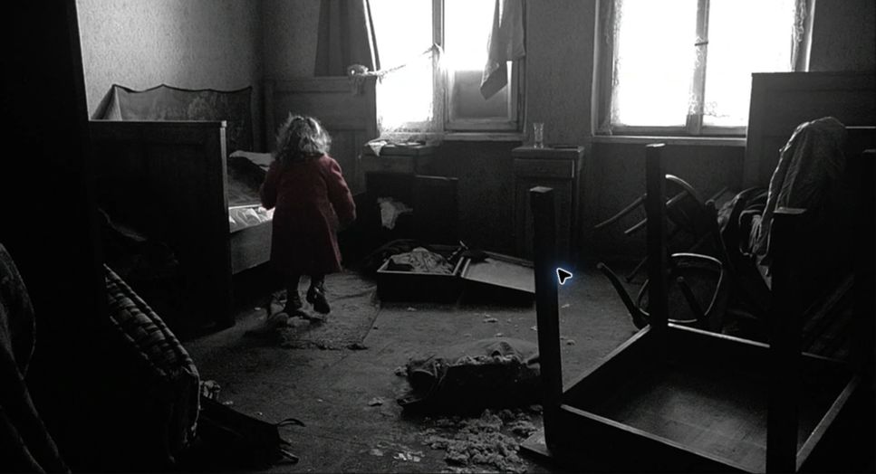
So an interpretation has to be confirmed by the film itself. One red dress is a costume choice. A red that appears at the first meeting and returns at the betrayal is a symbol. In Schindler's List (1993), a small girl in a red coat walks through a black-and-white film; when the coat returns later, nobody in the audience needs it explained. That is color symbolism working through selective color: meaning built by isolation and return, not by a dictionary.
What do colors mean in movies?
The common associations are a starting point, because the audience already carries them in:
- Red is love, lust, violence, danger, power and warning at once, and the loudest hue in any frame: the eye goes to it first. The roses in American Beauty (1999) stand for desire; the red raincoat in Don't Look Now (1973) keeps returning as a warning; HAL's red lens in 2001: A Space Odyssey (1968) makes a machine feel like a watching eye. The Sixth Sense (1999) reserves red for moments touched by the dead.
- Orange and yellow read as warmth, sunlight and nostalgia, and just as easily as heat, sickness or decay. Traffic (2000) gives its Mexico storyline a hot, bleached yellow that feels dangerous, not cozy.
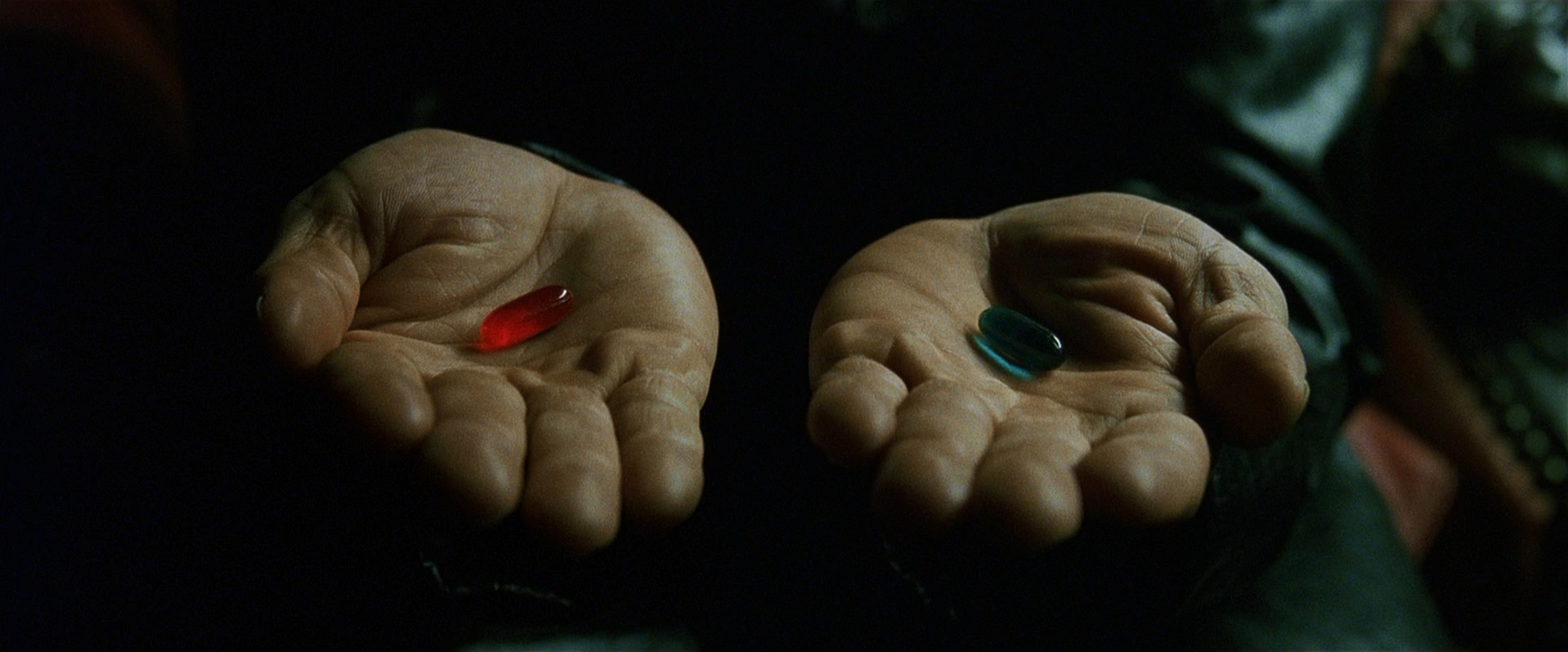
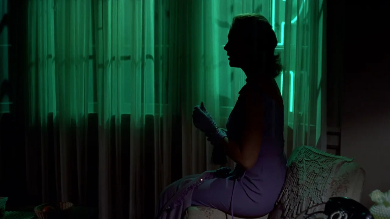
- Green is nature and growth in life, but on screen it is more often envy, poison, obsession, the artificial and the uncanny. Vertigo (1958) ties it to a woman who may not be real; The Matrix (1999) tints its simulated world green.
- Blue is calm, cold, distance, melancholy and night. Kieślowski's Three Colours: Blue (1993) surrounds a grieving widow with blue light and blue objects.
- Purple is royalty, mystery and theatrical flamboyance, which is why the Joker wears it.
- White is purity or innocence, but also clinical emptiness.
- Black and desaturation mean absence, loss or the past: the grayer the film, the louder any single hue.
What does red mean in movies?
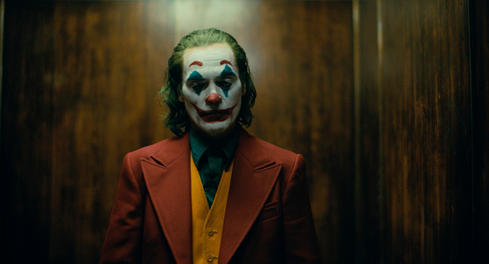
All of the above, which is the point. Red has no single meaning; it has intensity. The film decides the direction. Arthur Fleck's red suit in Joker (2019) reads as a costume of power worn by a man who had none, while a red mailbox in the background would mean nothing. Treat any chart as what the audience might bring, then make your film choose.
Associative color: tying a hue to a character or idea
Associative color is the most common working form of color symbolism: a hue is attached to a character, place, time or idea, so whenever it appears, the audience feels the link.
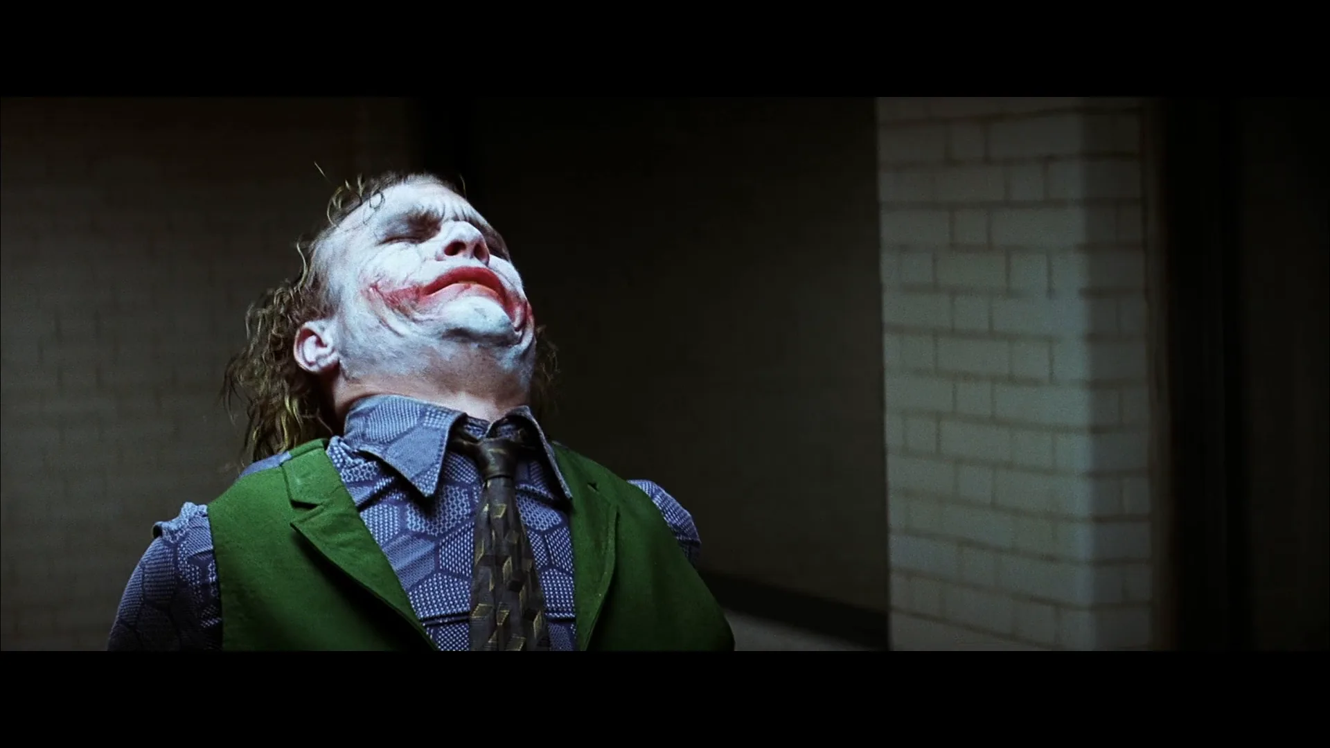
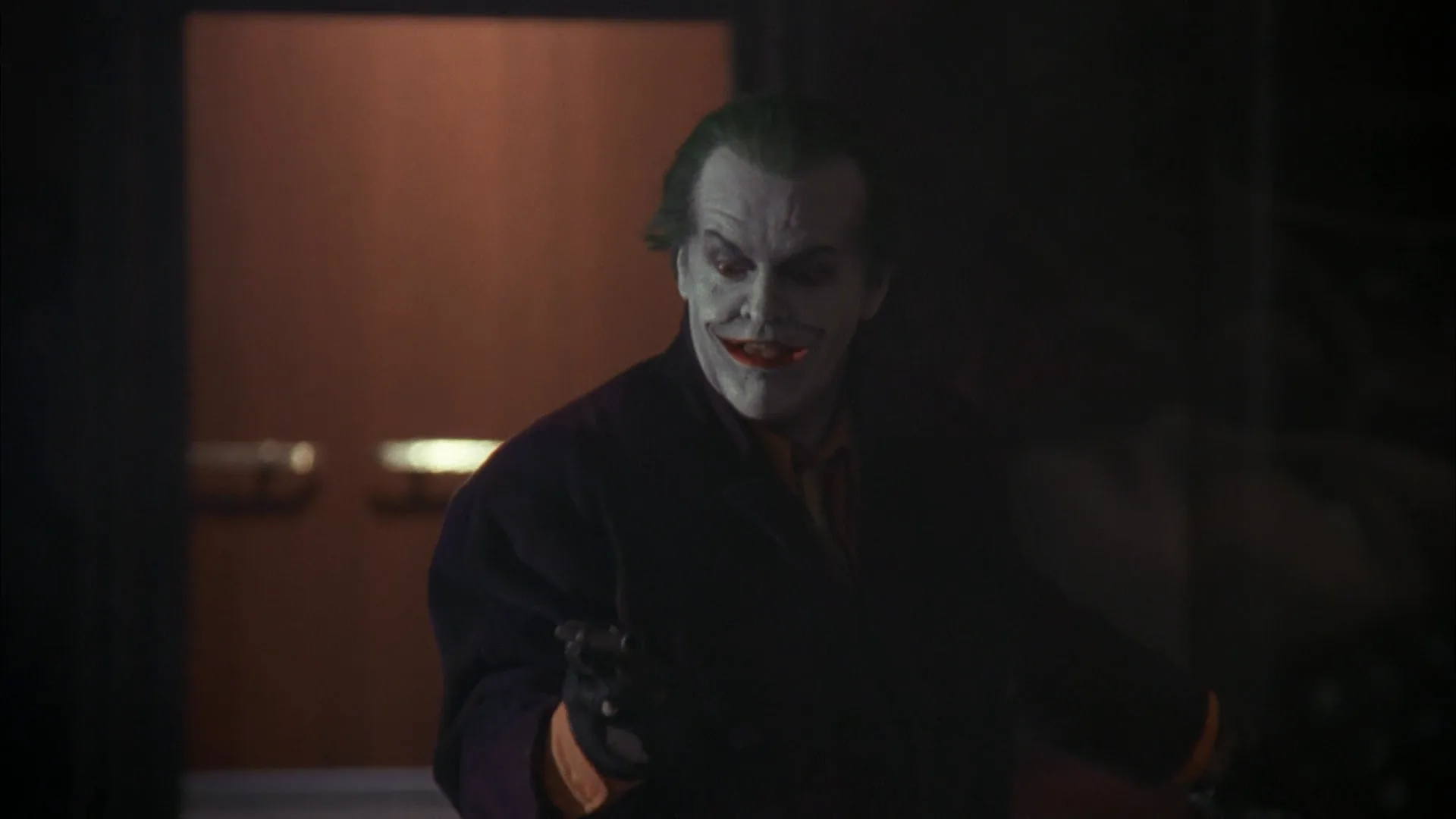
The Joker is the textbook case. Across Batman (1989) and The Dark Knight (2008), two very different productions keep the same purple and green from the comics; the pair is so fixed that a purple coat and green hair are enough to name the character. Vertigo works more quietly: green follows Madeleine, from the green wrap she wears at her first appearance to her green car, and later green neon floods the hotel room where Judy is remade in her image. By then the color says what Scottie will not admit.
The Matrix builds an association into a choice. The red pill and the blue pill are offered side by side, and the dialogue itself spells out that one leads to the truth and the other back to comfortable illusion. The film extends the idea: the simulated world carries a green cast, the real one does not.
To make an association hold:
- Introduce it with the character. The hue's first strong appearance should coincide with the character's.
- Keep it exclusive. No other character, prop or light should use that hue in the same scenes. This is mostly the job of costume color and set dressing.
- Reuse it at turning points. The association pays off when the color appears without the character, as a warning or a memory.
Color coding characters, factions and worlds
Color coding scales association up to structure: each character, faction, world or timeline gets its own palette, so the audience tells them apart without being told. Where associative color says this is her, color coding says we are now there.
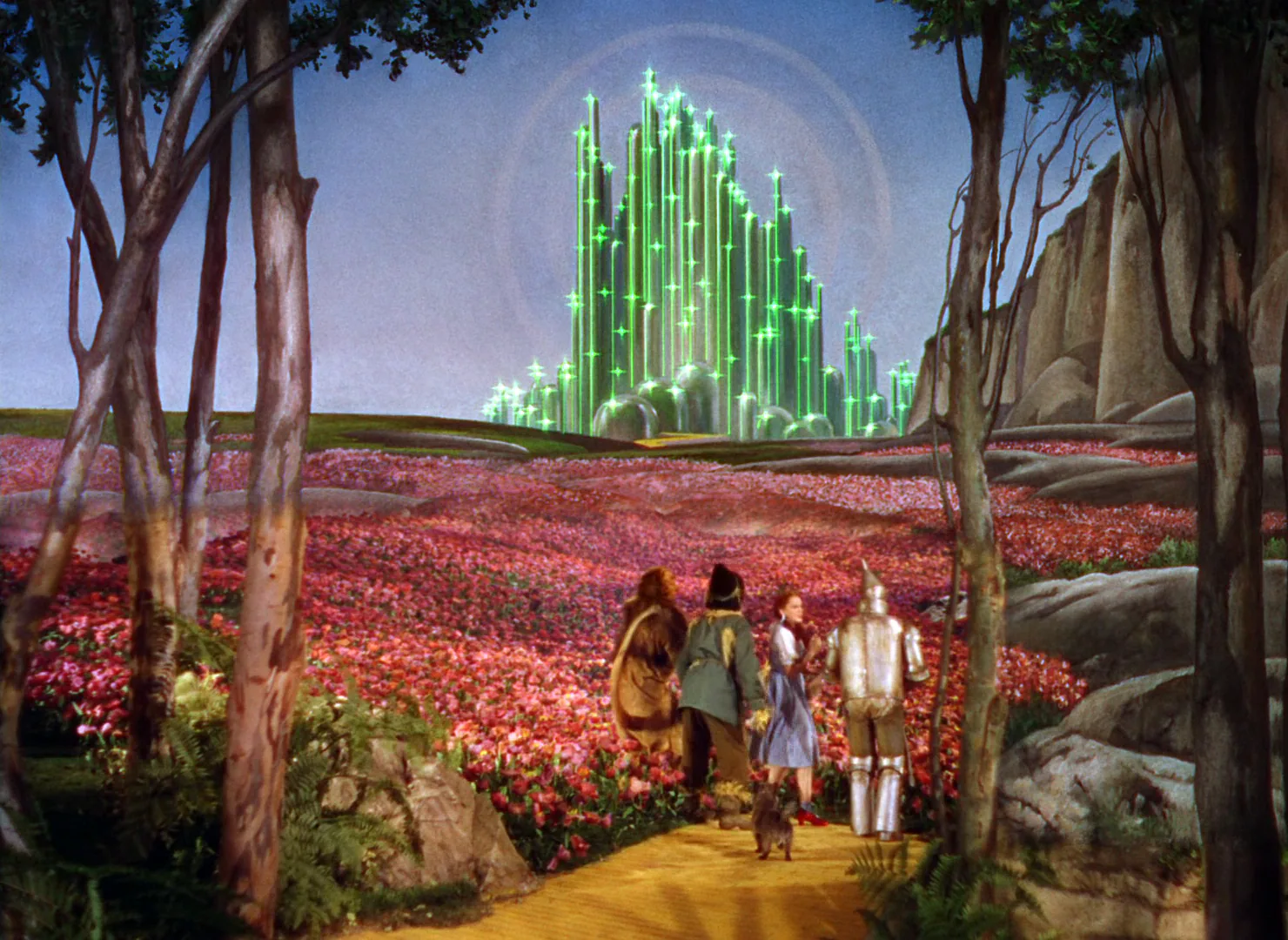
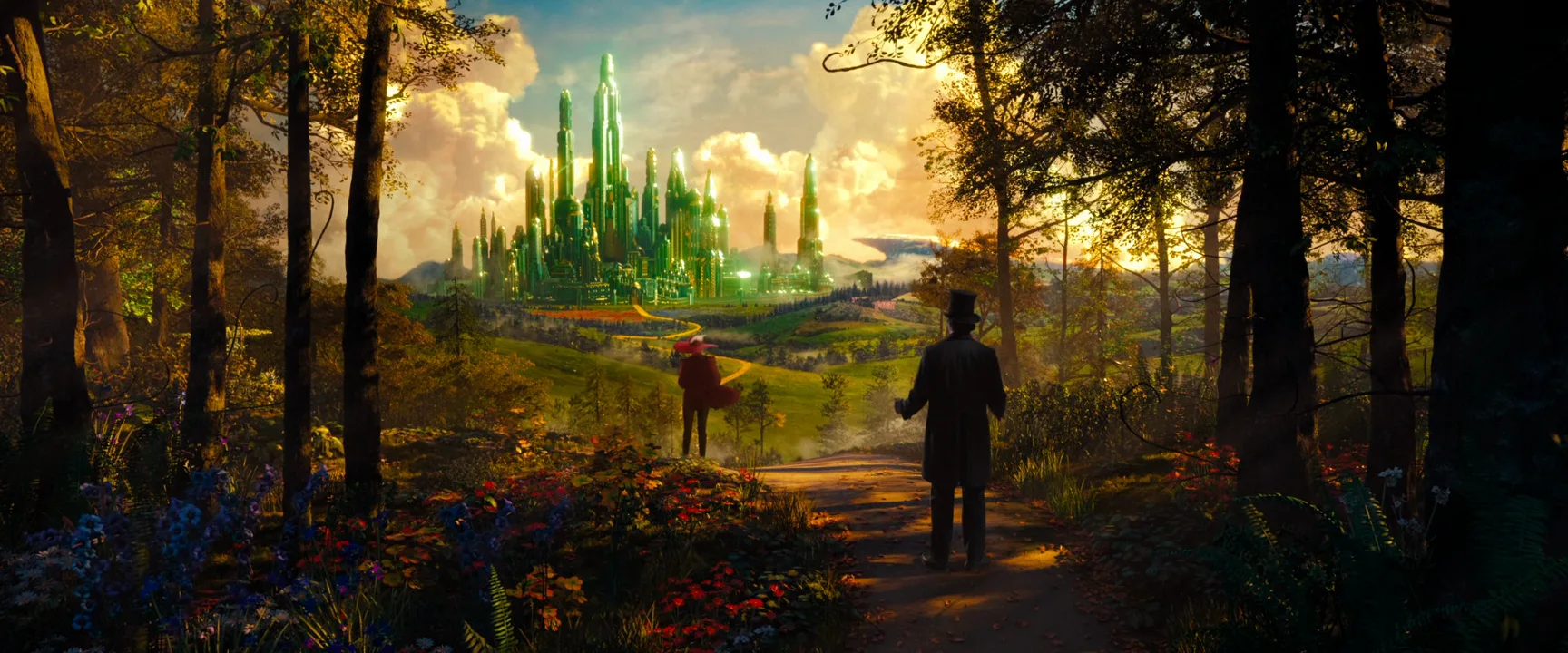
The Wizard of Oz (1939) is the canonical example: Kansas is sepia, Oz is full three-strip Technicolor, and inside Oz the Emerald City is literally green. The switch from one to the other is the story's promise made visible. Traffic (2000) cuts between three storylines that each have a distinct look: a hot, grainy yellow for Mexico and a cold blue for the Washington and Ohio thread, so a single frame tells you which story you are in. Zhang Yimou's Hero (2002) goes further and dresses each version of the same story in its own dominant color, so the palette signals which account the audience is watching.
Superhero cinema codes whole characters: Iron Man's red and gold armor, the green light of the Green Lantern ring. A clash of two coded colors in one frame is a clash of the characters.
Practical rules for coding:
- Separate by hue and by value. Pick families far apart on the wheel, often complementary colors such as teal and orange, and make one clearly darker, so the code still reads for color-blind viewers.
- Code the whole frame. Light, walls and grade should agree: one limited color palette per world.
- Plan the crossover. The most powerful shot in a coded film is often the one where a color leaks into the wrong world.
Color motif: how repetition builds meaning
A color motif is a hue that recurs around the same idea and gains meaning each time it returns. Where an association is a fixed label, a motif develops: it can grow, spread, fade or change what it points to.
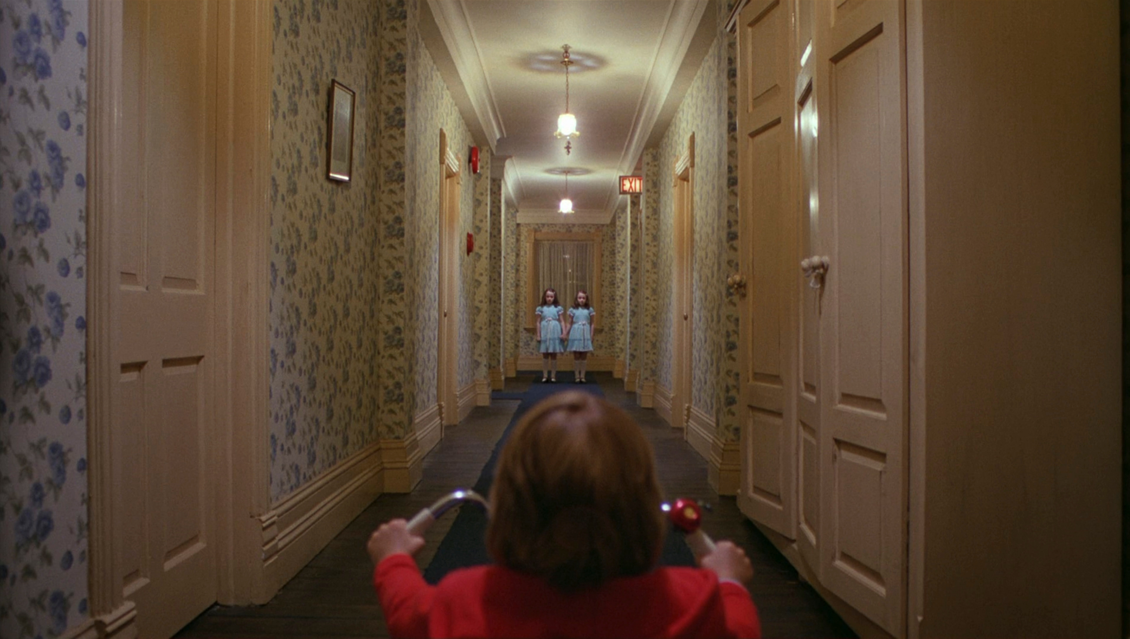
The Shining (1980) threads red through the Overlook: the carpets, the bathroom where Jack talks to the past, the elevator that pours blood. Different objects, one color: the hotel itself starts to feel like the source of the red. In Schindler's List, the red coat appears twice, and the second appearance lands only because of the first. In Don't Look Now, a small figure in a red coat keeps appearing at the edge of Venice until the color itself becomes dread.
A motif can also run across films. HAL's red lens set a convention that later science fiction still leans on: a single red point of light as a machine that watches, which Oblivion (2013) echoes with a red light inside a white triangular chamber.
When a motif changes over the whole running time, it becomes a color arc. Pleasantville (1998) is built on one: a black-and-white town gains color person by person as its characters change, so the spread of color is the plot.
Map every appearance of the hue in the script before the shoot. Three to five strong returns are usually enough; more and the color turns into wallpaper.
How to build color symbolism on set and in the grade
Symbolic color is decided in pre-production and protected at every stage after that.
- Write it down. Pick one symbolic hue per story, two at most, and put its meaning and appearances in the lookbook. Name the exact shade (crimson, not red), or every department brings its own red.
- Clear the frame. Keep the hue out of set dressing, extras' wardrobe, signage and props that don't carry the meaning. A useful rule of thumb: an accent color that covers less than a tenth of the frame reads as a sign; one that covers half reads as a mood.
- Choose the carrier. Costume and props are the most readable carriers because they stay with a person. Light is stronger but less precise: a gelled practical or a neon sign can wash a whole face, as in Vertigo. See colored lighting and lighting gels for the tools.
- Protect it in exposure. Saturated reds and greens clip easily on digital sensors and lose texture before the rest of the frame does. Check the symbolic color on a waveform and a vectorscope, and hold it about half a stop to a stop under clipping.
- Lock it in the grade. Isolate the hue with a qualifier and keep it consistent between scenes; viewers notice when the symbol drifts toward orange or pink. Desaturate around it rather than pushing the symbol.
- Test it in grayscale. If the frame still works in black-and-white, the symbol is extra meaning, not a crutch; if the symbol disappears, give it a value difference too.
Color symbolism vs. symbolism
Symbolism is the broader idea: any concrete object, place, action or color that stands for something abstract, such as a key, a staircase, rain. Color symbolism is the subset where the hue itself carries the sign.
A symbolic object is tied to its shape. A symbolic color can detach from any single object and travel. The red in The Shining moves from carpet to bathroom to elevator, and the audience follows the color, not the objects. That mobility makes color the most flexible symbolic tool, and the easiest to lose: a similar red on a background extra breaks the sign.
Use object symbolism when the meaning belongs to a specific thing a character can hold, lose or give away. Use color symbolism when the meaning should spread across the world of the film, or when it has to survive cuts between locations, people and time. A red coat is both, and the film can use either half. For the wider design picture, the color hub covers palettes, contrast and harmony.
Color Symbolism examples in film
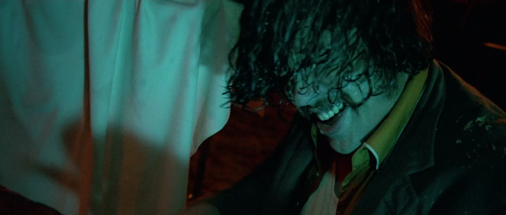
14 framesFrames where one hue carries a meaning the film has taught its audience: a machine's eye, a villain's palette, a world coded by color. Note how little of each frame the symbolic color occupies.



How to create a color symbolism with AI
4 promptsImage models know the color chart but not your story, so words like symbolic or meaningful do nothing. What works is describing the hue on one specific object, calling it the only saturated color, and naming a neutral color for everything else in the frame. Keep the reference frames, every take and your color notes on one FlashBoards board, so you can check that the symbolic hue matches from shot to shot. The fourth prompt re-shoots a real film shot from a text description alone, and the original plays next to the result so you can compare.
Cinematic wide shot of an open-air train platform at dawn in light rain. Everything is cold and desaturated: slate-gray concrete, gray-blue sky, a dull silver commuter train waiting on the left track, pale gray puddles. A woman in her fifties walks toward camera along the platform: close-cropped white hair, a small gap between her front teeth, round tortoiseshell glasses, a long charcoal wool coat, and a vivid crimson wool scarf around her neck. The crimson scarf is the only saturated color in the whole frame. 35mm lens at eye level, soft overcast light, fine film grain, quiet and tense mood.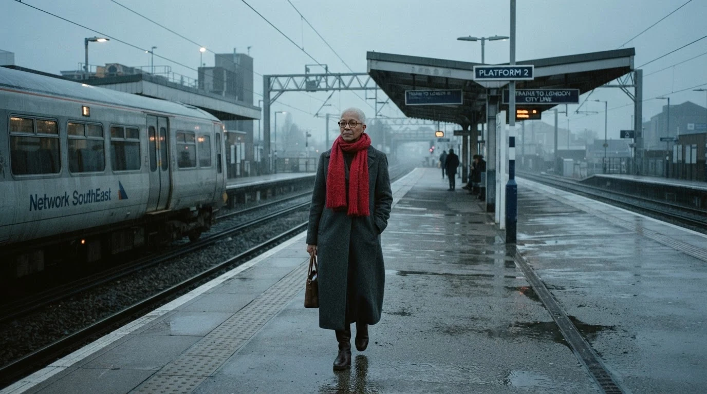
The only saturated color in the whole frame does the work; naming gray, silver and slate for every other object stops the model from adding red signals or signage. Crimson rather than red fixes the exact shade.
Open FlashBoardsWidescreen symmetrical interior of a long dining table seen from its head, color-coded in two halves. Left half, cool teal world: a thin man in his sixties with a hooked nose, a long gray ponytail and a teal velvet jacket, teal glassware, a cyan-shaded lamp. Right half, warm amber world: a stocky woman in her thirties with a shaved head, a gold ring in her eyebrow and a mustard-yellow dress, amber candles, brass plates. The center line of the white tablecloth divides the two palettes exactly. 28mm lens at seated eye height, low-key light, tense standoff.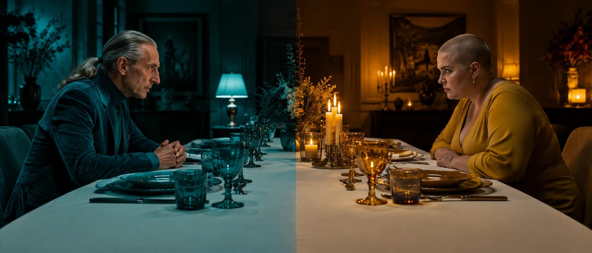
A second take on the same idea as color coding: each character owns a palette that extends to light and props. Assigning every object to left or right keeps teal and amber from mixing into brown.
Open FlashBoardsCamera: slow steady dolly-in toward the woman, from wide shot to medium shot, at eye level. Action: She is already walking toward camera along the wet platform, the crimson scarf lifting in the wind with every step while rain falls across the frame. The silver train on the left begins to pull away behind her. She stops, grips the crimson scarf with one hand and pulls it tighter, looking straight past the camera. The crimson scarf stays the only bright color as the gray train slides out of frame.Walking and wind start on the first frame, so the clip is alive at once. Repeating crimson scarf keeps the hue locked through the move, and only objects from the start frame are named, so nothing new appears in the background.
Open FlashBoards{
"output": "Full-screen live-action scene from Vertigo (1958) from its very first frame: one continuous locked-off shot. Late-1950s Technicolor 35mm look, night interior of a small hotel room. The only strong light is a saturated emerald-green neon glow coming through floor-length sheer curtains that fill the back of the frame; a bent green neon tube shows faintly through the curtain at the upper right. Everything in front of the curtains falls into near-black silhouette; the room's right edge is deep brown-black shadow.",
"characters": {
"S1": {
"name": "Judy, played by Kim Novak",
"look": "slim woman in her twenties, brown hair in soft waves ending at the nape, sleeveless fitted lavender-purple dress, pale short gloves on both hands; her face and body read as a dark silhouette against the green curtains, the dress keeping a dim purple sheen",
"voice": "soft, wary, a little hurt"
}
},
"shots": [
{
"shot": 1,
"camera": "static camera, completely still for the whole shot, eye level at her seated head height, normal lens, medium-wide shot in strict side profile: S1 sits on the front edge of a pale lace-covered armchair just right of frame centre, her face turned to frame left toward someone standing off frame left; open green-lit curtain fills the whole left half of the frame; a black telephone sits on a table at the bottom right corner",
"action": [
"BEGINNING: alive from the first frame, S1 already sits upright in profile facing frame left, back straight, knees toward frame left; both gloved hands are raised together in front of her chest, fingers of her near hand tugging at the fingertips of the other glove; her lips part as she speaks; her gaze stays level on the person off frame left.",
"THEN: her chin lifts very slightly and settles again; her hands keep working at the glove fingers and begin to sink slowly from chest height toward her waist.",
"THEN: a short pause; she stays still, head unmoving, the green glow steady and humming behind her, a thin green edge outlining her forehead, nose and lips.",
"END: she speaks again with lips barely moving, her gloved hands now resting low in front of her lap, still holding each other; her head and gaze have not moved, still on the person off frame left; the green light is unchanged."
],
"dialogue": [
{
"speaker": "S1",
"on_screen": true,
"when": "from the first frame, while her hands are still raised at her chest",
"delivery": "quiet, questioning, guarded",
"line": "<d>[English] Why?</d>"
},
{
"speaker": "S1",
"on_screen": true,
"when": "after the short pause, as her hands come to rest low in her lap, at the end of the shot",
"delivery": "soft, a little bitter, half a question",
"line": "<d>[English] 'Cause I remind you of her?</d>"
}
]
}
],
"sound": {
"ambience": "steady electric hum of a neon sign heard from outside, very faint city traffic far away, the soft rustle of her gloves",
"speech": "exactly these spoken phrases, each said once, in this order",
"never_spoken": "no narration and no voice-over: the descriptions, performance notes and step words of this prompt are never spoken aloud",
"music": "a film score under the scene, always below the voices: slow, yearning low strings with a faint haunting harp, romantic and uneasy",
"subtitles": "none"
}
}This remakes the green-lit hotel-room shot from Vertigo (1958), dir. Alfred Hitchcock, DP Robert Burks; the prompt carried over the static side profile, Judy's two lines, her gloved hands sinking to her lap and the green glow filling the curtains behind her.
The prompt never asks for symbolism; it names one light source, emerald-green neon through sheer curtains, and calls it the only strong color. Judy's two real lines from the scene and a static side profile keep the moment small, so the green carries the meaning: the dead woman's color closing around her.
Open FlashBoardsCommon mistakes
- The color spreads. Ask for a red scarf and the model adds red lights, red signs, red lipstick. Say it is the only saturated color and give every other object a neutral color.
- The symbol grows. A red accent becomes a whole red outfit. Name the object and its size: a scarf, a coat, a single lamp.
- Symbolic words are ignored. Menacing red changes nothing. Put the meaning in staging and palette, not adjectives.
- Hue drift in video. Over a few seconds crimson slides to orange or pink. Repeat the exact color with its object in the video prompt.
- Two coded palettes turn to mud. Teal and amber mix into brown when they share light. Assign each color its own side of the frame and its own light source.
Keep the reference frames, prompts and every generated take side by side — images and video in one canvas.
FAQ
5 questionsWhat does red mean in movies?
Red can mean love, desire, anger, violence, danger or power, and the eye finds it first in any frame. Which meaning applies depends on context and repetition inside the film: the red lens in 2001: A Space Odyssey means a watching machine, the roses in American Beauty mean desire. Read red as intensity, and let the story say where that intensity points.
What does green symbolize in film?
In life green suggests nature and growth, but on screen it more often signals envy, obsession, sickness, poison or something artificial. Vertigo ties green to a woman who may not be real, and The Matrix tints its simulated world green. Green fluorescent light on skin reads as unhealthy. Like every symbolic color, the film's own repetition decides the final meaning.
What is color psychology in film?
Color psychology is the general emotional effect of hue: warm colors feel close and energetic, cool colors calm or distant, saturated colors loud, desaturated ones heavy. Color symbolism builds on it but goes further: a specific color is tied to a specific character, place or idea through repetition. Psychology sets the mood of a scene; symbolism gives a color a meaning the audience learns.
Is color symbolism universal?
No. Some links are close to universal, such as red with blood and fire, but many are cultural: white is worn at weddings in much of the West and at funerals in parts of East Asia, and red means luck and celebration in China. That is why filmmakers establish meaning inside the film, introducing the color with a character or event and repeating it, instead of relying on a chart.
How do you use color symbolism in a short film?
Pick one color and one meaning. Introduce it clearly early, on a costume or prop, repeat it two or three times at key moments, and keep that hue out of the rest of the frame: set dressing, extras and signage in neutral tones. In the grade, desaturate around the symbol rather than boosting it.
Related terms
5- SymbolismStorytelling
Symbolism is using a concrete object, color, place or action to stand for an abstract idea — a key, a staircase, rain, a red coat — so the image carries meaning beyond itself.
- Selective ColorColor
Selective color keeps one hue — or one object — in color while the rest of the frame is black-and-white or heavily desaturated, turning that object into the story's focal sign.
- MotifStorytelling
A motif is an image, sound, object or line that recurs through a film and gathers meaning with each return, supporting the theme.
- Color TheoryColor
Color theory in film is the practical knowledge of how hue, saturation and brightness interact and how filmmakers use palettes, contrasts and color changes to guide the eye and shape emotion.
- Color PaletteColor
A film's color palette is the limited set of colors that dominates its images — in sets, costumes, light and grade — chosen to give the film a coherent look and emotional temperature.
Further reading
Patti Bellantoni, If It's Purple, Someone's Gonna Die: The Power of Color in Visual Storytelling — color and emotion in film, scene by scene. Josef Albers, Interaction of Color — how neighboring colors change what a hue looks like.