 FlashBoards Learn
Color · Film language
Warm Color Palette
Also called: warm tones, golden palette, amber look
A warm color palette is a film look dominated by reds, oranges, ambers and yellows across sets, costumes, light and grade. Used gently, it reads as intimacy, nostalgia, comfort or summer heat; pushed to saturation, the same hues turn into fever, danger and sickness.
- What it does
- Pulls the whole frame toward amber and red so the scene feels close, lived-in, hot — or, pushed hard, threatening.
- Use it when
- Memory, home, romance, a heat wave, candlelit interiors, or a world that should feel scorched and hostile.
- Watch out
- One orange lamp in a neutral room is not a warm palette; and a flat orange filter turns skin muddy and kills separation.
- Try this prompt
Cozy diner at dusk, warm color palette, amber tungsten lamps, honey wood, low golden window light, deep brown shadows, 35mm film still
What is a warm color palette?
A warm palette is a color palette whose dominant hues sit on the red–yellow half of the color wheel: brick, rust, amber, honey, gold, peach. It is built in three layers: production design and costume supply the pigments, light supplies the temperature, and the grade ties it together by nudging midtones and shadows toward orange.
Judge the whole frame, not one object. A red dress in a gray office is an accent; a room where walls, skin and even shadows lean amber is a warm palette — one of the core looks in the color toolkit.
What do warm colors mean in film?
Warm color has strong default readings.
- Intimacy and comfort. Firelight and household lamps are warm, so amber reads as shelter. Amélie (2001) wraps Paris in reds, greens and gold to make it a storybook home.
- Nostalgia. Warm, slightly faded images feel like old prints; taken to the limit this becomes sepia tone.
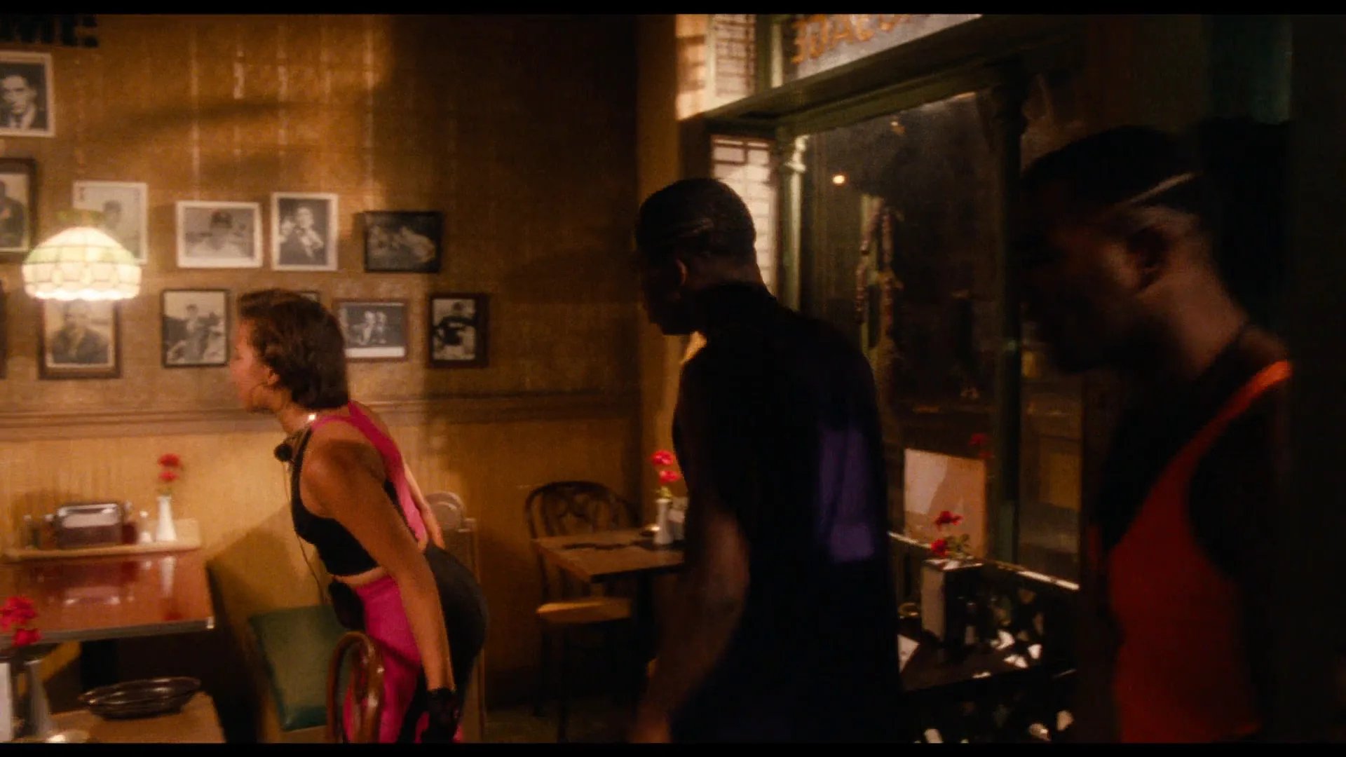
- Heat. Do the Right Thing (1989) plays out on the hottest day of a Brooklyn summer, and its reds and oranges make the temperature visible.
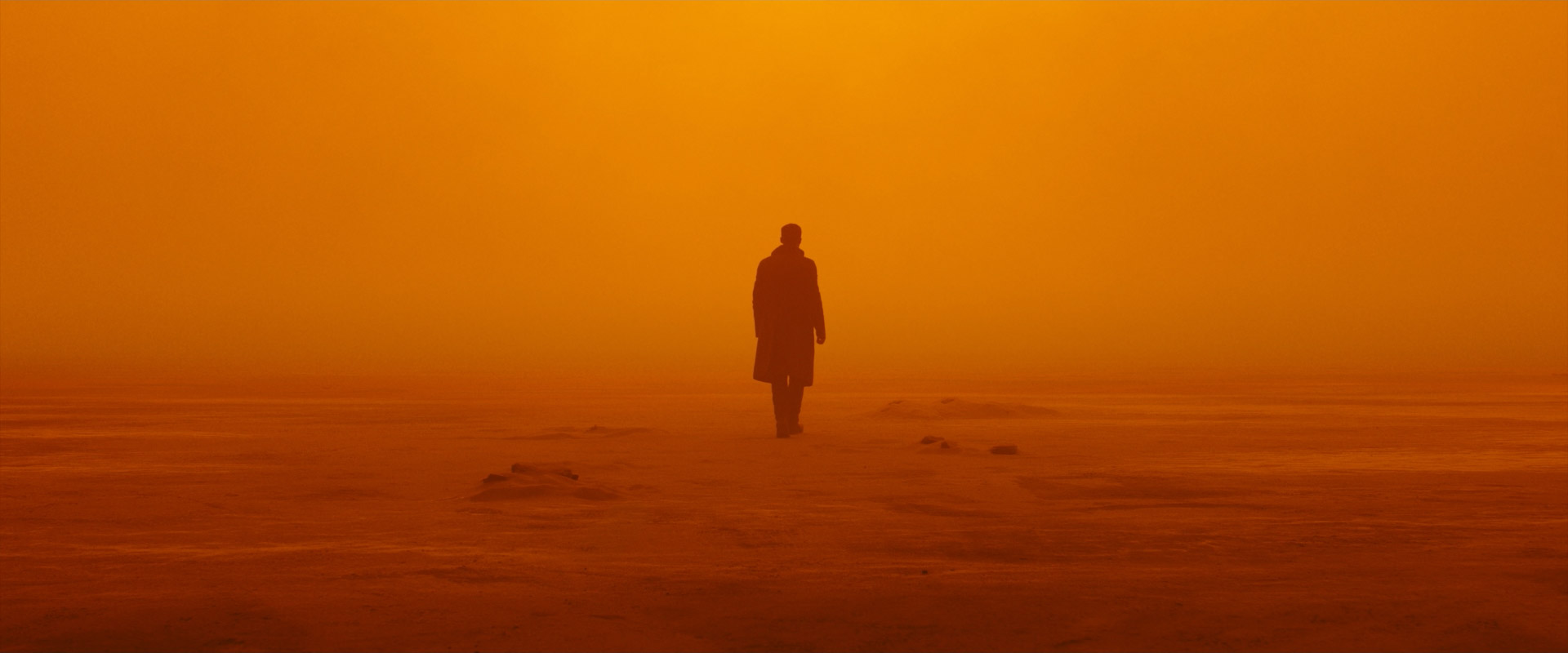
- Danger and sickness. The Mexico scenes of Traffic (2000) are pushed to a harsh yellow; Blade Runner 2049 (2017) turns an abandoned city into orange dust.
The cozy and the toxic versions differ mostly in saturation and contrast.
How to shoot and grade a warm palette
Start with objects. Warm light can't make a blue wall orange. Choose wood, brick, ochre and costumes in rust and mustard; keep blues small.
Use warm sources. Tungsten lamps (about 3200K) on a camera balanced to 5600K render deep orange; a full CTO gel converts daylight fixtures to roughly tungsten. Candles sit near 1900K — see firelight — and low sun is naturally amber, which is why golden hour carries so many warm exteriors. The numbers are in color temperature.
Keep depth. Let shadows fall to deep brown, not flat orange; light haze separates planes.
Grade with restraint. Warm midtones and shadows, keep highlights clean, and keep faces near the skin-tone line on the vectorscope. A small cool accent makes the warmth read stronger — the logic of complementary colors.
Warm vs. cool color palette
A warm palette pulls toward red and amber; a cool color palette pulls toward blue, cyan and cold green.
| | Warm | Cool | |---|---|---| | Typical sources | Tungsten, candles, low sun | Shade, moonlight, fluorescent | | Default reading | Closeness, memory, heat | Distance, calm, loneliness | | Pushed hard | Fever, fire, alarm | Clinical, frozen |
Many films cut between them to separate worlds or times — a warm past against a cool present. Within one frame, warm skin against a cool background is the familiar orange-and-teal split.
When does a warm palette feel threatening?
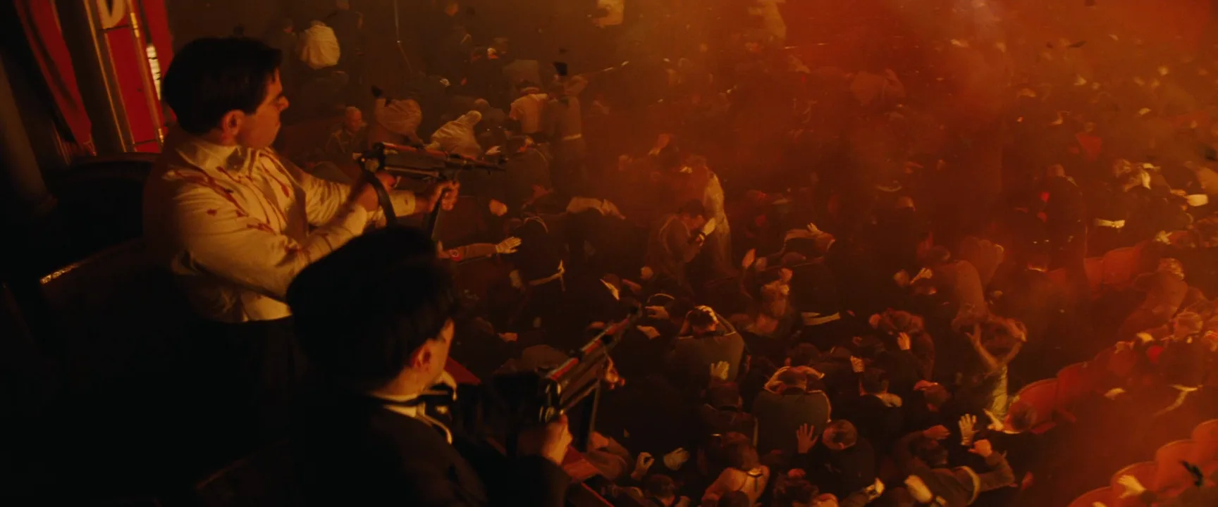
Three things flip warm from welcoming to hostile. Saturation: once reds and oranges clip, faces lose detail and the image feels feverish. Monotony: every surface the same orange, with no neutral relief. No source: a room simply flooded red reads as an alarm, not a home.
Warm Color Palette examples in film
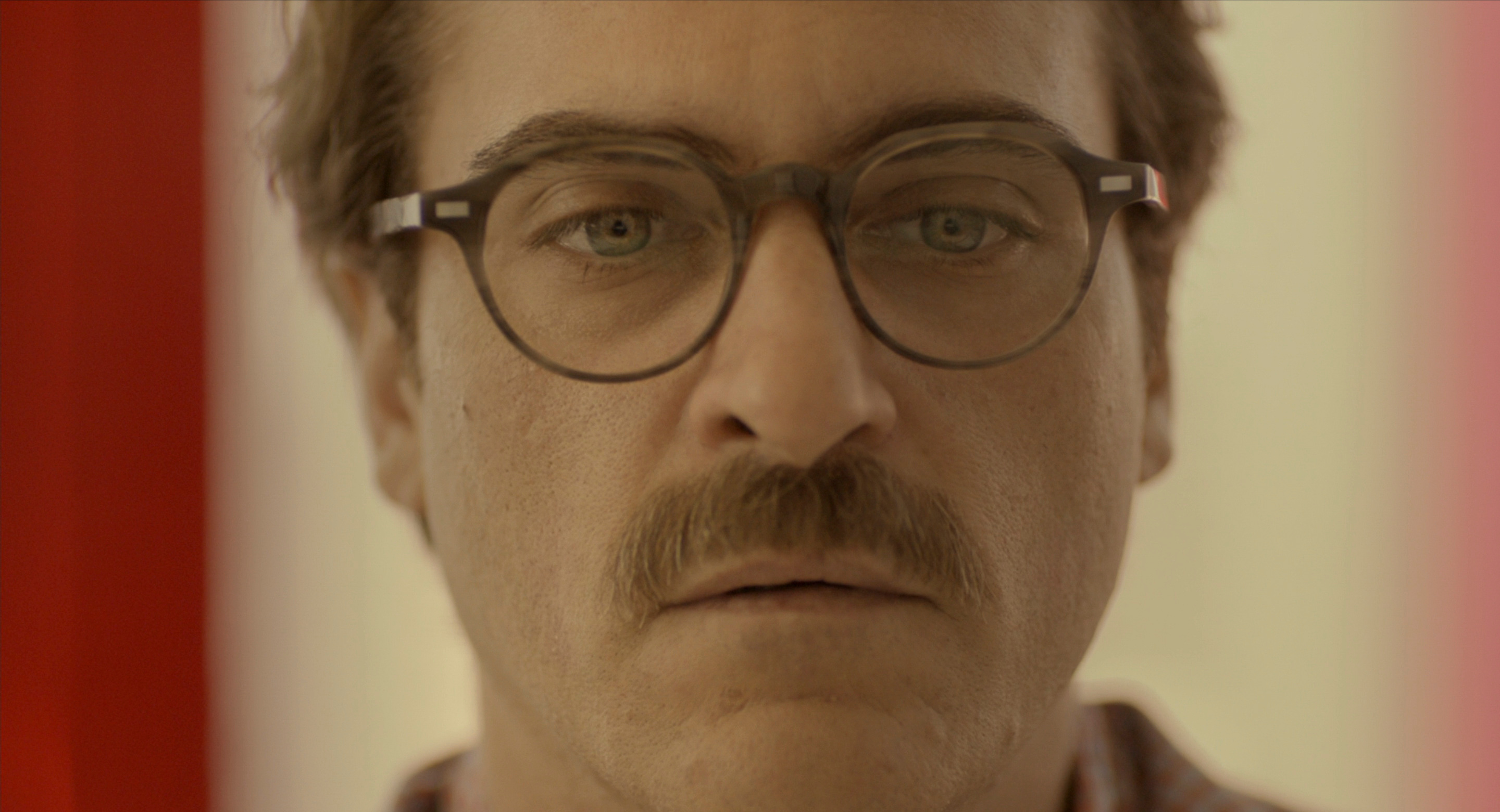
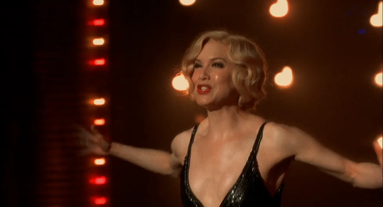
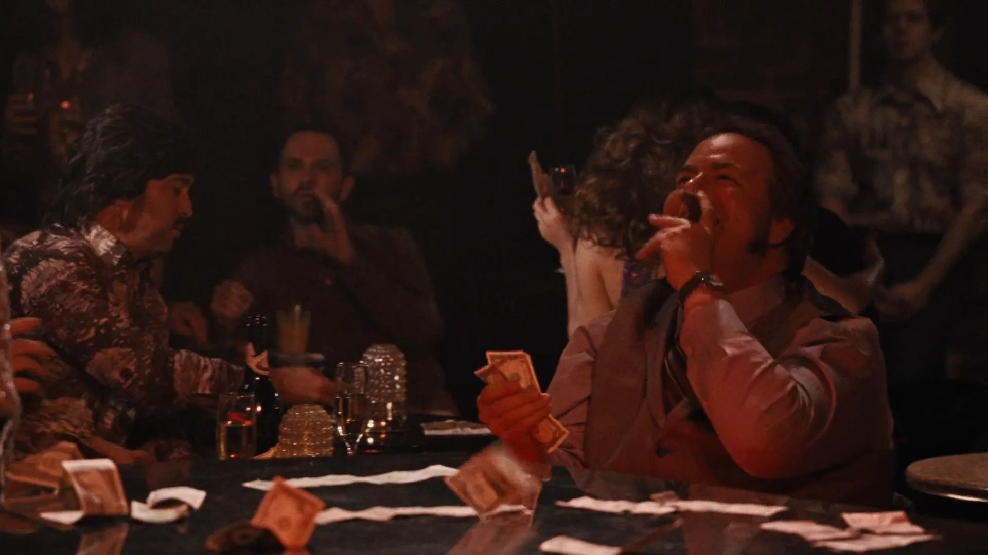
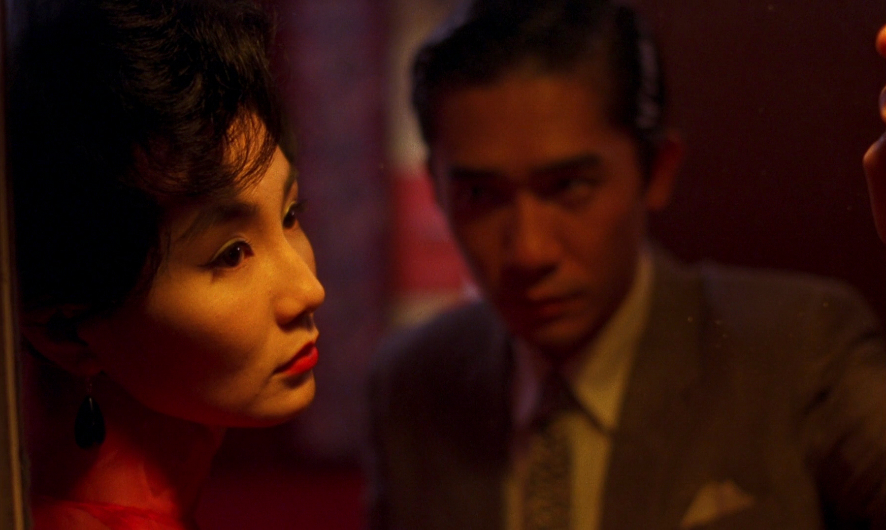
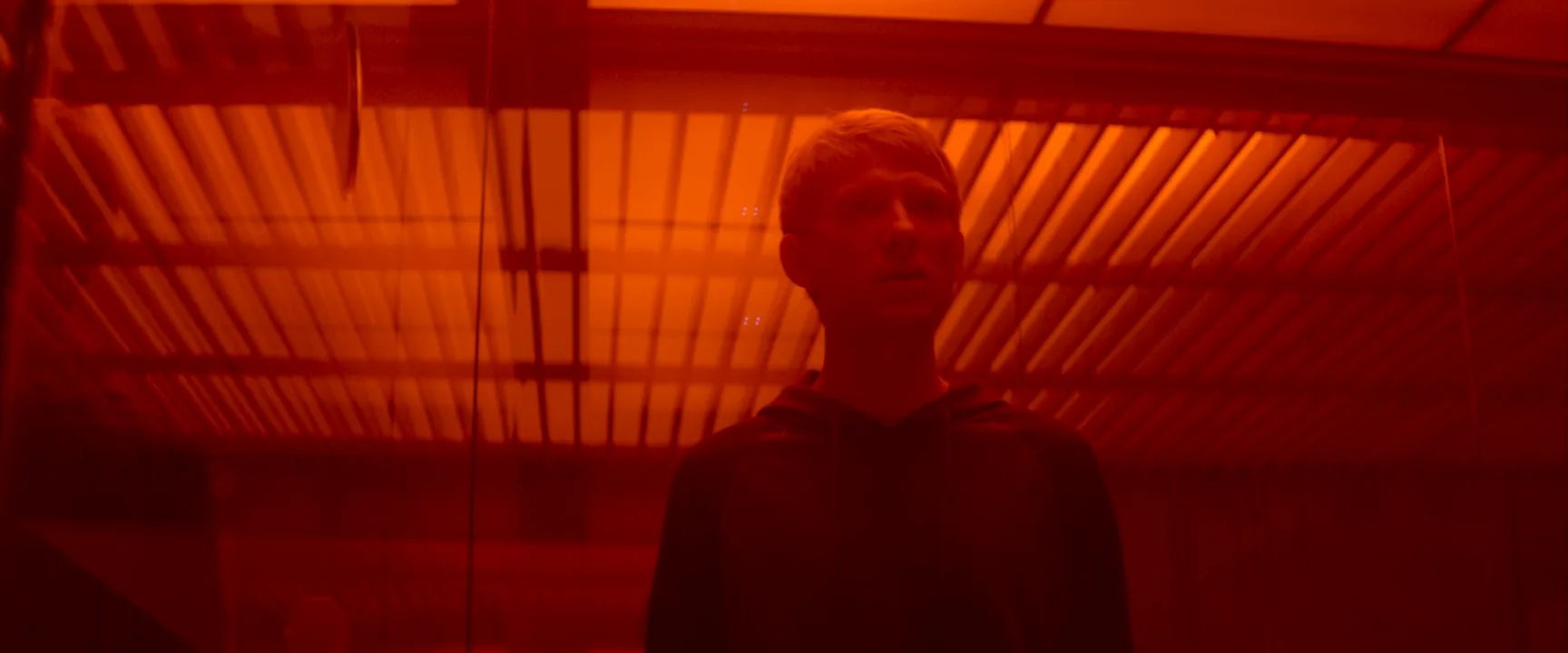
9 framesFrames where warm hues dominate the whole image, from gentle amber to menace.

How to create a warm color palette with AI
4 promptsImage models treat "warm" as a filter unless you give them warm sources and materials to render. Name the lamps, the surfaces and the shadow color. On a FlashBoards board, pin the film frames next to your takes and compare them side by side before animating the best one. The fourth prompt re-shoots a real film shot from a text description alone, and the original plays next to the result so you can compare.
Wide medium shot inside a small 1970s roadside diner at dusk, warm color palette: amber tungsten pendant lamps, orange vinyl booths, honey wood paneling, low golden sun through the front window. A fictional waitress in her fifties with a gray braided bun and a mustard-yellow uniform pours coffee for a lanky young man with a shaved head and a rust corduroy jacket. Seated eye height, 35mm lens, light haze, deep brown shadows, one small teal neon sign far in the background. Cinematic film still.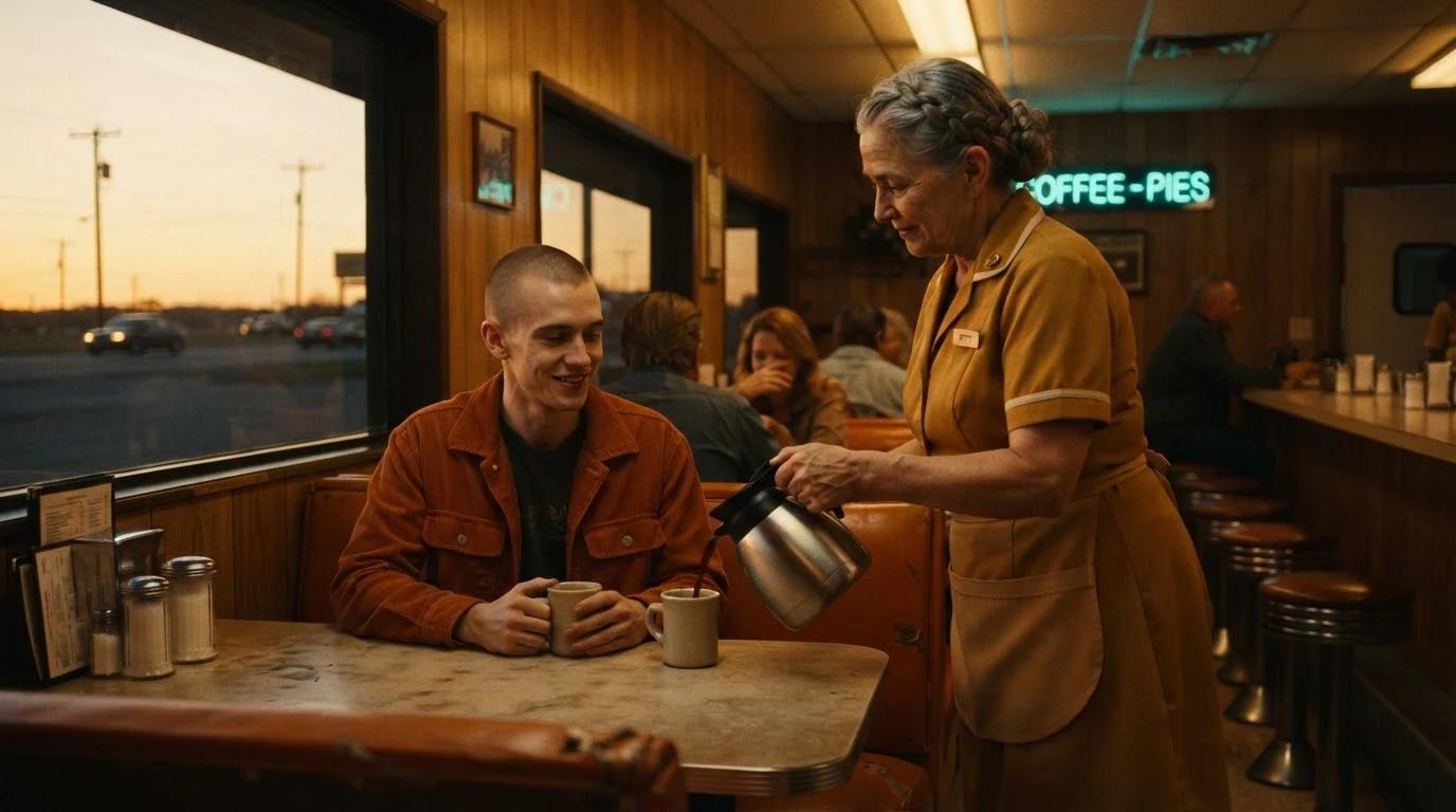
Warmth is named in three layers: sources (pendants, low sun), materials (vinyl, wood, mustard and rust costumes) and shadow color. The single teal sign gives a cool reference so the amber reads stronger.
Open FlashBoardsAnamorphic widescreen shot at golden hour on a dry hillside of wooden beehives, palette of honey, ochre and burnt orange. A fictional elderly beekeeper with a square-trimmed white beard and a frayed straw hat lifts a frame dripping with amber honey. Low sun behind him from frame left puts a gold rim on his beard; dust and bees glow in the backlight. Chest height, 50mm, shallow depth of field, skin tones natural, warm brown shadows.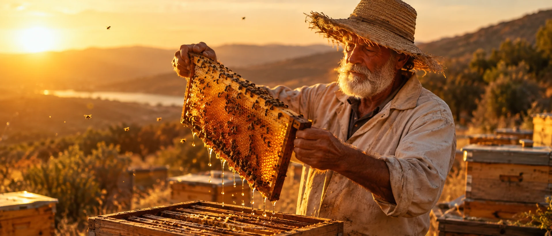
Here daylight makes the warmth: "golden hour", "low sun behind him" and "gold rim". "Skin tones natural" stops the model from painting the face orange.
Open FlashBoardsCamera: slow, steady push in at seated eye height, from the wide medium shot to a medium two-shot of the waitress and the young man. Action: Coffee is already streaming into his cup and haze drifts through the golden window light. She finishes pouring and sets the pot on the counter. He wraps both hands around the mug and laughs while the amber pendant lamps glow above them.The pour and haze move from the first frame, so the clip starts alive. Everything named already exists in recipe 1, and restating the lamps keeps the palette stable.
Open FlashBoards{
"output": "Full-screen live-action film shot from Ex Machina (2015), alive from its very first frame: one continuous shot, no cuts. Look: a monochrome red image like a darkroom safelight during a power failure; a ceiling of thin horizontal louvre slats fills the whole background, glowing orange-red from above; every wall, slat and shadow is scarlet, orange or maroon; low contrast, soft haze, grainy 35mm film, scope frame.",
"characters": {
"S1": {
"name": "Caleb, played by Domhnall Gleeson",
"look": "slender young man, close-cropped sandy hair, dark wool sweater, face and body in dim red near-silhouette",
"voice": "quiet, urgent, low"
},
"S2": {
"name": "Ava, played by Alicia Vikander",
"look": "never seen except one blurred out-of-focus hand at the right edge of frame",
"voice": "soft, even, pleading"
}
},
"shots": [
{
"shot": 1,
"camera": "locked-off static shot from slightly below, chest height tilted up, 40mm; Caleb mid-chest up in the left-centre third; the frame never moves",
"action": [
"BEGINNING: alive from the first frame, Caleb stands still under the red slatted ceiling, head turned slightly toward screen right, looking toward screen right, lips moving as he speaks, arms down out of frame",
"THEN: he finishes speaking and holds still, jaw set, eyes staying on screen right, breathing",
"THEN: a blurred out-of-focus hand rises into the right third of frame close to the lens, fingers spread, moving slowly",
"END: the blurred hand hovers at the right edge while Caleb stays still, looking toward it, face unchanged"
],
"dialogue": [
{
"speaker": "S1",
"on_screen": true,
"when": "from the first frame",
"delivery": "low, urgent, barely above a whisper",
"line": "<d>[English] He's gonna reprogram your Ai. Which is the same as killing you.</d>"
},
{
"speaker": "S2",
"on_screen": false,
"when": "right after Caleb finishes, as the hand rises into frame",
"delivery": "soft and pleading, off screen",
"line": "<d>[English] Caleb, you have to help me.</d>"
}
]
}
],
"sound": {
"ambience": "dead quiet room during a power cut, faint electrical hum",
"speech": "exactly these spoken phrases, each said once, in this order",
"never_spoken": "no narration and no voice-over: the descriptions, performance notes and step words of this prompt are never spoken aloud",
"music": "a film score under the scene, always below the voices: a low droning synth pad with a slow uneasy pulse",
"subtitles": "none"
}
}Remakes the Ex Machina (2015) power-cut shot of Caleb under slatted red ceiling panels, keeping the static low angle, one-hue red frame, near-silhouette, the film's two lines and Ava's blurred hand at the edge.
The hostile end of a warm palette: one hue on every surface and no lamp in frame, so the red reads as alarm, not home. Monochrome red like a darkroom safelight keeps the model from adding teal edges; near-silhouette keeps the face unlit.
Open FlashBoardsCommon mistakes
- Yellow wash. "Warm" alone tints everything like a photo filter. Name warm sources and materials instead.
- Orange skin. Add "skin tones natural" and keep lamps as practicals in frame.
- Muddy shadows. Ask for "deep brown shadows" plus haze or backlight to separate planes.
- Unwanted teal. Models often add blue shadows; name the background — "ochre walls", "honey wood".
- Video cools down. Repeat the warm sources in the video prompt.
Keep the reference frames, prompts and every generated take side by side — images and video in one canvas.
FAQ
5 questionsWhat do warm colors mean in film?
Warm colors — reds, oranges, ambers, yellows — usually signal closeness, comfort, nostalgia or heat, because we link them to fire, household lamps and low sun. Dose matters: soft, low-contrast amber reads as home or memory, while saturated, clipped orange or red reads as fever, danger or sickness.
What is the difference between warm and cool colors in film?
Warm colors sit on the red–yellow side of the wheel and feel close, lived-in and emotional; cool colors sit on the blue–cyan side and feel distant, calm or clinical. Warm tones seem to advance, cool tones recede. Many films cut between them to separate past and present or safety and threat.
How do you get a warm look in camera?
Dress the set in wood, brick, rust and mustard. Light with tungsten around 3200K on a daylight-balanced camera, CTO-gelled fixtures, candles or golden-hour sun. Then warm midtones and shadows in the grade while keeping skin natural and highlights clean. A small cool accent makes the warmth read stronger.
Can a warm color palette feel scary?
Yes. Pushed to heavy saturation, spread over every surface with no neutral relief, or flooding a room with no visible source, warm hues read as heat, alarm or illness. The same amber that feels cozy at low contrast feels hostile at high contrast.
What is an amber or golden look?
An amber or golden look is a warm palette centered on yellow-orange rather than red: honey highlights, gold skin, brown shadows. It usually comes from tungsten practicals or golden-hour sun plus a gentle warm grade, and suits period pieces, memories and romance. Keep shadows dense or it slides into flat sepia.
Related terms
5- Cool Color PaletteColor
A cool palette is dominated by blues, cyans and cold greens; it tends to read as distance, calm, loneliness, night or clinical control.
- Color TemperatureLighting
Color temperature describes how warm or cool a light source is, measured in kelvin: candlelight around 1900K, tungsten about 3200K, daylight about 5600K, overcast and shade higher still.
- Golden HourLighting
Golden hour — which filmmakers call magic hour — is the short window after sunrise and before sunset when the low sun gives warm, soft, raking light and long shadows; crews often keep shooting into the blue twilight that follows.
- FirelightLighting
Firelight is light from — or imitating — flames: candles, fireplaces, torches, campfires; warm, low and flickering, it falls off quickly into darkness, and on set is often faked with flicker effects on dimmed tungsten lamps.
- Color PaletteColor
A film's color palette is the limited set of colors that dominates its images — in sets, costumes, light and grade — chosen to give the film a coherent look and emotional temperature.
Further reading
Patti Bellantoni, If It's Purple, Someone's Gonna Die: The Power of Color in Visual Storytelling (Focal Press). Alexis Van Hurkman, Color Correction Handbook (Peachpit Press).