 FlashBoards Learn
Color · Film language
Complementary Colors
Also called: complementary color scheme, teal and orange, orange and teal, opposite colors
Complementary colors sit opposite each other on the color wheel: red and green, blue and orange, yellow and purple. Placed in the same frame they produce the strongest possible color contrast, so the eye separates subject from background instantly. Teal and orange, warm skin against cool shadows, is the best-known film version.
- What it does
- Pairs two opposite hues so each looks more intense and the subject separates from the background at a glance.
- Use it when
- You need a face, prop or costume to pop, or want a scene to carry visual tension between two forces.
- Watch out
- Two fully saturated complements at equal size fight each other; let one dominate and keep the other as an accent.
- Try this prompt
cinematic night harbor, teal sky and water fill the frame, a single orange lantern lights her face, natural skin, 50mm
What are complementary colors in film?
Complementary colors are pairs of hues that sit directly across from each other on the color wheel. On the painter's wheel most people learned in school, the classic pairs are red and green, blue and orange, and yellow and purple. In a frame, a complementary scheme means the image is built mostly around one such pair: one hue for the world, its opposite for whatever needs the viewer's attention.
Filmmakers work with light and digital color, so it helps to know the second wheel too. In additive color (the RGB system cameras, monitors and grading software use), the opposites are red and cyan, green and magenta, blue and yellow. The two wheels agree closely on the pair cinema uses most: orange and a blue that leans toward cyan, which is why the look is called teal and orange rather than blue and orange. On a vectorscope a complementary scheme is easy to see: the trace stretches in two directions roughly 180 degrees apart instead of clustering in one area.
Why the pairing works comes down to perception. Placed side by side, opposite hues intensify each other, an effect color scientists call simultaneous contrast: a green wall makes a red coat look redder, and an orange face looks warmer against a blue background. That is the core of complementary color theory as cinematographers use it. The contrast comes from hue, not brightness, so it separates a subject even in a flat, evenly lit frame.
A complementary scheme is a structure for a film's color palette, not a palette in itself. The same red-and-green pair can feel festive in a Christmas comedy and poisonous in a horror film; what changes is saturation, how much of each color appears, and where it sits in the frame.
Why do filmmakers use complementary colors?
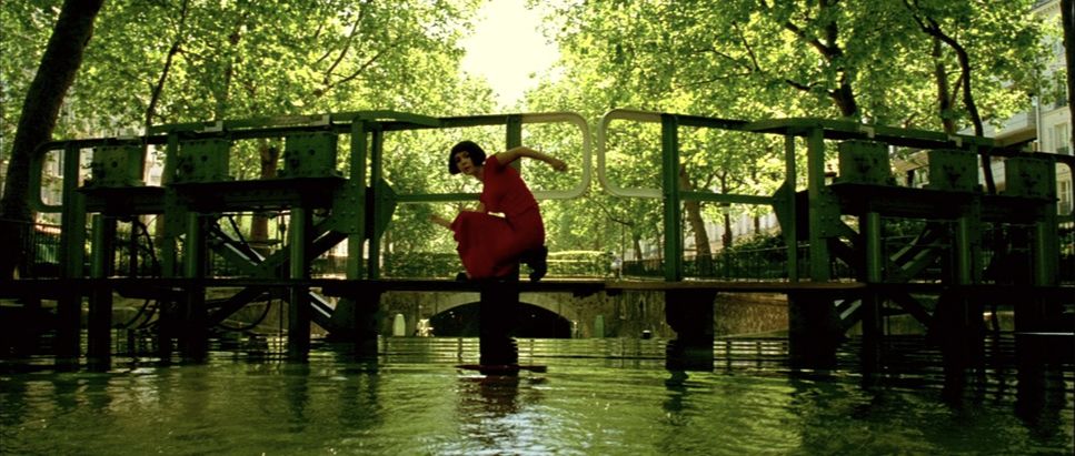
Separation. The most practical reason is to pull a subject off the background. A red coat in a green park, an orange face against a blue night: the eye finds the opposite hue before it reads anything else in the frame. Jean-Pierre Jeunet and Bruno Delbonnel built Amélie (2001) on this, dressing the heroine in saturated reds inside a world pushed toward greens and golden yellows.
Tension and conflict. Two opposite hues in one image read as two forces that do not blend. Hitchcock's Vertigo (1958) is the canonical case: Madeleine first appears in an emerald-green wrap against the deep red walls of Ernie's restaurant, and green returns in her car and in the neon outside the hotel where Judy lives. The complement marks her as out of place, an image that does not belong to the world around her. Kubrick's Eyes Wide Shut (1999) plays a similar game with cold blue window light against warm tungsten and Christmas-light interiors, keeping the domestic warmth and the threatening night in the same shot.
Vibrancy without extra saturation. Because complements amplify each other, a scheme can feel vivid even when neither color is pushed hard. A muted teal wall behind a dusty orange sweater looks richer than the same sweater against grey.
Story coding. Once a film assigns each hue a meaning (one character, one place, one state of mind), the pair can track a conflict across scenes. That link between hue and meaning belongs to color symbolism, and complementary schemes make the coding especially legible because the two sides never mix into one color.
Teal and orange: the complementary look of modern movies
Teal and orange is complementary color reduced to its most commercial form. The logic starts with skin. Human skin of every tone sits in a narrow hue range between red and yellow; graders call it the skin-tone line on the vectorscope. If faces are orange, the most effective way to make them stand out is to push everything else toward the opposite hue: teal shadows, cyan skies, blue-green night.
The look spread with the digital intermediate. Once whole features could be graded digitally (O Brother, Where Art Thou? in 2000 is usually named as the first), a colorist could isolate skin with a qualifier and shift the rest of the image independently. Through the 2000s, action and blockbuster cinema adopted the split so widely that it became a cliché, and by the 2010s critics were mocking posters in which every image was orange and blue.
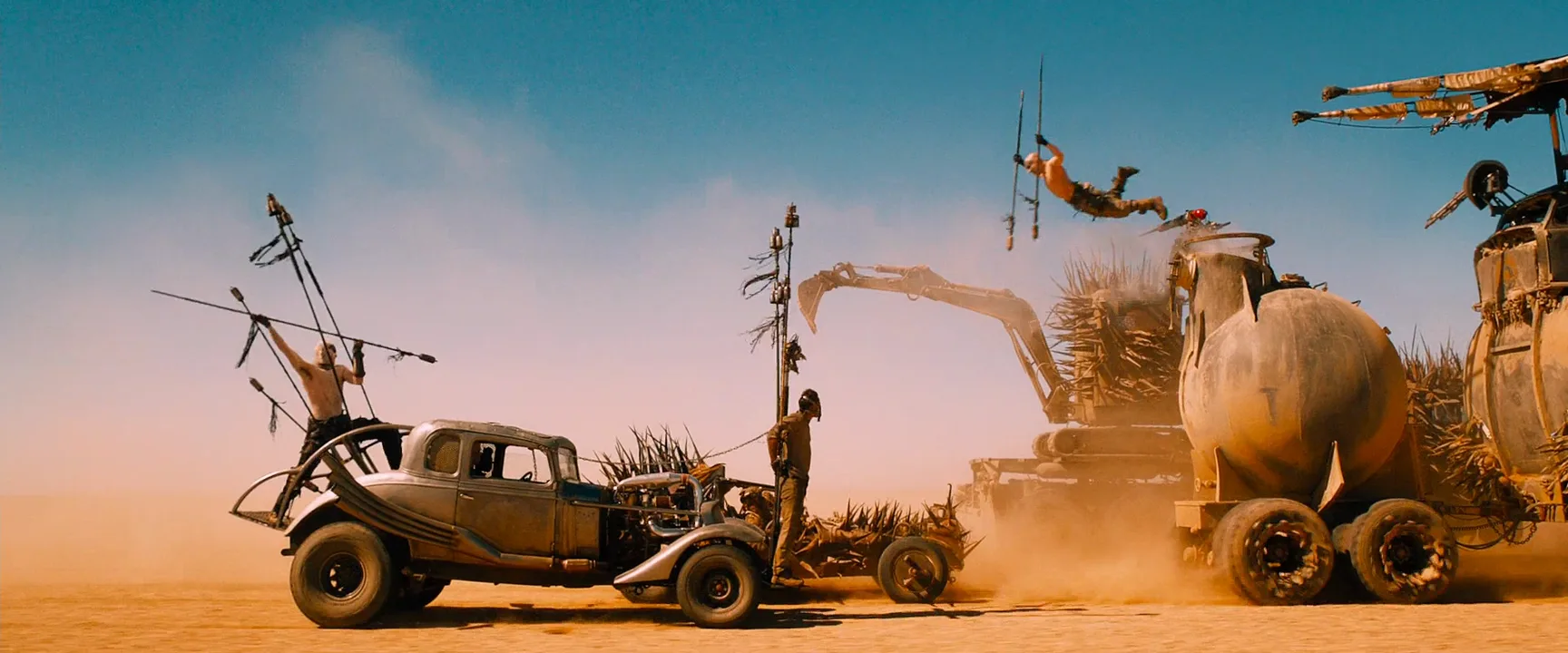
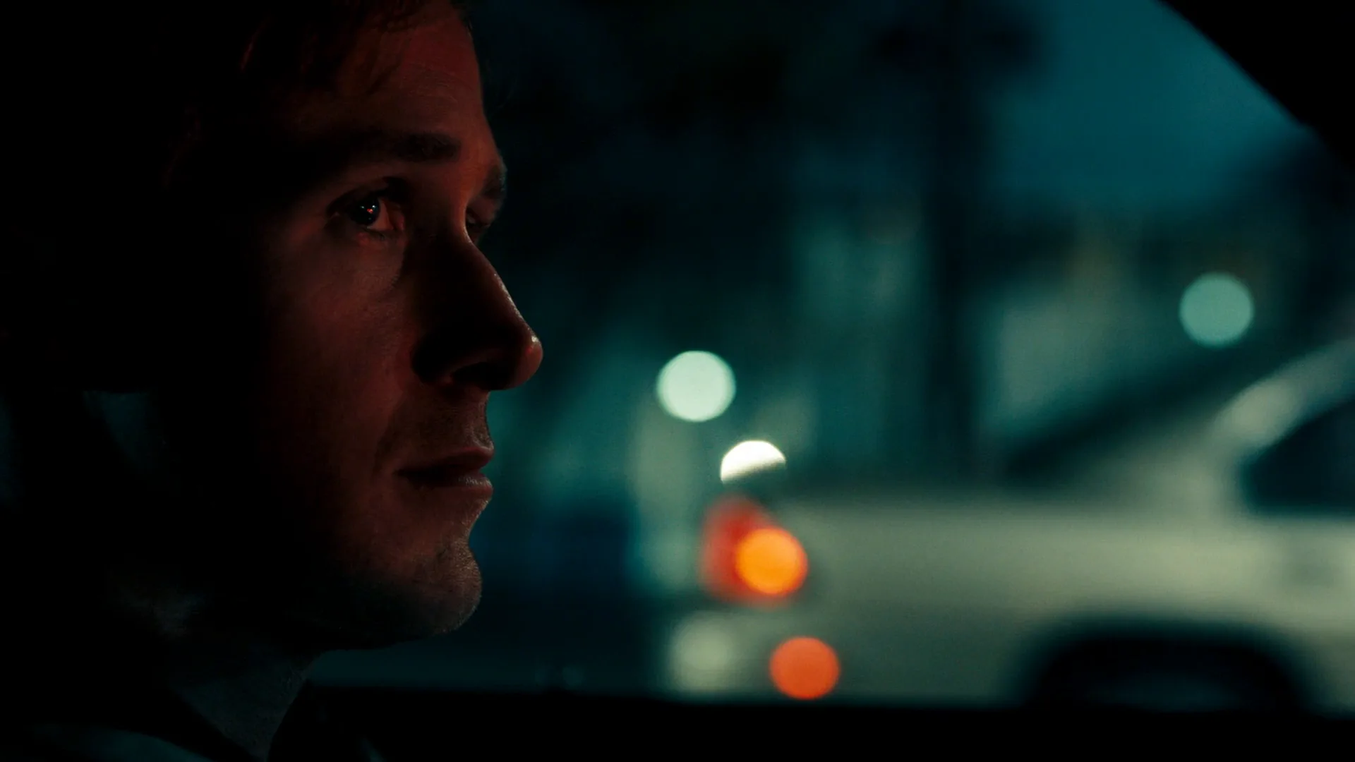
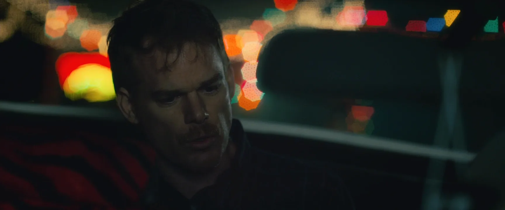
Used with intent, it still works. Mad Max: Fury Road (2015) pushes its day scenes to burnt orange sand under hard cyan sky, and its night scenes, shot day for night, into deep blue: the two halves of one complementary pair spread across the film. Drive (2011) keeps faces warm under sodium and tungsten light while the city behind stays teal. The difference between these and the generic version is restraint: one side of the pair carries the scene, the other appears only where it matters.
Three things keep teal and orange from looking like a preset:
- Protect neutrals. If white shirts, grey concrete and daylight all turn cyan, the image looks tinted instead of designed. Keep some true neutrals in the frame.
- Motivate it in the lighting. Tungsten practicals against blue dusk or daylight give the grade something real to push. For the physics behind that warm-cool split, see color temperature.
- Watch the skin. Pushing orange too far turns faces sunburned; pushing shadows too far into teal drags green into the skin. Grade the background, then check faces last.
How to create a complementary color scheme on set and in the grade
A complementary scheme is strongest when it is built before the camera rolls, not only added in post. Work through it department by department.
1. Pick the pair and the ratio. Decide which hue owns the world and which one is the accent. A useful rule of thumb is roughly 70 to 80 percent dominant hue and 20 to 30 percent accent. Equal amounts of two saturated opposites vibrate and tire the eye; a small accent against a large field reads as intention.
2. Put it in the set and costumes. Production design and costume design carry most of the color in any frame. Paint walls, choose upholstery and dress extras in the dominant family; reserve the accent for the lead's costume, a key prop or a single light source. Test fabrics on camera: many greens and teals shift noticeably under different light sources.
3. Light for it. The cheapest complementary setup is mixed color temperature. Set the camera to around 4300K, light the face with a 3200K tungsten source and let 5600K daylight or a blue-gelled backlight fill the background: the tungsten reads orange, the daylight reads blue. For stronger hues use lighting gels (full CTB turns a 3200K lamp to roughly daylight, full CTO does the reverse) or RGB LED fixtures dialed to exact hues. Keep the two colors on separate surfaces; where they overlap on a face they mix toward grey or muddy magenta.
4. Control saturation. A complementary pair does not have to be loud. Lowering color saturation on the dominant side while keeping the accent slightly richer is often enough. Some of the best examples use a dusty teal and a faded brick red.
5. Finish in the grade. In the grade, push shadows and background toward the dominant hue, key the accent (skin, costume, prop) and hold it steady, and watch the vectorscope: a clean scheme shows two distinct arms on opposite sides of center. Check the image on a calibrated monitor before judging it; laptop screens often exaggerate cyan.
6. Keep a reference board. Collect frames that use your exact pair and ratio, and show them to production design, wardrobe and the gaffer before the shoot, so everyone builds the same scheme.
Split-complementary and other variations
Pure complements are not the only option, and sometimes they are too blunt.
- Split-complementary. Take one hue and pair it with the two colors on either side of its opposite: orange with teal and blue-violet, for example. You keep strong contrast but lose some of the head-on clash, which suits drama more than action.
- Double complementary (tetradic). Two complementary pairs in one frame, such as red-green plus blue-orange. It is rich and hard to control; stylized, heavily designed films use it, usually with one pair dominant and the other quiet.
- Complementary accent in a monochrome frame. A frame that is almost entirely one hue, with a small spot of its opposite. This sits between a complementary scheme and a monochromatic color scheme and is one of the most effective ways to direct the eye: a single red object in a blue-grey world.
- Complementary across a cut or a film. The pair does not have to share one image. Alternating orange day scenes and blue night scenes, or a warm storyline and a cool storyline, sets up the same opposition over time.
In every variant the contrast is a dial, not a switch: move away from the exact opposite, or shrink the accent, and tension drops while separation stays.
Complementary colors vs. color palette
A color palette is the full, limited set of colors a film uses across sets, costumes, light and grade. A complementary scheme is one way of organizing that palette: around a pair of opposite hues. Every film has a palette; not every palette is complementary.
The common alternatives make the difference clear:
| Scheme | Built from | Typical effect | |---|---|---| | Complementary | Two opposite hues | Maximum contrast, separation, tension | | Analogous | Neighboring hues (orange, amber, yellow) | Harmony, calm, a unified mood | | Monochromatic | Shades of one hue | Strong atmosphere, little separation | | Warm or cool | One side of the wheel | Temperature and emotional tone |
A warm color palette or cool color palette describes which half of the wheel dominates; a complementary palette deliberately uses both halves at once. In practice many films mix approaches: an analogous warm palette for most of the running time, with a complementary accent reserved for the scenes that matter. When you plan a look, decide on the palette first (the specific hues, their saturation and brightness), then decide whether it should be structured as a complementary pair. For more on how hue choices build a film's look, browse the color hub.
Complementary Colors examples in film
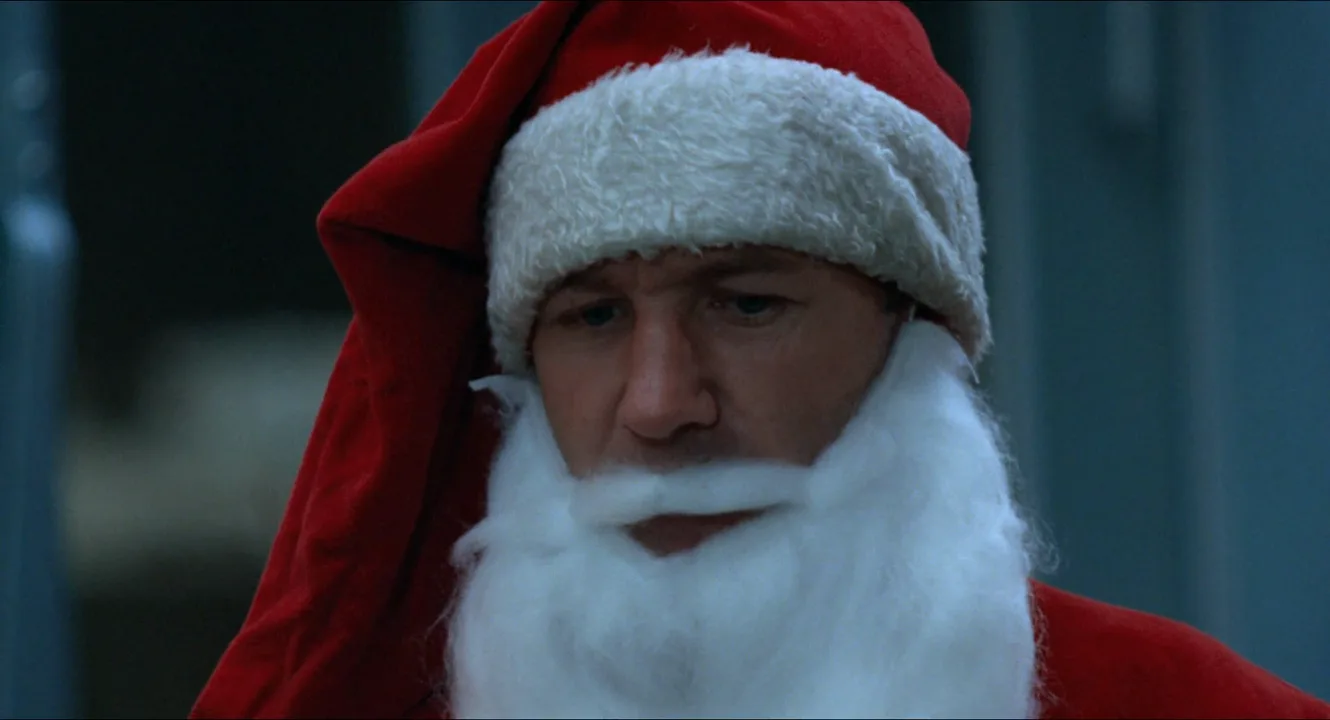
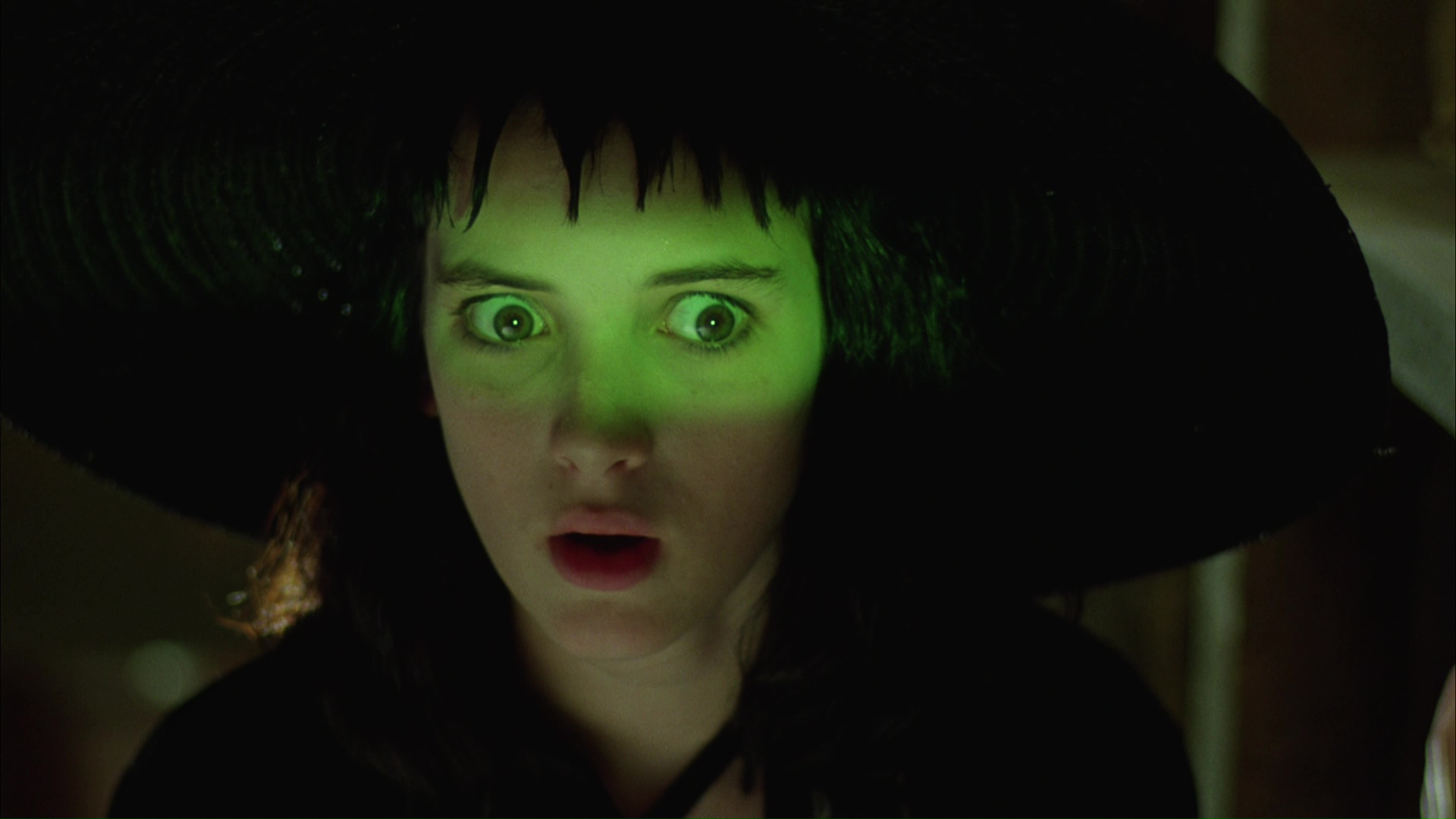
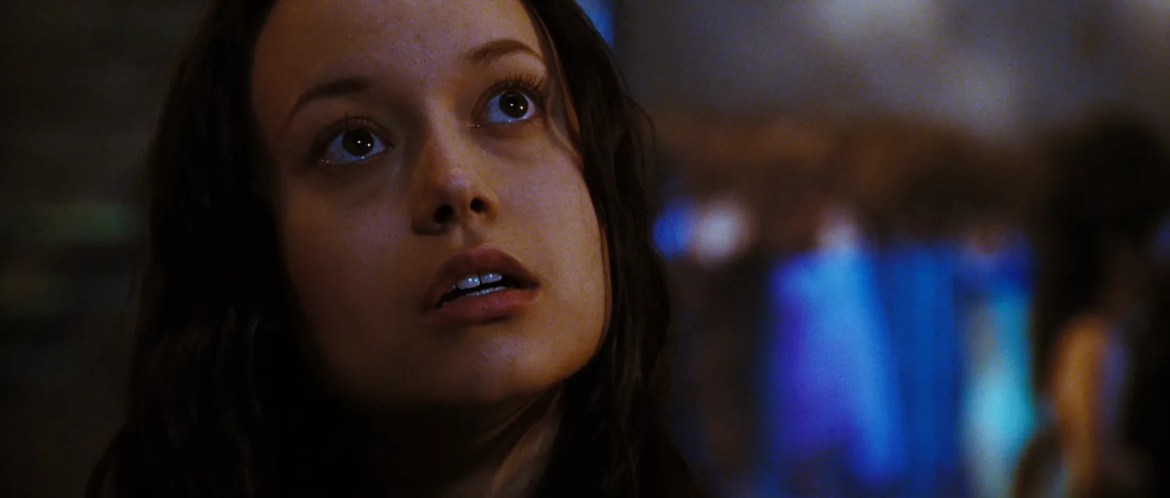
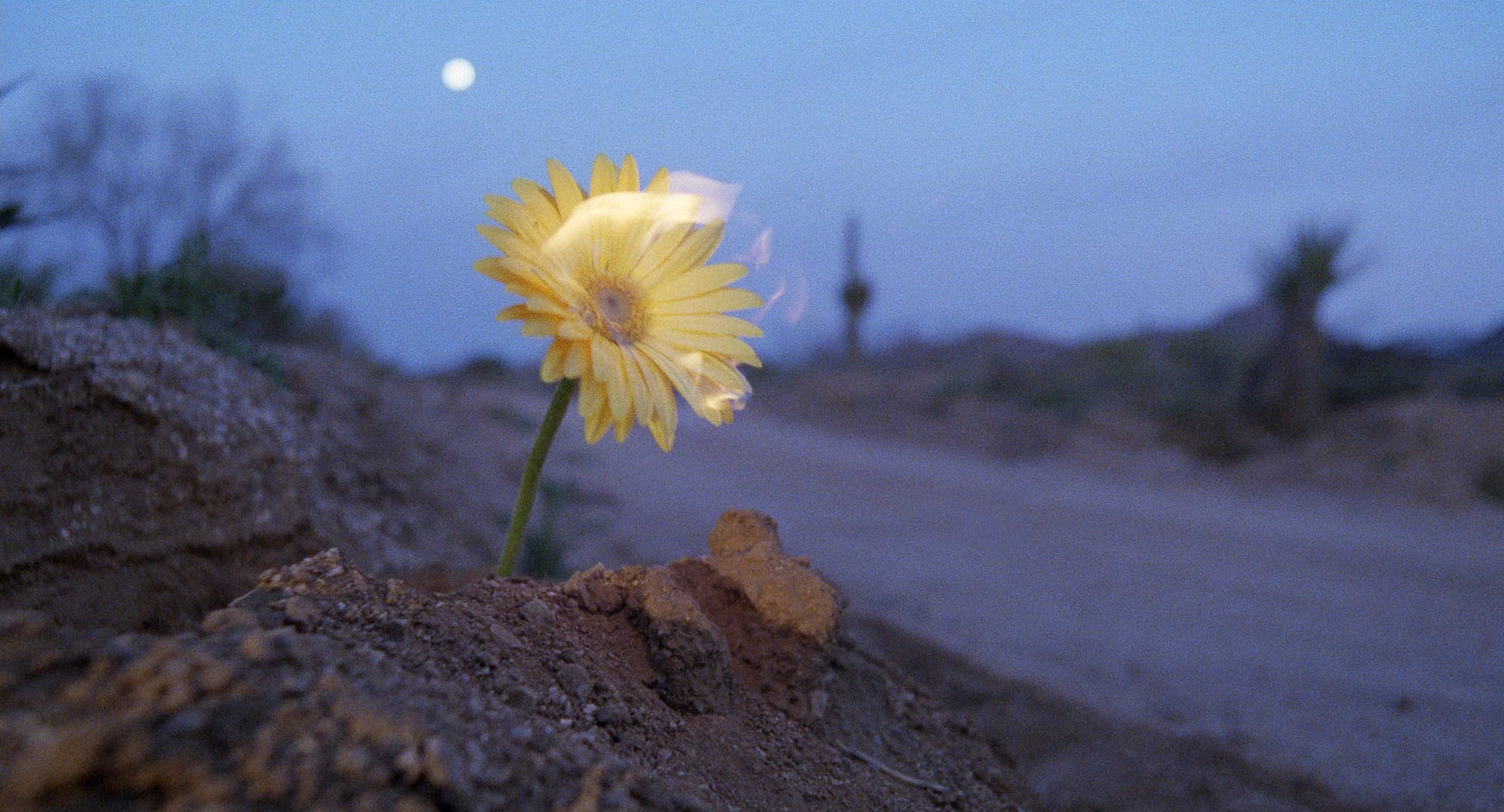
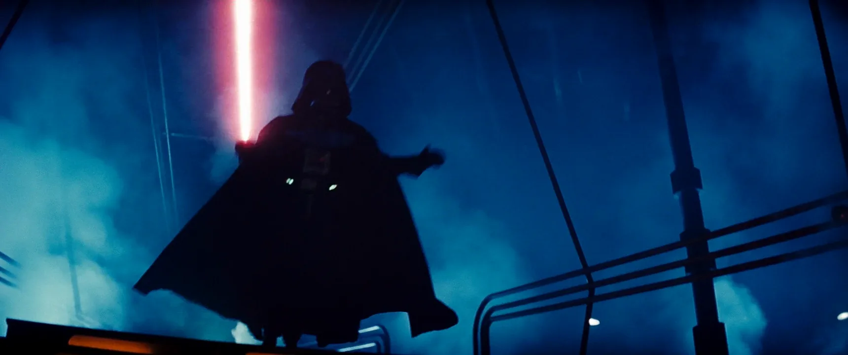
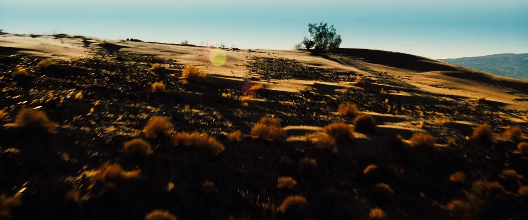
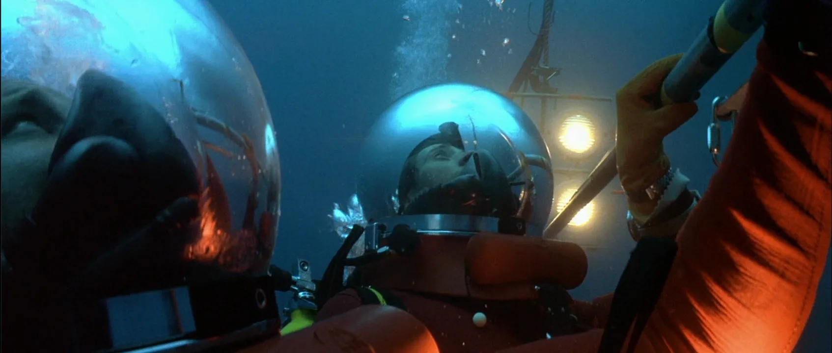
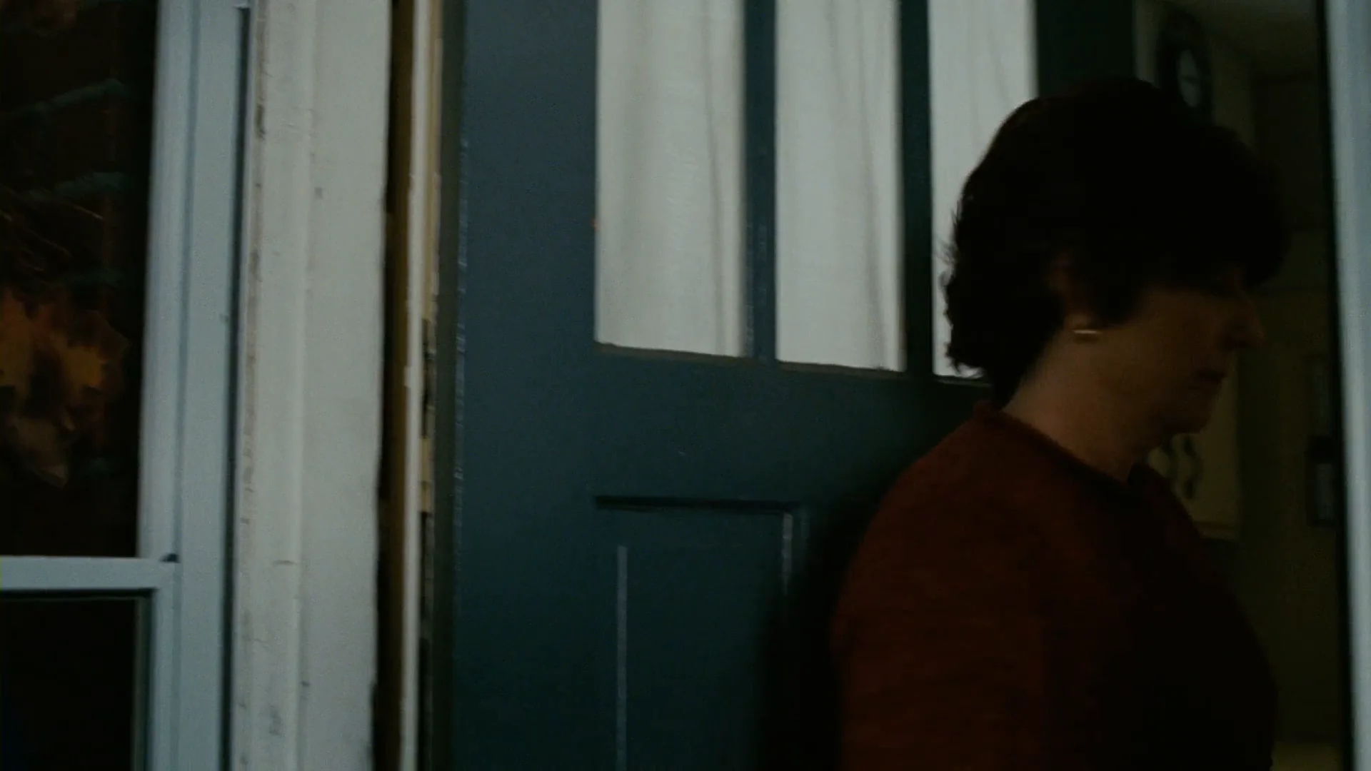
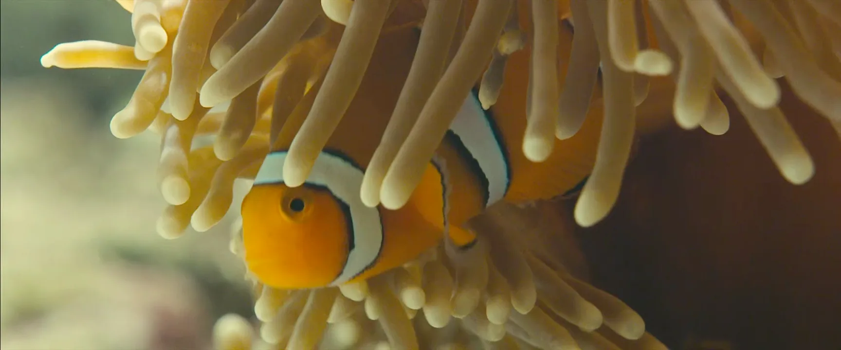
15 framesFrames where two opposite hues carry the image: teal and orange, red and green, blue and yellow, magenta and green. Notice how much of each color appears and where the accent sits.

How to create a complementary colors with AI
4 promptsImage models know the phrase teal and orange, but they tend to apply it as a filter over everything. To get a designed complementary scheme, name which objects carry each hue, how much of the frame each one owns, and where the light comes from. On a FlashBoards board you can keep reference frames next to each take and compare the color balance side by side. The fourth prompt re-shoots a real film shot from a text description alone, and the original plays next to the result so you can compare.
Cinematic medium close-up at night on a rain-wet wooden harbor pier: a woman in her early forties with a shaved undercut, a thick dark-copper braid over one shoulder, a small silver ring in her nose and weathered hands, wearing a navy oilskin coat, holds a lit brass kerosene lantern at chest height. Complementary teal and orange color scheme: deep teal night sky, teal-green harbor water and teal-painted railings fill most of the frame; the only warm color is the lantern's orange flame, lighting her face and hands. Natural warm skin, cool cyan shadows, 50mm lens at eye level, shallow depth of field, light rain, 35mm film grain.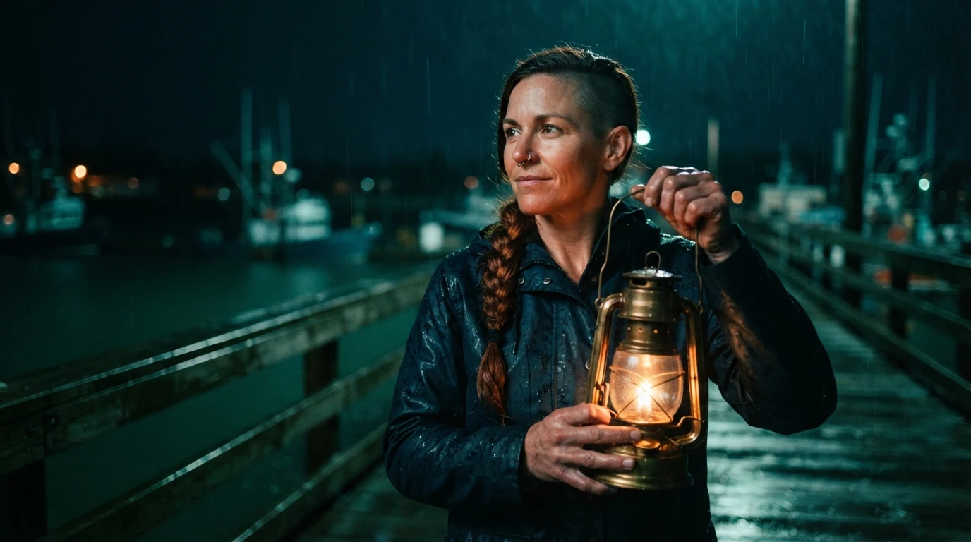
Assigning teal to named surfaces (sky, water, railings) and orange to one named source keeps the model from tinting the whole image. Saying the flame is the only warm color sets the ratio, and natural warm skin stops faces from turning cyan.
Open FlashBoardsWidescreen symmetrical wide shot of a narrow 1960s roadside diner at dawn: a thin older man with a white goatee, horn-rimmed glasses and a bright red cardigan sits alone at the center of a long counter. Walls, vinyl booths, stools and the counter are all muted sage and bottle green; his red cardigan and a single red neon clock above him are the only red in the frame, about one fifth of the image. Soft overhead fluorescent light, 32mm lens at chest height, quiet lonely mood, fine film grain.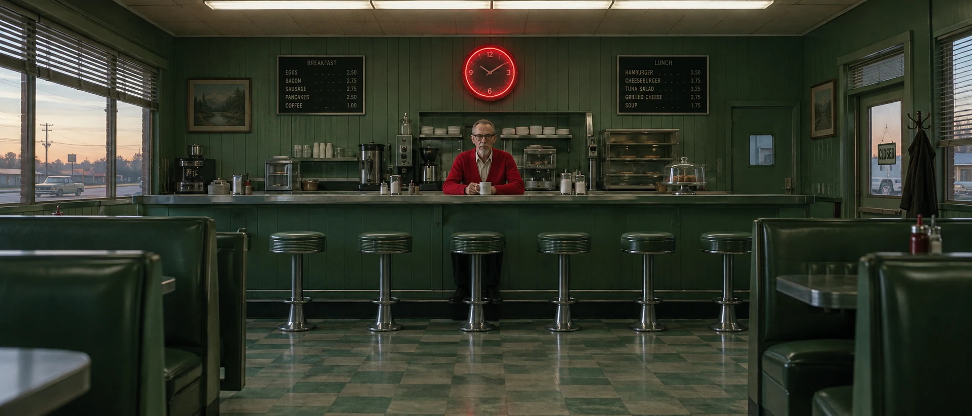
This take switches the pair to red and green and moves the scheme into production design rather than lighting. Naming every green surface and limiting red to two objects, with an explicit one fifth share, produces a clear dominant-accent split.
Open FlashBoardsCamera: slow, steady push-in at eye level from medium close-up toward a close-up of her face. Action: The lantern flame is already flickering and rain is falling through the orange light as she raises the lantern from chest to shoulder height. The warm glow spreads across her cheek and braid while the teal water and railings behind her stay cool. She turns her head toward the dark harbor and holds still, the orange flame steady beside her face.The flicker and falling rain start on the first frame, so the clip is alive immediately. Raising the lantern moves the orange accent closer to her face, and restating that the background stays teal keeps the scheme from drifting warm during the move.
Open FlashBoards{
"output": "Full-screen live-action shot from Drive (2011), alive from its very first frame: one continuous locked-off shot, no cuts. Night, inside a dark parked car on a city street, low-key 2010s digital cinema with fine grain and deep crushed shadows. Strict complementary teal and orange: the whole background is deep teal-green, and the only warm tones are the amber-orange glow on his face and the orange taillights of a passing car.",
"characters": {
"S1": {
"name": "Driver, played by Ryan Gosling",
"look": "early thirties, short dark-blond hair swept back and a little tousled, light stubble on cheek and jaw, dark jacket collar just visible at the bottom of frame",
"voice": "silence: he never speaks"
}
},
"shots": [
{
"shot": 1,
"camera": "static, locked-off, eye level, long lens, close-up in profile: S1's head and shoulders fill the left two-fifths of the frame, his face turned toward frame right; the car interior around him is almost black; very shallow focus, so the street beyond him is a soft teal blur with a few round pale-green bokeh lights to the right of his face; the framing never changes",
"voice": "silence: nobody speaks in this shot, no voice at all",
"action": [
"BEGINNING: alive from the first frame, S1 sits still in profile facing frame right, eyes open, gazing ahead at something off frame right; a warm amber-orange light from low in front of him lights his cheekbone, nose, lips and stubbled jaw, while the back of his head and his ear sink into shadow; the blurred street behind him is cool teal.",
"THEN: he closes his eyes in one slow blink and opens them again; his head does not move.",
"THEN: a pale silver sedan, soft and out of focus, glides slowly across the background behind him from left to right, its white headlight leading the way from the lower left of frame.",
"THEN: as the sedan's rear passes behind his chin, two glowing orange taillights drift from left to right just below his jaw, echoing the orange on his face; he keeps looking ahead, eyelids lowering halfway.",
"THEN: the sedan slides out of frame right, leaving only the teal street and the green bokeh; his eyes stay downcast and his head tilts slowly down, chin sinking.",
"THEN: he leans slightly forward, so his face slips out of the warm light into shadow.",
"END: his hand nearest the camera rises from the lower right of frame to his face, fingertips pressing into his eye and the bridge of his nose, rubbing slowly, fingers spread across his cheek; he holds there, head bowed, face mostly dark against the teal."
],
"dialogue": []
}
],
"sound": {
"ambience": "hushed car interior, a faint engine idle, distant city traffic heard from outside, the soft tire hiss of the passing sedan",
"speech": "no words in this video; the only human sounds are breaths and movement",
"never_spoken": "no narration and no voice-over: the descriptions, performance notes and step words of this prompt are never spoken aloud",
"music": "a film score under the scene, always below the voices: a slow, melancholic analog synth pad with a soft low pulse",
"subtitles": "none"
}
}Remakes the locked-off profile close-up of the Driver from Drive (2011), dir. Nicolas Winding Refn, DP Newton Thomas Sigel: the warm-lit face against a blurred teal street, the pale car with orange taillights crossing behind, the lowered eyes and the hand rising to the brow were carried over.
The scheme is split between fields: output makes the whole background teal and allows only two warm sources, the glow on his face and the passing taillights. The action steps time the orange taillights to cross just under his jaw, so the car repeats the accent, and the silent track with a low synth score keeps attention on color.
Common mistakes
- Tint instead of scheme. Teal and orange alone often yields an evenly orange-and-blue filter. Assign each hue to named objects and sources.
- Equal halves. Models like to split the frame 50/50, which looks garish. State the ratio or say the accent is the only warm (or red) thing in the frame.
- Teal skin. Cool shadows leak onto faces. Add natural warm skin and put the warm source on the face.
- Muddy overlap. When both colored lights hit the same surface, the model blends them into brown or magenta. Keep each color on its own surface.
- Drift in video. During camera moves the grade can slide toward one hue. Repeat in the action which areas stay cool and which stay warm.
Keep the reference frames, prompts and every generated take side by side — images and video in one canvas.
FAQ
5 questionsWhat are complementary colors in film?
Complementary colors are hues opposite each other on the color wheel, such as red and green, blue and orange, or yellow and purple. In film, a complementary scheme builds a frame or a whole film around one such pair, usually with one hue dominating and its opposite used as an accent. The contrast separates subjects from backgrounds and can express tension between characters, places or moods.
Why is teal and orange so common in movies?
Skin tones sit in the orange range, so pushing backgrounds and shadows toward teal, the opposite hue, makes faces stand out without extra lighting. Digital color grading made it easy to isolate skin and shift everything else, and the look spread through action and blockbuster films in the 2000s. It works when it is motivated and restrained; applied as a blanket filter it looks generic.
How do you get a teal and orange look without it looking fake?
Build it on set: light faces with warm tungsten or warm LED sources and let daylight, dusk or blue-gelled light fill the background. In the grade, push shadows toward teal but protect skin tones and keep some true neutrals like white shirts or grey walls. Use one side of the pair as the dominant hue and the other as an accent rather than splitting the frame evenly.
What is the difference between complementary and analogous colors?
Complementary colors sit opposite each other on the color wheel and create maximum contrast. Analogous colors sit next to each other, such as orange, amber and yellow, and create harmony and a unified mood. Filmmakers use complementary schemes to separate subjects and build tension, and analogous schemes to create calm, cohesive atmospheres. Many films combine both, adding a complementary accent to an analogous palette.
Which movies are famous for complementary colors?
Classic examples include Vertigo (1958), with its emerald-green wrap against red restaurant walls; Amélie (2001), with red costumes in a green and gold world; Eyes Wide Shut (1999), with blue night light against warm interiors; and Mad Max: Fury Road (2015), with orange desert days and blue nights. Drive (2011) is a frequently cited teal-and-orange example built from warm faces against cool city light.
Related terms
4- Color PaletteColor
A film's color palette is the limited set of colors that dominates its images — in sets, costumes, light and grade — chosen to give the film a coherent look and emotional temperature.
- Color TheoryColor
Color theory in film is the practical knowledge of how hue, saturation and brightness interact and how filmmakers use palettes, contrasts and color changes to guide the eye and shape emotion.
- Warm Color PaletteColor
A warm palette is dominated by reds, oranges, ambers and yellows; it usually reads as intimacy, nostalgia, heat, comfort — or, pushed hard, danger and sickness.
- Cool Color PaletteColor
A cool palette is dominated by blues, cyans and cold greens; it tends to read as distance, calm, loneliness, night or clinical control.
Further reading
Blain Brown, Cinematography: Theory and Practice (Routledge) — chapters on color and color control. Patti Bellantoni, If It's Purple, Someone's Gonna Die: The Power of Color in Visual Storytelling (Focal Press).